Suntup Editions Books (4)
Tämä viestiketju jatkaa tätä viestiketjua: Suntup Editions Books (3).
KeskusteluFine Press Forum
Liity LibraryThingin jäseneksi, niin voit kirjoittaa viestin.

2howtoeatrat
Is that the *numbered* edition selling for $2k?
4Pax_Romana
Viestin kirjoittaja on poistanut viestin.
5DMulvee
The lettereds (O and G) have been getting sold off some going for one third their initial cost - of course the discount depends on the title.
6astropi
>2 howtoeatrat: Indeed it is. Crazy right? That said, I'm not surprised. Some titles are just hugely popular -- Lord of the Rings, Harry Potter, and also The Last Unicorn -- while arguably not as popular the aforementioned, Last Unicorn absolutely has a large following and this is without doubt the most magnificent edition of the book ever to be published. So yeah, probably will continue to appreciate in value. Congrats to everyone that managed to get a numbered copy, I hope you cherish it.
7ambyrglow
My classic edition of The Last Unicorn arrived today. Gorgeous endpapers, love the two-color printing, the fold-out illustration is lovely (but fills me with terror that I'm going to accidentally tear it).
8Shadekeep
>7 ambyrglow: Mine appeared on the porch as well today, going to open it up tonight.
9NathanOv
>7 ambyrglow: This was my first Suntup edition in a while and I’m impressed. It feels on par with many of the previous numbered editions that were letterpress on Mohawk superfine with a full cloth binding like this.
Now I’m looking forward to my order of Life of Pi!
Now I’m looking forward to my order of Life of Pi!
10ambyrglow
Are other people planning on putting a mylar cover on the jacket? The slipcase fit is tight enough that I'm worried about sliding the book back in if I do cover it.
11IsabellaEverett
I am new here, learning new things every day, thank you, everyone.
12amysisson
>10 ambyrglow:
I hadn't thought of mylar for the DJ, because between the slipcase and the fact that I keep the special books behind glass seems like protection enough.
I hadn't thought of mylar for the DJ, because between the slipcase and the fact that I keep the special books behind glass seems like protection enough.
14abysswalker
>13 Shadekeep: lovely bindings on the numbered and lettered. Too bad all are printed offset.
15LeBacon
The illustrations aren't doing much for me. It looks like generic thriller paperback covers from the 90s.
16astropi
>15 LeBacon: Fair, but they're probably meant to look like that :)
Also, got to give kudos to the author for being so talented as to illustrate his own works -- that's really fabulous! I will also say the author is good guy, I've corresponded with him and he's genuine. I know most of us are really into the letterpress work Suntup releases. That said, while his work is not as well-known as many other authors Suntup has published, the offset price differential compared to letterpress does make it far more affordable. I suspect it will sell out super quickly, but who knows.
Also, got to give kudos to the author for being so talented as to illustrate his own works -- that's really fabulous! I will also say the author is good guy, I've corresponded with him and he's genuine. I know most of us are really into the letterpress work Suntup releases. That said, while his work is not as well-known as many other authors Suntup has published, the offset price differential compared to letterpress does make it far more affordable. I suspect it will sell out super quickly, but who knows.
17Undergroundman
Easy pass. Already got the CD version. If I didn't have that one, I would definitely buy.
18SF-72
I like the illustrations a lot and prefer no letterpress due to the price difference and since it really isn't that relevant to me. But unfortunately the topic doesn't appeal to me, so it's a pass although the edition is visually very appealing. Well, another time, I'm sure.
19Shadekeep
>14 abysswalker: My problem is that I just can't seem to find a modern horror author I enjoy. I'm pretty much limited to gothic and weird fiction from dead authors (or Clive Barker) until I can find one I like. I think the last one I tried that I even halfway enjoyed was Tender Is the Flesh by Agustina Bazterrica. I have no trouble finding new science fiction authors to like, it's only horror that proves challenging for me.
20astropi
>19 Shadekeep: Have you read Ramsey Campbell? I highly recommend -- he's one of the few "horror" (although his stories are really in the "weird tales" genre) authors still alive today that I find interesting, unique, and well written. I did also enjoy "Guests" by Burke -- that said, his stories to tend to be a bit depressing at times.
21NotSoSlimShady
Nice looking editions for sure. A bit iffy on the art myself but am impressed by such a well-rounded creator. Was intrigued about the numbered price differential between this ($350) and 'Guests' ($295 in 2021). Overall, about tracking with inflation.
I wonder how many are staying on primarily for Steinbeck next month. Hoping that it has a solid name attached to the afterword!
I wonder how many are staying on primarily for Steinbeck next month. Hoping that it has a solid name attached to the afterword!
22PatsChoice
>19 Shadekeep: The last engaging horror I read was The Ruins by Scott Smith; try that one if you're unfamiliar. He writes with neat prose and momentum builds quickly, making it a breezy read.
23Shadekeep
>20 astropi: Campbell is a good one, though for some reason I always slot him in with the Lovecraft crowd, even though he's clearly a late addition. Probably because Arkham House was publishing him back in my college days. (Lumley ends up in the same bucket for those reasons, too.)
>22 PatsChoice: Thanks, I appreciate the recommendation! I should add that Jeanette Winterson puts out some readable horror-adjacent stuff as well, so she counts among my living author list.
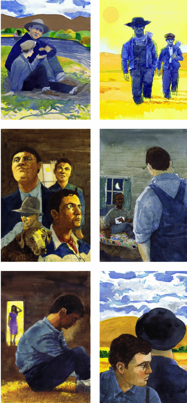
>22 PatsChoice: Thanks, I appreciate the recommendation! I should add that Jeanette Winterson puts out some readable horror-adjacent stuff as well, so she counts among my living author list.
24astropi
>23 Shadekeep: Also, The Woman in Black is a fun and well written gothic from 1983. It's not amazing nor the most original story, but I enjoyed it. It's certainly much better than the 2011 film. I take it you've already ready through pretty much all of Shirley Jackson? To me, she's the epitome of the great modern "horror" writer. My favorite of her works is The Sundial :)
25Undergroundman
>22 PatsChoice: Interesting. That's another Cemetery Dance release. I hope Paul publishes that one too. LOL
26amysisson
>19 Shadekeep:
Apologies if this has been suggested to you, or if you yourself have mentioned it elsewhere, but have you read The Library at Mount Char by Scott Hawkins? Horror/dark fantasy that blew my mind.
Apologies if this has been suggested to you, or if you yourself have mentioned it elsewhere, but have you read The Library at Mount Char by Scott Hawkins? Horror/dark fantasy that blew my mind.
27Shadekeep
>24 astropi: Agreed, and I've read (and re-read) Shirley Jackson with great pleasure. Same for Daphne du Maurier. I'm hoping to pick up Arion's version of The Sundial on their next sale, if it's still around by then.
>26 amysisson: It's not been mention to me, so thanks! It sounds a bit like Mordew by Alex Pheby, which I've picked up but not cracked open yet. Apparently it's really good too, so perhaps I should.
>26 amysisson: It's not been mention to me, so thanks! It sounds a bit like Mordew by Alex Pheby, which I've picked up but not cracked open yet. Apparently it's really good too, so perhaps I should.
28ExLibrisDavid
I received my copy of "Life of Pi" today, the illustrations look even better in person and both the slipcase and the quarter cloth binding are of this fascinating material that changes color depending on the angle you view it at. Overall, I'm quite pleased I purchased this one!
29NotSoSlimShady
>28 ExLibrisDavid: I am equally impressed by Life of Pi classic. Really nice production! The dual cloth slipcase had me playing mind games looking at it coming down the stairs!
30astropi
>28 ExLibrisDavid: >29 NotSoSlimShady:
Agreed! It's gorgeous. A few years ago if someone had told me you would be able to purchase a letterpress edition, signed by the artist and author, for under $200, I would have said "in what universe?" I think we all owe Suntup a thank you for really being the modern LEC and producing gorgeous and affordable books we all want.
Agreed! It's gorgeous. A few years ago if someone had told me you would be able to purchase a letterpress edition, signed by the artist and author, for under $200, I would have said "in what universe?" I think we all owe Suntup a thank you for really being the modern LEC and producing gorgeous and affordable books we all want.
31NathanOv
Just received The Yellow Wallpaper. Suntup is on a roll.
The wood engravings with four-block color printing are probably the best illustrations and press work I've seen from this publisher, and I quite like the binding as well.
The wood engravings with four-block color printing are probably the best illustrations and press work I've seen from this publisher, and I quite like the binding as well.
32ambyrglow
>31 NathanOv: It really did look lovely! But at that price, I'm going to have to content myself with the Clinker Press version.
33Shadekeep
>31 NathanOv: Got it here, it really does look and feel like Suntup's most "fine press" book to date. I hope more like this are on the slate.
34LBShoreBook
>31 NathanOv: I noticed that Ascensius Press did the printing for this one - not surprised by the top-tier press work given that collaboration. Makes me wish I'd looked at this one while in stock - I love Scott's work.
35abysswalker
>34 LBShoreBook: I think this one is peripheral to many Suntup customers' core collecting interests, so I wouldn't be surprised if you could find a secondhand copy at little to no markup, especially on the Facebook group if you watch for it.
36NathanOv
>35 abysswalker: I'm not sure you've got that quite right. The last copy on eBay sold for over $600 total.
When Suntup does editions like this, or really anything that strays from their typical genre fare, they tend to be expanding their audience to a wider range of collectors.
When Suntup does editions like this, or really anything that strays from their typical genre fare, they tend to be expanding their audience to a wider range of collectors.
37abysswalker
>36 NathanOv: eBay sales are generally considerably higher priced than Facebook group sales for Suntup.
Collectible book vault has it at $285 for "fair market value" (which is less than list price), but only based on one sale. (I'd only rely on CBV for the collecting subculture around modern signed/limited, Suntup, etc., but it is a resource there.)
In any case, I don't speculate (in the financial sense), but my read on the community preferences is that if you watch and wait for someone wanting to make some shelf space on the Facebook group, you'll be able to find a copy reasonably priced.
38A.Godhelm
Life of Pi took a little while longer to reach me but it's finally arrived, and it's gorgeous. The green and purple two-tone effect of the slipcase is very nice and I think FS did something similar with the Call of Cthulhu book (in that case leaning green). The pronounced texture of the paper, in combination with the letterpress, really give the text a dimensional look in the right light. Beautiful illustrations, author signature, really top notch work and my favourite so far alongside Animal Farm.
Hoping for more "Classic" state books in future.
Hoping for more "Classic" state books in future.
39NotSoSlimShady
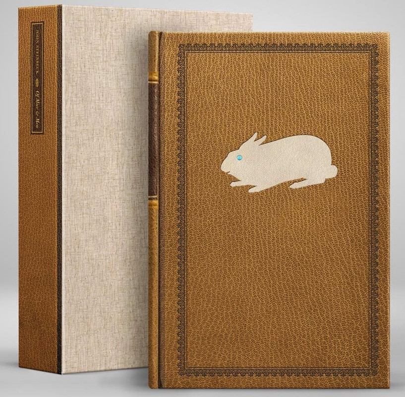
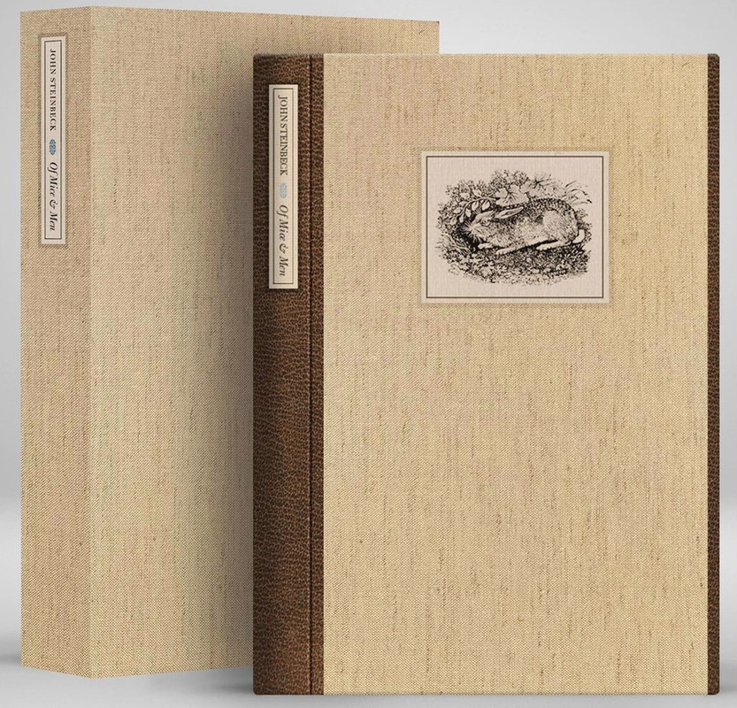
May title is indeed Of Mice and Men.
Lettered edition really is the star of the show in my opinion.
https://suntup.press/of-mice-and-men/
Lettered edition really is the star of the show in my opinion.
https://suntup.press/of-mice-and-men/
40CenSur
I told myself I wouldn’t buy this if it was Mice and Men, not because I think it’s terrible, but just because it falls outside the range of my typical interest. In other words it’d be something I read once I exhaust my reading list in a couple of years, but even then not on fine press at first. But boy is that lettered edition just gorgeous.
41NotSoSlimShady
>40 CenSur: This is definitely one of my favorite reads of all time. Would highly recommend the Folio edition on secondary if you're looking to pick up a very quality version at a fraction of the price! Great tactile experience in their edition.
42Undergroundman
The illustrations are hideous. Easy pass. Agree about better options out there at the fraction of the price. Still, I am hopeful we get more John Steinbeck titles from Suntup.
43EPsonNY
>42 Undergroundman: In regards to illustrations and illustrator's "exceptional contributions to Children’s Literature," it looks like one of his children contributed to this one ;).
And that cute, innocent rabbit with beady eyes on the cover of the Lettered... oh, wait...
And that cute, innocent rabbit with beady eyes on the cover of the Lettered... oh, wait...
44NathanOv
Huh, the illustrations are what convinced me to pull the trigger even though I hadn’t planned to read this one again anytime soon!
Part of that is just the excellent reproduction they’ve described for this edition, but I also think I have pretty different tastes than the typical Suntup collector, and don’t tend to like a lot of their hyperrealistic or overly digital looking illustrations.
Part of that is just the excellent reproduction they’ve described for this edition, but I also think I have pretty different tastes than the typical Suntup collector, and don’t tend to like a lot of their hyperrealistic or overly digital looking illustrations.
45NotSoSlimShady
>42 Undergroundman: I may be in the minority for this one but I actually liked the art (but not 2x,5x, etc. more so than the Folio / Easton versions that both have very quality - and honestly similar themed art in the $100 range).
I think the thing that actually bummed me the most was the afterword contributor. I was really expecting a bigger name. Someone very connected to Steinbeck academically or an individual attached to the more recent film adaptation (John Malkovich, Gary Sinise, etc.). I think this one was going to be a bit difficult to please due to the number of choice out there already. But exciting new content would have been a big differentiator for me.
I think the thing that actually bummed me the most was the afterword contributor. I was really expecting a bigger name. Someone very connected to Steinbeck academically or an individual attached to the more recent film adaptation (John Malkovich, Gary Sinise, etc.). I think this one was going to be a bit difficult to please due to the number of choice out there already. But exciting new content would have been a big differentiator for me.
46JacobHolt
Not my favorite Steinbeck work (so I will pass). But the illustrations look great to me.
47Undergroundman
>45 NotSoSlimShady: John Malkovich would have been great, but I think Gary Sinise would have been more inclined to contribute. Aside actors, who else would of been a better choice? Another California writer?
48NotSoSlimShady
>47 Undergroundman: I feel like the perfect high-profile writer introductions would be Cormac, seconded by Toni Morrison, and then finally Joan Didion which unfortunately couldn't happen. I would have to think more about California specific writers!
Back to movies - Director: Terrence Malick (Tree of Life, Badlands, Days of Heaven) would have been a dream (despite no direct Steinbeck relationship). I feel like his sense of cinematography is so close to how I perceive environment in Steinbeck novels.
Back to movies - Director: Terrence Malick (Tree of Life, Badlands, Days of Heaven) would have been a dream (despite no direct Steinbeck relationship). I feel like his sense of cinematography is so close to how I perceive environment in Steinbeck novels.
49astropi
Everyone is entitled to their opinion, but I think the illustrations are gorgeous. The yellow in the watercolor paintings immediately invokes the Depression, but the green is opportunity. The illustrator has done a lot of work (and won awards) for his children's illustrations. While M&M is certainly not children's literature, both protagonists are children in their own right, so I personally think the illustrations are also very apropos.
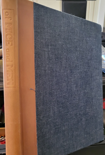
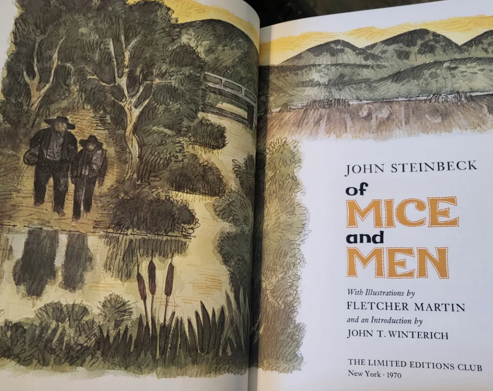
The Easton Press edition reprints the Fletcher Martin illustrations from the LEC. For the price, the EP edition is fabulous. All that said, Suntup's edition looks far more appealing than the LEC edition. Here are a couple of pictures of the LEC edition I found online --
ps Has there been any announcements/speculations on what comes after M&M?
ps2 Tough call, the lettered is very unique for sure, but all things considered, I think the numbered edition is ever so slightly more to my liking -
The Easton Press edition reprints the Fletcher Martin illustrations from the LEC. For the price, the EP edition is fabulous. All that said, Suntup's edition looks far more appealing than the LEC edition. Here are a couple of pictures of the LEC edition I found online --


ps Has there been any announcements/speculations on what comes after M&M?
ps2 Tough call, the lettered is very unique for sure, but all things considered, I think the numbered edition is ever so slightly more to my liking -


50NotSoSlimShady
>49 astropi: June is a bit of a mystery right now. I think the majority believed it was Don Quixote - but while not denying it, Paul poured a bit of water on that guess in his last live stream. I've heard Divine Comedy, Count of Monte Cristo, and Tale of Genji as other somewhat popular guesses. I had originally hoped 100 Years of Solitude. Although that may be out because there is rumbling that Conversation Tree is picking that up later this year (not guaranteed).
>644 on this page - JacobHolt has somewhat convinced me it is Tale of Genji.
https://www.librarything.com/topic/352529
>644 on this page - JacobHolt has somewhat convinced me it is Tale of Genji.
https://www.librarything.com/topic/352529
51LBShoreBook
>49 astropi: if I were to buy one of these, the numbered is far superior to the lettered IMO. That cover on the lettered .... not for me. 😂
52What_What
The palette is pleasant, but figures in the illustrations look deformed. Quite a few of the recent books look great, but apart from the Last Unicorn, a lot of the art is a miss for me.
53abysswalker
>52 What_What: I agree. It's interesting to me that the build specs on this are uniformly excellent (especially for the prices of the lower two states), and about half the art pieces work wonderfully for me (including 1-2 with figures), but the ones that don't work really don't work for me. The core book design is also classically pleasing (the ornamented title page and display breaks are lovely). I wonder if this is another Jerry Kelly production (wasn't obvious from the info page).
54astropi
>53 abysswalker: Curious what piece(s) in particular don't appeal to you? I always found the Fletcher Martin illustrations in the LEC edition to be disappointing. Fletcher Martin is a great artist, but the illustrations in the book are basically sketches, at least that's exactly what it looks like. There are other LEC books in the same vein such as All Quiet on the Western Front -- and I can certainly respect anyone that loves that style, just felt half-finished for my taste. Currently the AE is over half sold.
55abysswalker
>54 astropi: I do love the color palette used by the Suntup illustrations; the one that is two blue figures on yellow is great. The sitting at the river is nice. The over the shoulder overalls is not good; odd composition, dishwater colors, awkward anatomy. The hunched over one with the lady in back is not quite as bad but also doesn't work for me.
This artist's strength seems to be sunlit landscape; all of those are gorgeous. But the interior spaces not so much.
I'm not familiar with the LEC illustrations (this isn't a story that I need in a fine edition, so only something that truly blows me away would be compelling).
This artist's strength seems to be sunlit landscape; all of those are gorgeous. But the interior spaces not so much.
I'm not familiar with the LEC illustrations (this isn't a story that I need in a fine edition, so only something that truly blows me away would be compelling).
56EPsonNY
Easton Press lesser know edition Of Mice and Men from either the 6 or 8 volume John Steinbeck collection includes watercolor illustrations in black and white by Christopher Simon, which perhaps due to the lack of color are a bit underwhelming, but quite palatable...
57Inceptic
>42 Undergroundman: Glad I'm not the only one who can see the faults in the illustrations. I was so ready to buy, especially after Paul teased the specs yesterday, but it looks awful.
58DMulvee
Interesting how split we seem to be on the artwork! For me it’s a deal breaker and means I’m not interested in this version
59Levin40
>57 Inceptic: I had the same reaction. Even the increased price cf other AEs would be ok given that it's hand bound, but I just can't get past the art. For instance, in the one of them walking through the field, there's something very off about the proportions of Lennie Small. His head and neck are too large, or his right arm too small. I know he's supposed to be a big guy but it just looks odd, to me at least. Shame, as I was looking forward to this one.
60NathanOv
>59 Levin40: I think it’s pretty clear from the artist’s general style here that the proportions weren’t meant to be realistic.
Total realism in art isn’t something that interests me. Unless it’s meant to be scientifically accurate, like in a nature work, I want to see the artist’s interpretation.
Total realism in art isn’t something that interests me. Unless it’s meant to be scientifically accurate, like in a nature work, I want to see the artist’s interpretation.
61What_What
>60 NathanOv: The artist interprets everyone has extra long torsos and necks, and tiny little legs? Genuine question. It sounds like you’re saying the illustrator could’ve probably illustrated them with correct proportions - so what’s the philosophy with making them look that way?
62NathanOv
>61 What_What: See page 2: http://bergenhighschool.com/Art%20Assignments/Art%20Talk/10%20-%203%20How%20Arti...
In several of the sample pieces, Lennie is specifically distorted alongside characters with fairly regular proportions. Faces and emotive features (e.g, Lennie's hung head) are emphasized. The characters fit into a general style that seems to be driven by the rustic pastoral, somewhat abstract landscapes.
In several of the sample pieces, Lennie is specifically distorted alongside characters with fairly regular proportions. Faces and emotive features (e.g, Lennie's hung head) are emphasized. The characters fit into a general style that seems to be driven by the rustic pastoral, somewhat abstract landscapes.
63astropi
Artists depict people and animals from photo-realistic to Picasso-like and everything in between. Looking at the illustrations I think they overall look great and none of the characters are so distorted as to looking hyperbolized. Also, if I understand correctly the illustrations will actually be tipped-in prints, which I know will look wonderful --

64What_What
>62 NathanOv: Thanks Nathan. Maybe I’m just boring, I like normal looking people.
65ChampagneSVP
>53 abysswalker: “I wonder if this is another Jerry Kelly production (wasn't obvious from the info page).”
Idk if it was a recent update but the page names Mark Argetsinger as the designer. Between him and David Wolfe doing the printing, it’s shaping up to be a nice publication. I’m not on the Suntup bandwagon but I appreciate him seeking out quality printers and designers and I’m happy he also seems more open to crediting them than in the past.
Idk if it was a recent update but the page names Mark Argetsinger as the designer. Between him and David Wolfe doing the printing, it’s shaping up to be a nice publication. I’m not on the Suntup bandwagon but I appreciate him seeking out quality printers and designers and I’m happy he also seems more open to crediting them than in the past.
66Levin40
>62 NathanOv: Well, of course I understand that artists sometimes exaggerate or emphasize certain characteristics. Cartoonists and caricaturists have been doing that since art was invented. But in the piece I was talking about, Lennie's proportions are far closer to someone with dwarfism than a person verging on being a giant. I'm not sure how that can be what was intended. It just looks wrong, to me at least.
67NathanOv
>66 Levin40: So you’re saying that the artist managed to present him as both large and diminutive in one stroke. How fitting for the character.
I’m not arguing against anyone’s personal taste, the artist’s intent just seems quite clear. It’s obviously not a skills issue.
I’m not arguing against anyone’s personal taste, the artist’s intent just seems quite clear. It’s obviously not a skills issue.
68What_What
>67 NathanOv: Where did they say that?
69NathanOv
>68 What_What: Who say what?
70Levin40
>69 NathanOv: Sounds like you're better at interpreting art than English ;-). I think he might be referring to the bit in your post >67 NathanOv: (directed at me) where you say 'So you're saying...'. I didn't actually say that btw, but if you think that the artist was simultaneously trying to represent Lennie as a giant and a dwarf by making him really oddly proportioned then...fair play, perhaps. Too clever by half for me though. Look, I'm glad it all works for you and that you think the intent is clear. Still doesn't work for me though, so we'll have to leave it at that.
71astropi
The numbered edition is sold out. About 300 AE out of 500 are sold, so I would say that is definitely a success. When releasing such classics it's always hard to tell if there is enough demand, but I'm happy this work sold so well. While there are a gazillion and one fine press editions of Shakespeare (and I love Shakespeare) there are far far fewer Steinbeck, and in my opinion, this will be the finest Mice and Men published.
72NathanOv
>70 Levin40: I think that if you can’t see how your comments saying that he’s a giant who gives off the impression of a small person can be synthesized into him appearing both large and diminutive, then you shouldn’t be questioning other people’s English comprehension.
Of course it’s not for everyone. But calling it an issue of the artists skills, as so many are doing, is clearly ridiculous when Lennie is the one character who’s consistently distorted in different ways throughout the artwork we see, and where it repeatedly mirrors themes from the text.
Assuming you’re talking about George and Lennie walking through the field, I believe that’s from when the two characters are both contrasted, and Lennie’s broad, sloping shoulders and limp hanging arms are the features called out in the text, exactly as are slightly overemphasized in the art to draw attention to his appearance which is repeatedly described as odd and somewhat off putting in the book. This is exactly as you seem to be interpreting it, yet are criticizing the artist’s skills for portraying him that way.
75SDB2012
>73 Inceptic: It could be the art or that nearly $3k US dollars can buy several top-tier productions. I think the St James Park Press 1984 was less than that at issue.
76NathanOv
>74 What_What: You are forcing your own ignorance at this point. This is one of the most notable recent illustrators to do a Suntup volume.
You do not have to like his work, everyone has different tastes, but deriding his skills as an artist when he has an award-winning 4 decade career simply because you don’t understand (and refuse to learn about) some incredibly basic art concepts that multiple people have tried to explain to you just leaves me baffled.
You do not have to like his work, everyone has different tastes, but deriding his skills as an artist when he has an award-winning 4 decade career simply because you don’t understand (and refuse to learn about) some incredibly basic art concepts that multiple people have tried to explain to you just leaves me baffled.
77astropi
>73 Inceptic: There are 2 Lettered available and about 160 AEs. That means in less than a week 80% of the books have been per-ordered. How anyone can say this is anything less than a large success is beyond me. Also, everyone is entitled to their opinion, but clearly there are plenty of people that find the artwork appealing.
78DMulvee
>73 Inceptic: I think the market might be making some collectors rethink their priorities. The lettered Rebecca was offered for $2750 on the Facebook group (against a cost of $4500 direct from Suntup), whilst Of Mice and Men is currently offered at $2500 (against a direct cost of $3000). Even if you wished to buy all Suntup lettered books it might make more sense to just buy them on the secondary market (accepting you will pay a large mark up on the one or two big hits each year) and this will still cost you less money.
I seem to remember that even the Last Unicorn lettered was offered at retail price on the Facebook group
I seem to remember that even the Last Unicorn lettered was offered at retail price on the Facebook group
80Undergroundman
>78 DMulvee: Do these cheap lettereds get sold with rights?
83ChestnutPress
I am wondering if anyone has gotten hold of a copy of the Richard Matheson chapbook ‘Born of Man and Woman’ that Suntup has just published? If so, what are your thoughts? It certainly looks an interesting project and you can’t go wrong with something printed by John Grice at Evergreen Press.
84Shadekeep
>83 ChestnutPress: I'd be interested in seeing more of that one as well.
85A.Nobody
>83 ChestnutPress: According to the Suntup site, it's not scheduled to go out until Fall 2024 (though they seem to be making good progress and I wouldn't be surprised if it were more like Summer, at least for the Numbered).
86ChestnutPress
>85 A.Nobody: Interesting that it’s not actually published, as I thought it was all ready to go. Maybe the binding of the specials etc is holding it up.
87ChestnutPress
>84 Shadekeep: It’s a handsome piece. I saw an incomplete set of sheets for one of the specials on Barcham Green Dover handmade when I saw John in December.
88astropi
Hmm... I was looking at recent sales and saw this --
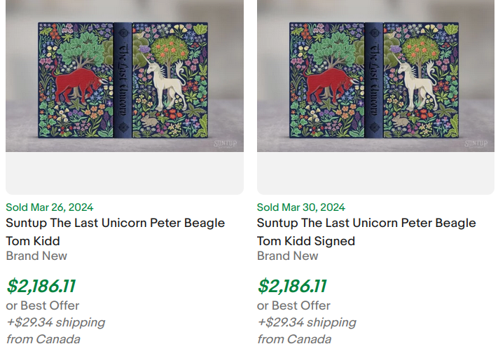
BUT - the seller - and these are indeed from the same seller, has another one listed!
https://www.ebay.com/itm/256463501552
I absolutely don't want to throw out any accusations without evidence, but that said, I know the numbered Last Unicorn was incredibly hard to get. How did this guy get so many copies? Legit, or something fishy?
89SDB2012
>88 astropi: $2000?
90astropi
>89 SDB2012: Apparently $2186.11
That said, I'm not necessarily surprised, I know some of the more desirable Suntup editions can hit those prices. What I'm interested to know is how can one seller have three numbered editions (or more) on pre-order?
That said, I'm not necessarily surprised, I know some of the more desirable Suntup editions can hit those prices. What I'm interested to know is how can one seller have three numbered editions (or more) on pre-order?

