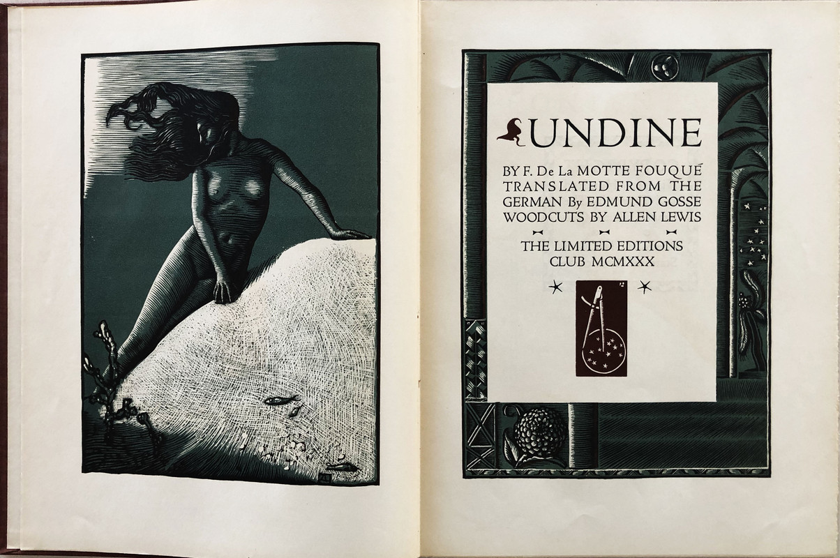
Undine by F. de la Motte - LIMITED EDITIONS CLUB 1930
KeskusteluGeorge Macy devotees
Liity LibraryThingin jäseneksi, niin voit kirjoittaa viestin.
1wcarter
Undine by F. de la Motte - LIMITED EDITIONS CLUB 1930
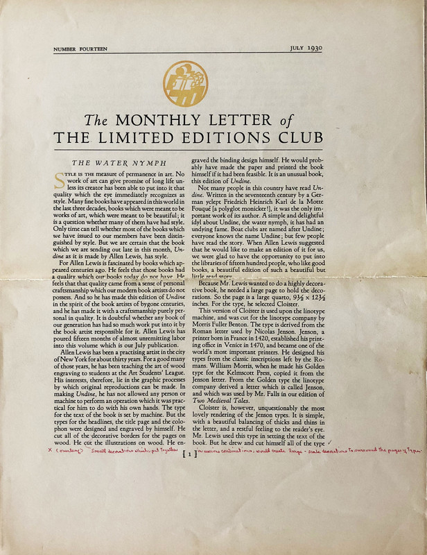
A PICTORIAL REVIEW
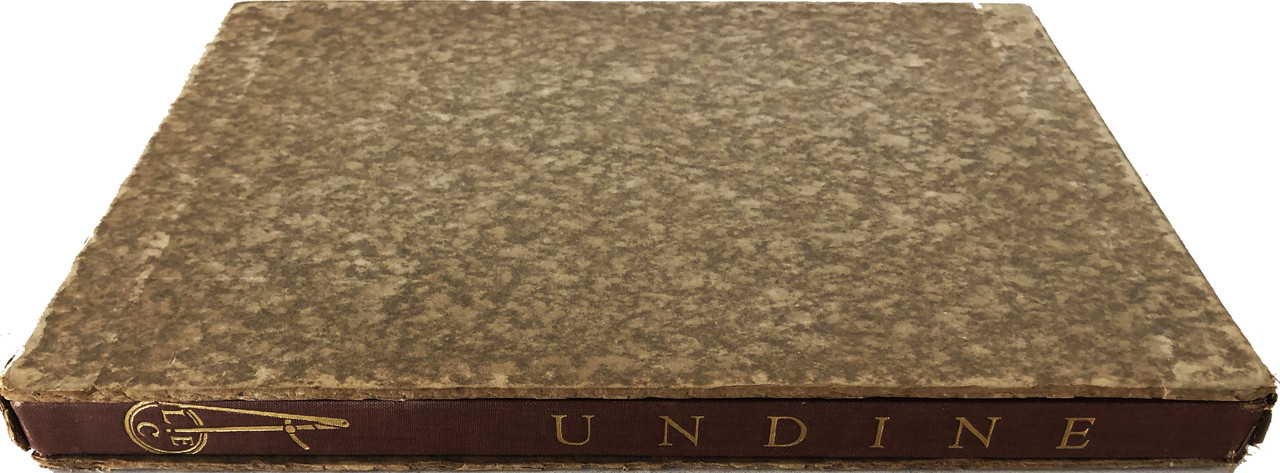
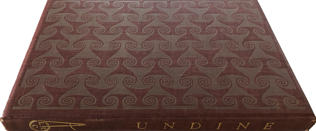
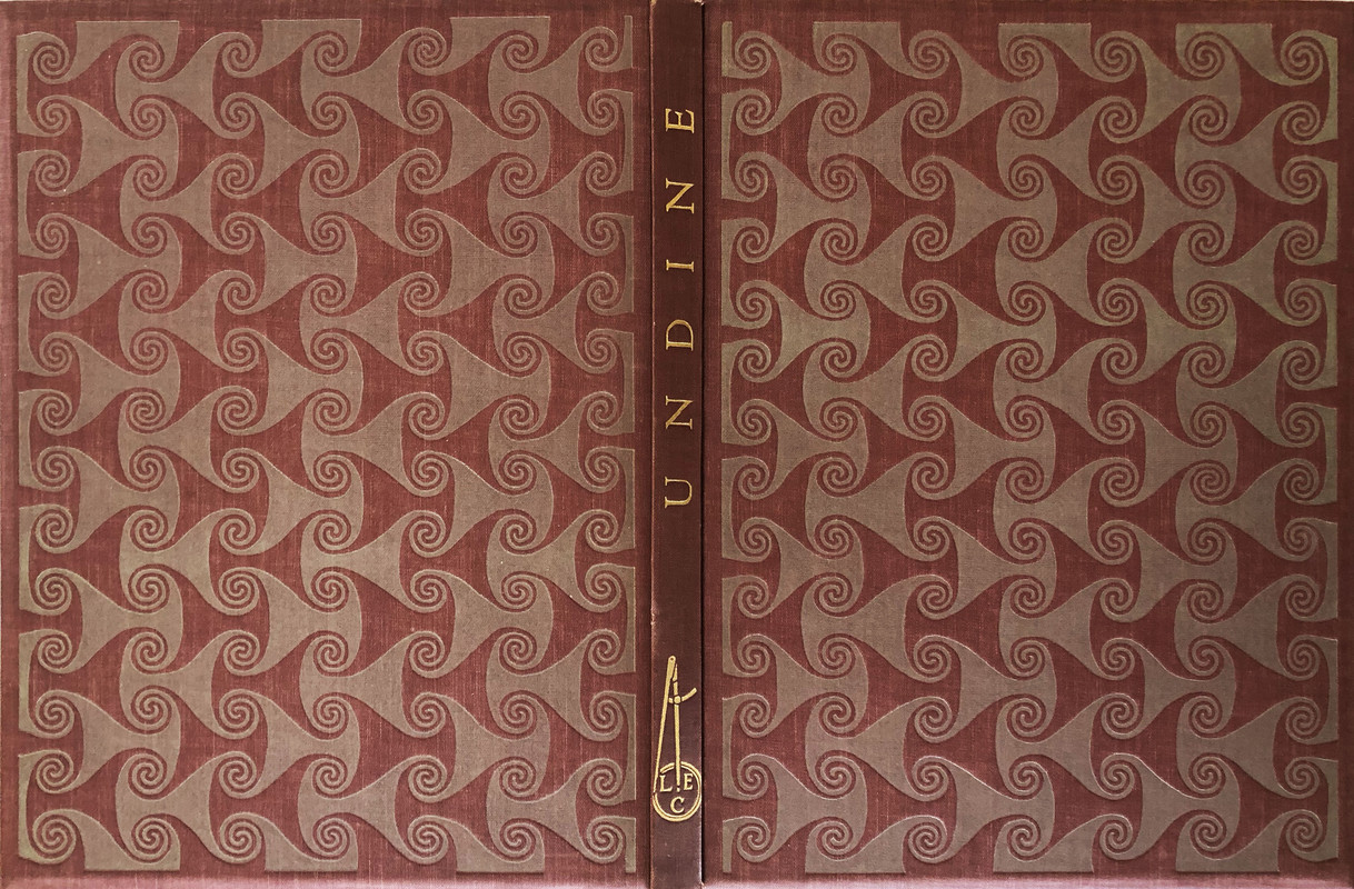
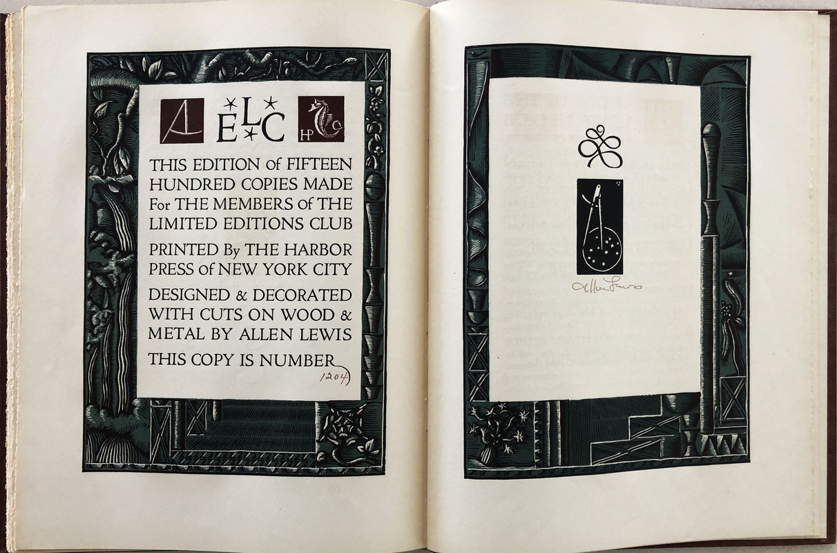
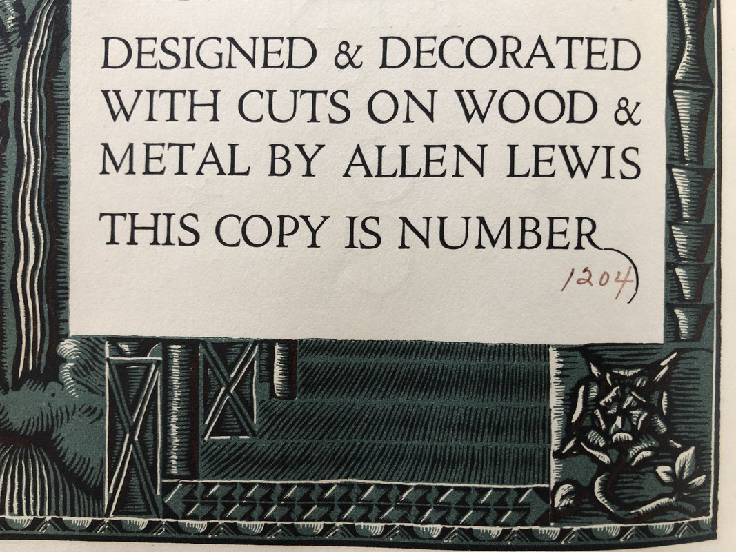
No. 1204 of 1500 copies
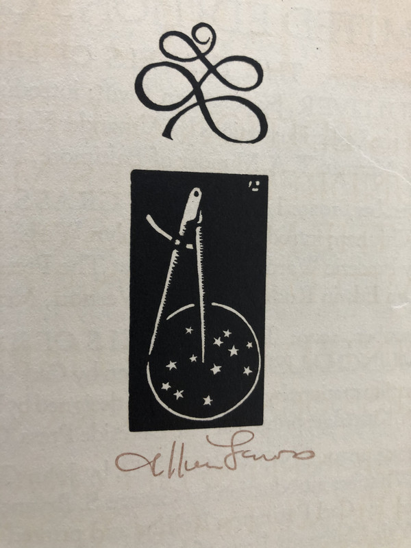
Signed by the artist.
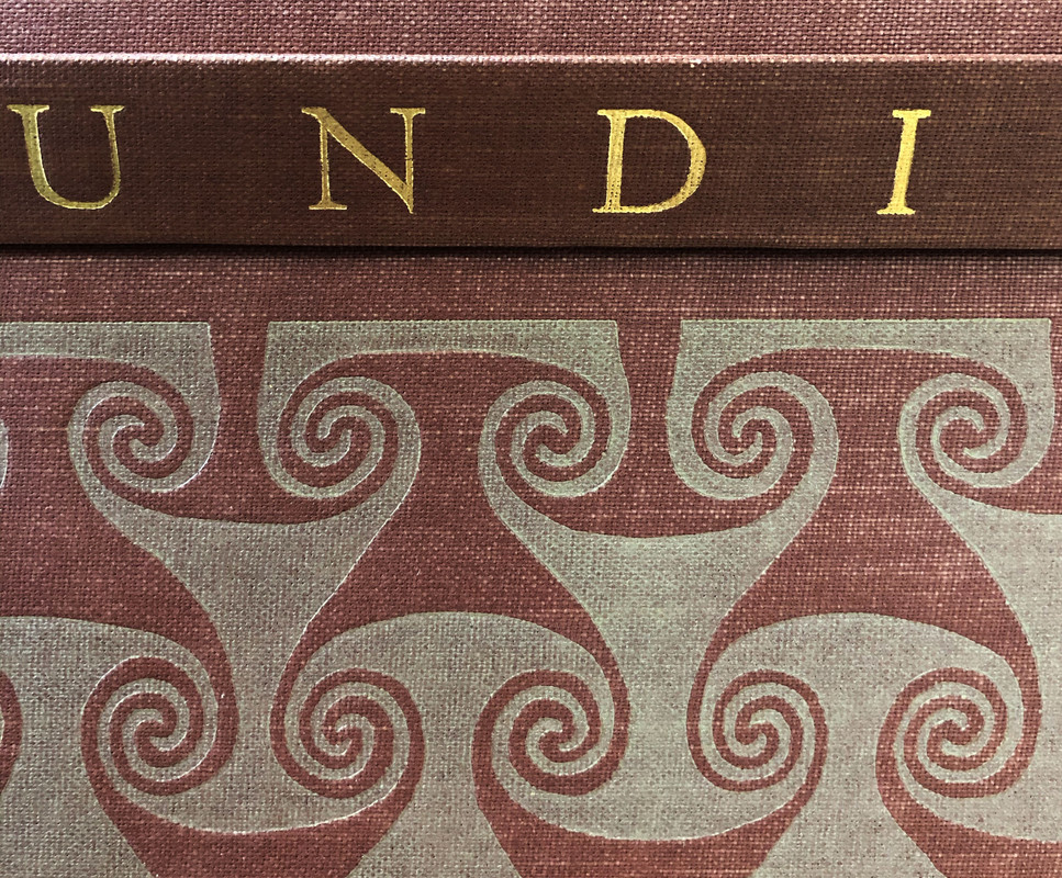
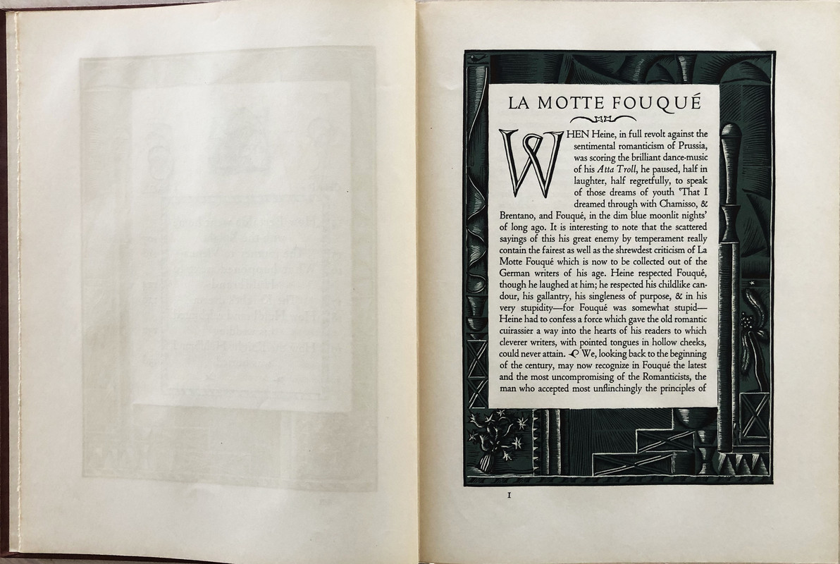
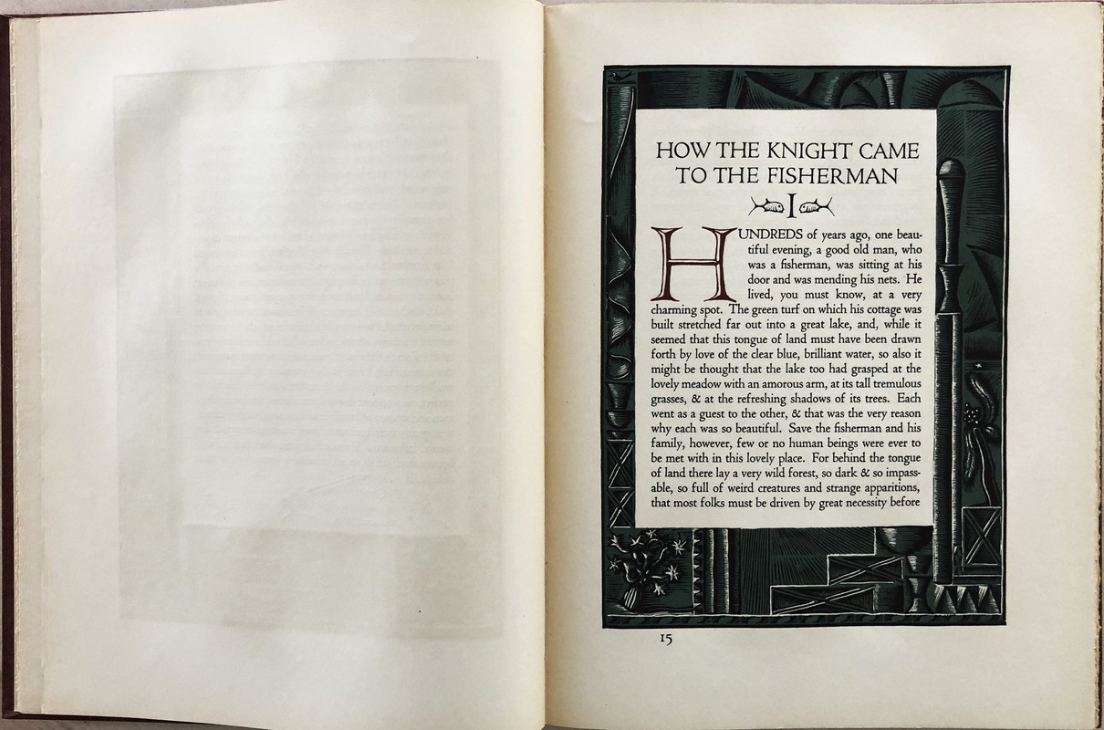
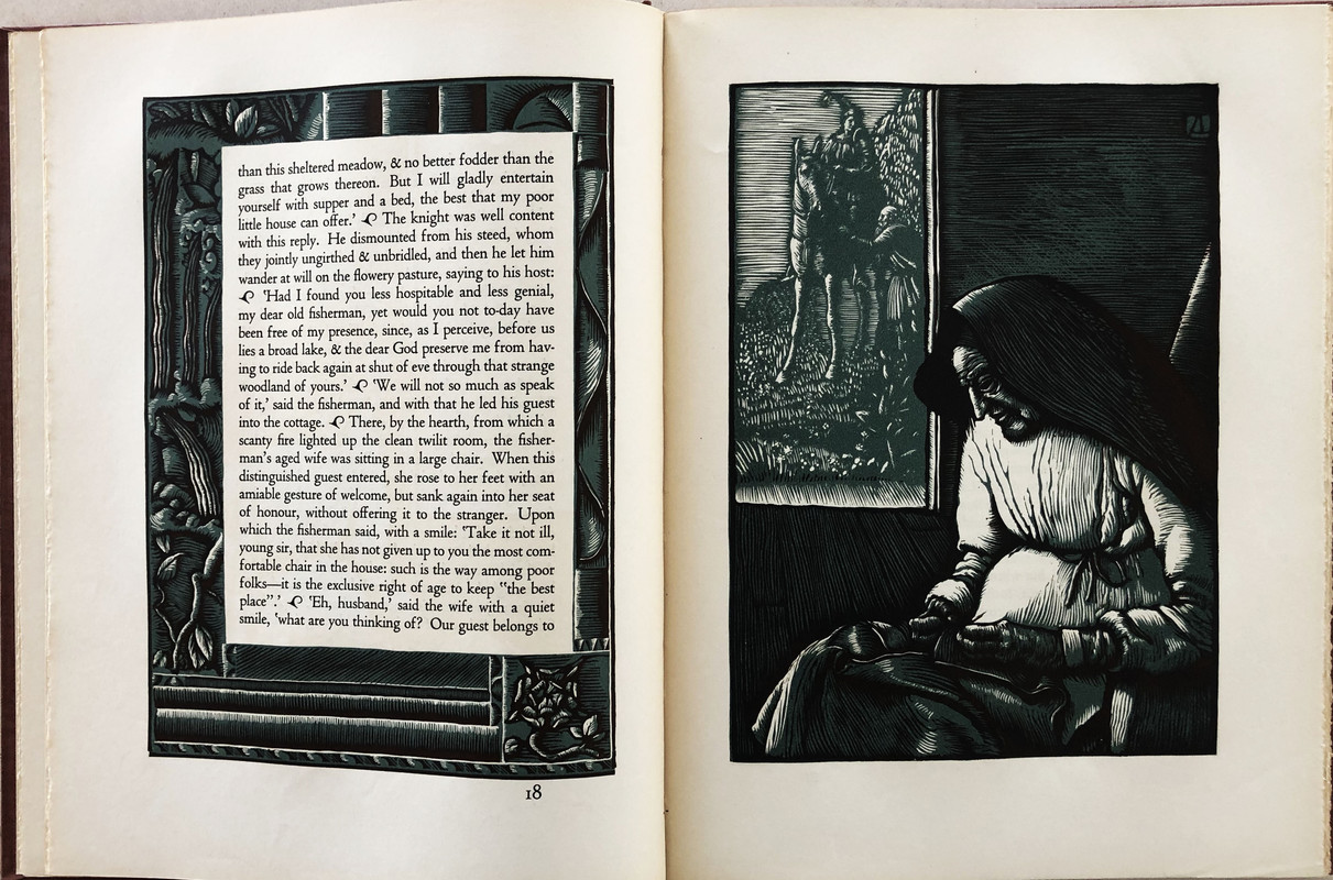
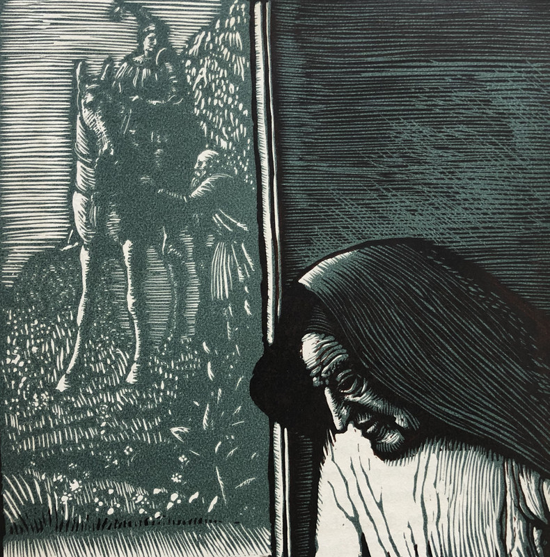
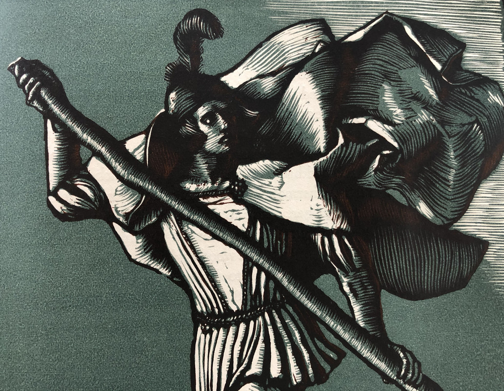
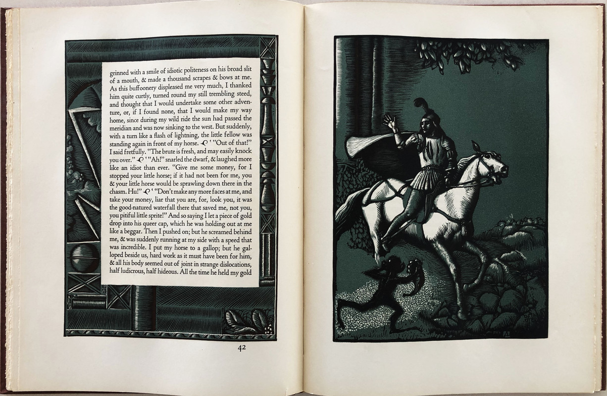
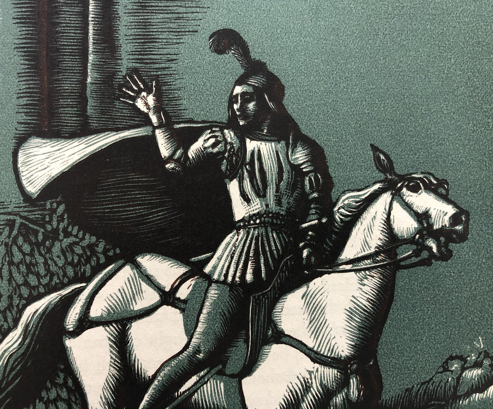
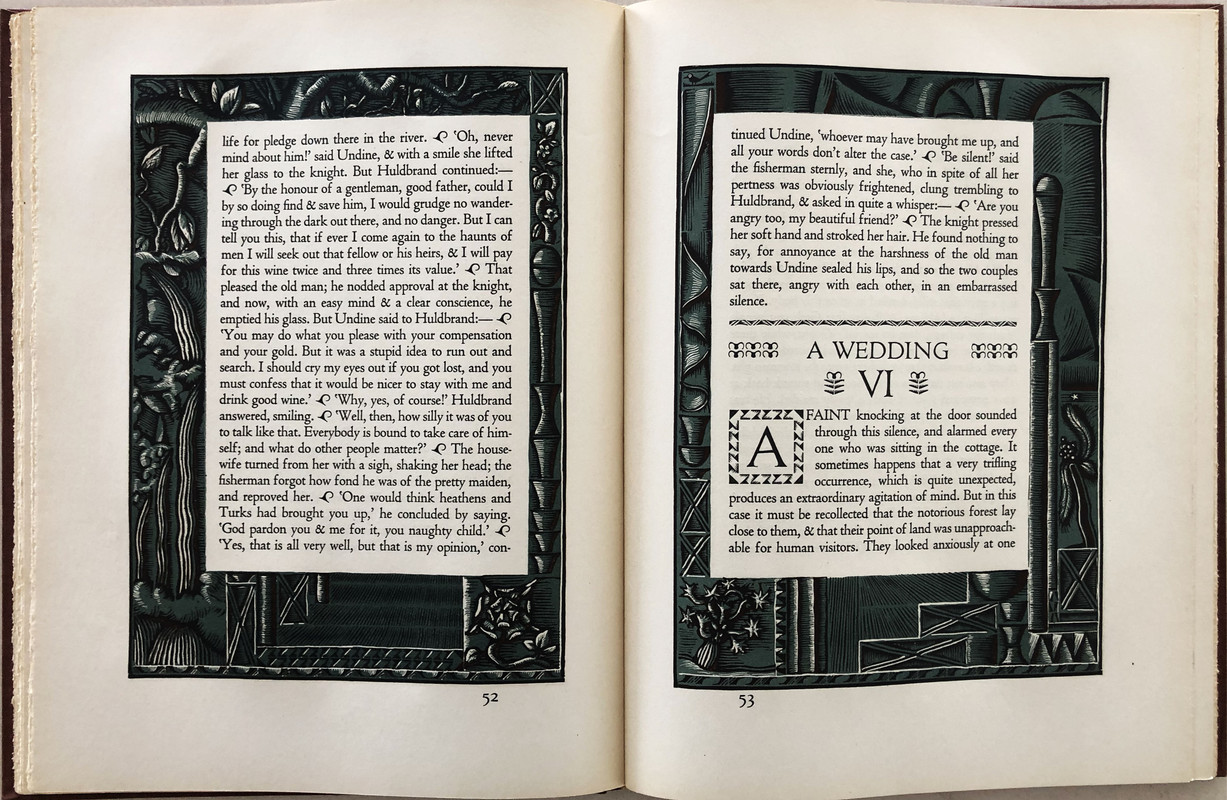
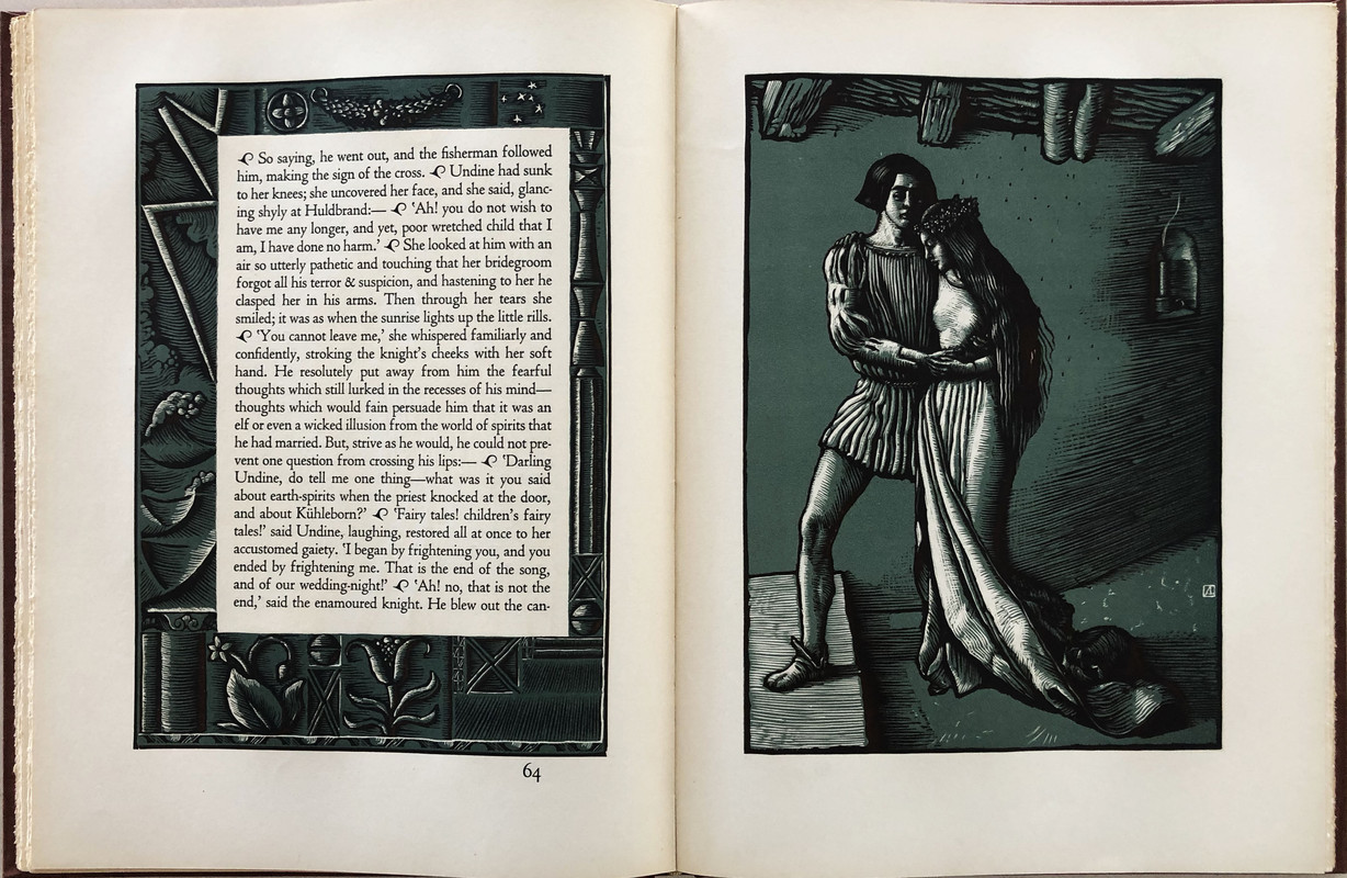
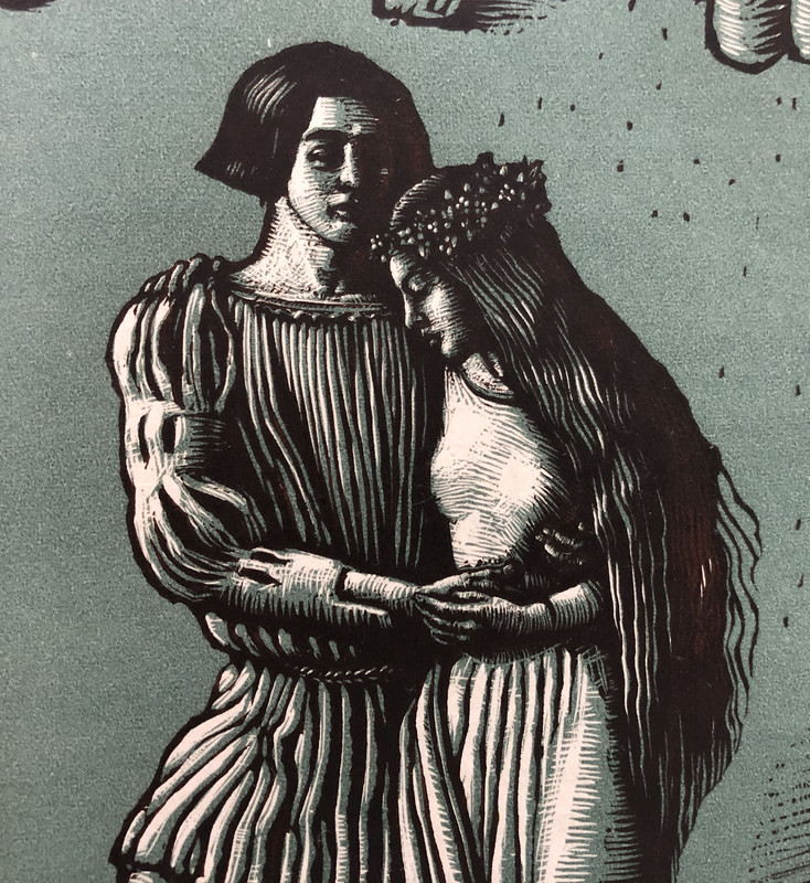
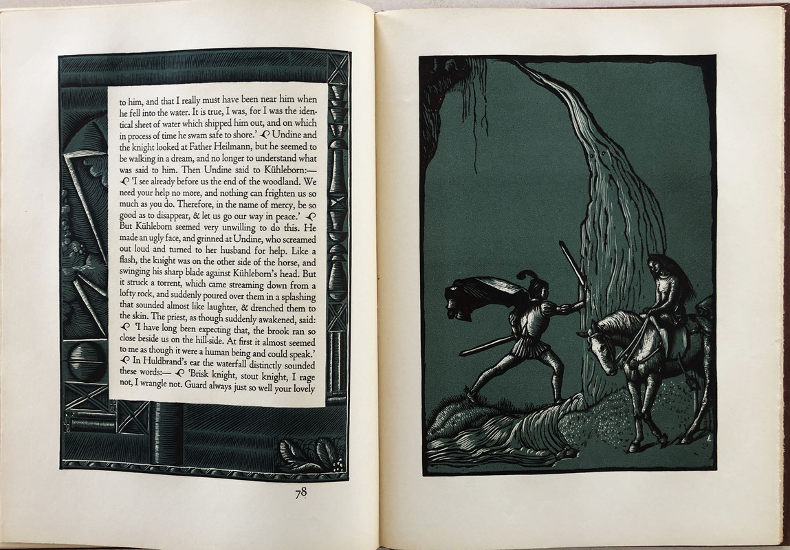
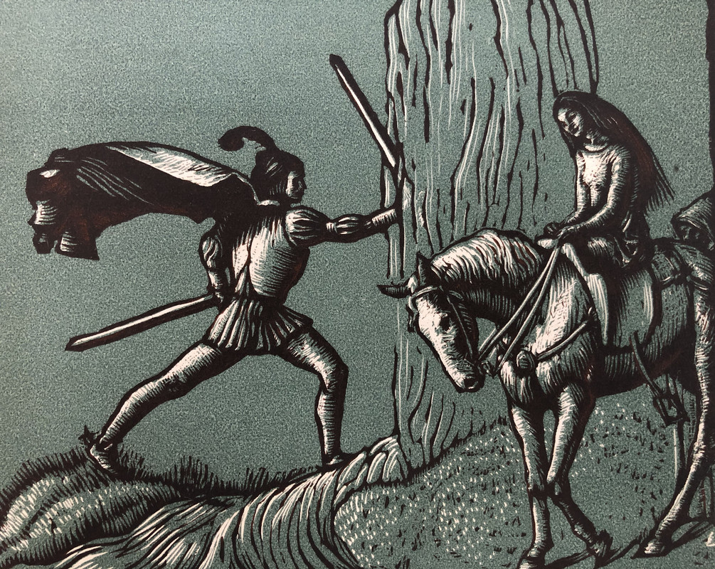
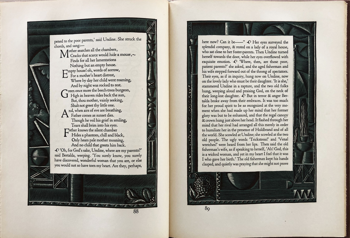
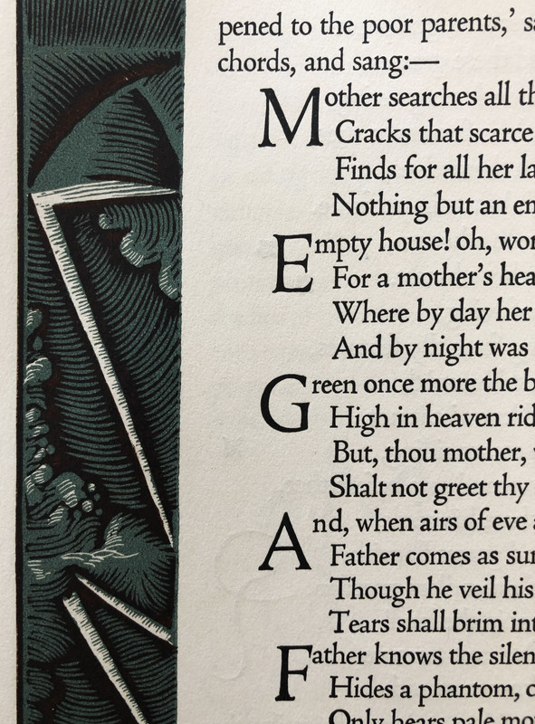
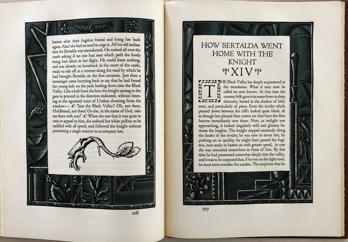
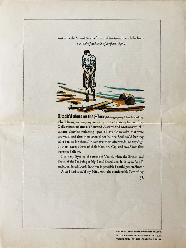
Wood and metal cut engravings by Allen Lewis.
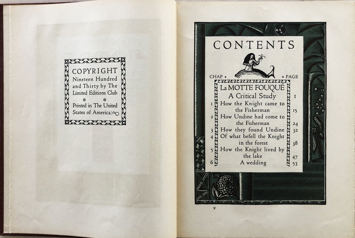
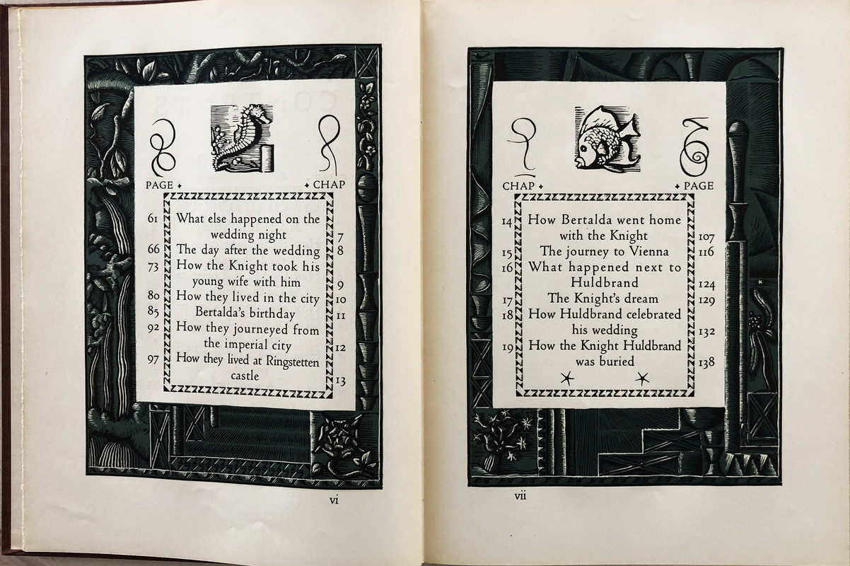
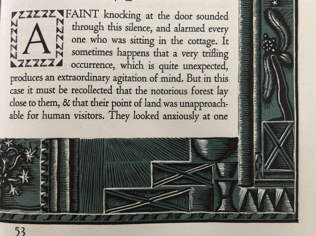
Page surround decorations on every page.
Translated by Edmund Gosse.
Bound in brown cloth covers embossed and blocked with a grey pattern.
Mottled brown slipcase.
Plain white endpapers
Gilded page tops.
Ragged outrt page edges.
Monthly letter laid-in.
144 pages
33.1x25.1cm.
Cost to me US$100

An index of the other illustrated reviews in the this series can be viewed here.
A PICTORIAL REVIEW
No. 1204 of 1500 copies
Signed by the artist.
Wood and metal cut engravings by Allen Lewis.
Page surround decorations on every page.
Translated by Edmund Gosse.
Bound in brown cloth covers embossed and blocked with a grey pattern.
Mottled brown slipcase.
Plain white endpapers
Gilded page tops.
Ragged outrt page edges.
Monthly letter laid-in.
144 pages
33.1x25.1cm.
Cost to me US$100


An index of the other illustrated reviews in the this series can be viewed here.
2UK_History_Fan
One of the favorite LEC titles in my collection. Thanks for the post and high quality pictures. I’m a big fan of these illustrations and the style they represent.
3SebRinelli
Thanks for sharing. Absolutely beautiful!
4WildcatJF
This is the next book I am buying, and this only reconfirms the commitment, haha. Thanks for sharing such lovely photos!
5edgeworn
Stunning! Now added (near the top) of my wants list. Thank you for such a well-illustrated review.
7MobyRichard
Can somebody explain why this edition is so highly praised? That's not a negative comment. It looks great, but there are a lot of great LECs. To me, it seems more middle of the pack. But then one of the first fine press books I ever bought was the Rackham illustrated Undine, so I am biased.
8Sport1963
>1 wcarter: This is a great book (and great story), and one of my favorites. Thanks for the comprehensive post.
9edgeworn
>7 MobyRichard: I can tell you why I am attracted to this book, judged solely on wcarter's photos.
I have a particular fondness for books where the text and illustrations have been designed as as integrated whole, and which successfully balance the weight and feel of the type with the graphical elements. This looks to me to be a successful and very attractive example of this.
My personal order of preference for illustrated books, in descending order, is:
1. books with print and illustrations closely integrated
2. books with illustrations interspersed in the text
3. books with illustrations which have been bound in separately (with those annoying blank reverses to the illustrations)
4. tipped in plates
10Django6924
>9 edgeworn:
Your #3 on the list above was something that I was thinking about last night when I was looking through my HP issue of The Idiot. It is profusely illustrated with Eichenberg's wood engravings, and so there are many blank reverses. Once the Limited Editions Club and HP came up with a brilliant solution (actually the illustrator, Charles Mozley, was probably the one who had the idea): in Galsworthy's The Man of Property, the 12 full-color lithographs, printed directly from the stones, "are backed up by a full-page monochrome lithograph, in sepia, depicting an aftermath of the scene visualized in the color plate" (from the ML). This was a fabulous idea, and one I wish had become a standard practice, but I've not seen any other examples of it.
Indeed, some of my favorite LECs are examples of your criteria #2; the Marco Polo with Lapshin's illustrations and All Quiet on the Western Front with Groth's sketches.
11MobyRichard
>9 edgeworn:
Thanks for your response. I would say I would largely agree with you, although my ranking changes depending on what I feel appropriate for the text in question.
Thanks for your response. I would say I would largely agree with you, although my ranking changes depending on what I feel appropriate for the text in question.
Join to post

