Questions for the Resident LEC and HP Experts - continued 04/2017
KeskusteluGeorge Macy devotees
Liity LibraryThingin jäseneksi, niin voit kirjoittaa viestin.
1BuzzBuzzard
Starting a new tread because the old one got a bit long.
Finally I was able to get to some long overdue readings. Started with Brothers Karamazov (LEC 1949) moved trough Treasure Island (LEC 1941) then Anna Karenina (LEC 1951) and War and Peace (LEC 1938). All wonderful G. Macy productions. I should have read Stevenson's classic much earlier but Blind Pew terrified me as a kid and I could not move past the initial chapters. I felt that the story had a few loose ends but nevertheless is engaging and fun read. The other three are absolutely perfect! Contrary to my expectation they are easy to read. I finished AK in about two weeks. Now to my question: How does Resurrection compare to AK and W&P? The theme of sin and redemption reminds me of Dostoevsky.
Finally I was able to get to some long overdue readings. Started with Brothers Karamazov (LEC 1949) moved trough Treasure Island (LEC 1941) then Anna Karenina (LEC 1951) and War and Peace (LEC 1938). All wonderful G. Macy productions. I should have read Stevenson's classic much earlier but Blind Pew terrified me as a kid and I could not move past the initial chapters. I felt that the story had a few loose ends but nevertheless is engaging and fun read. The other three are absolutely perfect! Contrary to my expectation they are easy to read. I finished AK in about two weeks. Now to my question: How does Resurrection compare to AK and W&P? The theme of sin and redemption reminds me of Dostoevsky.
2Jan7Smith
>1 BuzzBuzzard: Those books would probably take a year for me to finish. War and Peace took quite some time for me to read. Congratulations on reading some great literature. I hope to read all of them even if I am a slow reader. Which of the two Tolstoy books would you rate the highest?
3BuzzBuzzard
>2 Jan7Smith: I am not a fast reader either. With regards to AK my goal was to read 100 pages a day. As W&P goes I am reading one volume a week (currently at volume 6). Both schedules proved achievable for me. To tell you the truth I wish I had taken my time to extend my pleasure. May be W&P is a little more memorable because of the magnitude of the scene but both are very, very similar.
4Django6924
>1 BuzzBuzzard:
I read Resurrection back in the early 1960s when it was issued as one of the selections in the Heritage Club. It was the first novel by Tolstoy that I read, and my opinion was that the masterly author of "The Kreutzer Sonata" and "The Death of Ivan Ilyich" was too concerned with polemics in long form fiction. Later, after reading Anna Karenina and War and Peace, as well as some biographical material, I realized that Resurrection was somewhat atypical of Tolstoy the novelist. I have not re-read the novel, and perhaps my feeling that it is inferior to his earlier works is not as informed as it might be, though I still remember that the story of Dmitri and his maid was what interested me, and that it was overwhelmed by piling on scenes of social injustice.
I read Resurrection back in the early 1960s when it was issued as one of the selections in the Heritage Club. It was the first novel by Tolstoy that I read, and my opinion was that the masterly author of "The Kreutzer Sonata" and "The Death of Ivan Ilyich" was too concerned with polemics in long form fiction. Later, after reading Anna Karenina and War and Peace, as well as some biographical material, I realized that Resurrection was somewhat atypical of Tolstoy the novelist. I have not re-read the novel, and perhaps my feeling that it is inferior to his earlier works is not as informed as it might be, though I still remember that the story of Dmitri and his maid was what interested me, and that it was overwhelmed by piling on scenes of social injustice.
5booksforreading
>1 BuzzBuzzard:
I read Resurrection in my early to mid teens, so a lot of details are now difficult to remember; however, I had read War and Peace and other Tolstoy's stories and novels before reading Resurrection, and I remember that I was impressed by how many personal thoughts Tolstoy shared with his readers in that novel. Yes, I agree with Django6924 that there were many sections about social injustice, as well as criticism of contemporary state of Christianity; nevertheless, I found the work rather thought-provoking and interesting.
I read Resurrection in my early to mid teens, so a lot of details are now difficult to remember; however, I had read War and Peace and other Tolstoy's stories and novels before reading Resurrection, and I remember that I was impressed by how many personal thoughts Tolstoy shared with his readers in that novel. Yes, I agree with Django6924 that there were many sections about social injustice, as well as criticism of contemporary state of Christianity; nevertheless, I found the work rather thought-provoking and interesting.
6BuzzBuzzard
>4 Django6924: >5 booksforreading: Thanks for your thoughts. It is on my to read list.
>5 booksforreading: How did you like W&P at such a young age?
>5 booksforreading: How did you like W&P at such a young age?
7booksforreading
>6 BuzzBuzzard:
I don't remember how much time I took reading it, but I do remember that after the first book I really got emotionally attached to characters in the novel, and by the time I came to the end, I felt like I "lived through" all the events described in the book and passed through myself all the emotional transformations of the characters. I remember feeling some sense of emptiness after I finished the book.
I also remember that in original Russian version (which I read), most of the first book was in French, as Tolstoy wrote it (in letters), with Russian translations in large footnotes.
For the Russian nobility of the time, French was often the first language, not even the second.
8BuzzBuzzard
>7 booksforreading: For the Russian nobility of the time, French was often the first language, not even the second.
I just passed the section where Dolokhov and Petya go right into a camp of the fleeing French army to spy on. Of course speaking French that must have been pretty good.
I just passed the section where Dolokhov and Petya go right into a camp of the fleeing French army to spy on. Of course speaking French that must have been pretty good.
9boldface
I have a question for anyone who owns the LEC 1981 Odyssey of Homer with the Barry Moser illustrations.
It is billed as having 24 full page illustrations and one vignette, making a total of 25 engravings which are listed (with page number references) at the front of the book.
How come, then, that in my recently acquired copy there is a full page engraving facing p. 226 which is not listed anywhere? Thus there are actually 26 different illustrations in my copy. I'd be very grateful if anyone can explain this!
(Edited to correct spelling)
10kdweber
>9 boldface: Good question, you're right. Another mystery, like why is there no 509th title.
11Jan7Smith
Can someone recommend a nice edition of Jean-Christophe by Romain Rolland? I would probably prefer it in at least three volumes considering its length.
13wcarter
>10 kdweber: >12 boldface:
Maybe the forthcoming HISTORY OF THE LIMITED EDITIONS CLUB by Carol Grossman will enlighten us.
Maybe the forthcoming HISTORY OF THE LIMITED EDITIONS CLUB by Carol Grossman will enlighten us.
14astronauteric
Does that also mean there was no Monthly Letter #509?
Wasn't that (between 508 and 510) when Shiff bought the Club? Maybe the skipped number was simply meant as a demarcation signalling the beginning of the Shiff era.
Wasn't that (between 508 and 510) when Shiff bought the Club? Maybe the skipped number was simply meant as a demarcation signalling the beginning of the Shiff era.
15kdweber
>14 astronauteric: "Does that also mean there was no Monthly Letter #509?"
No, the newsletter number never matched the edition. There were four monthly letters issued before the first book. There were other occasions later when a monthly letter was issued without a standard edition making the numbers even farther apart.
"Wasn't that (between 508 and 510) when Shiff bought the Club?"
Close but no cigar. The Great Gatsby (508) was issued in late 1980. Shiff didn't buy the club until 1982. But the club was certainly going through a lot of turmoil at that time.
16Django6924
>9 boldface:
Only Mr. Moser could answer your question, but my own suspicion is that after completing the 24 illustrations and 1 vignette (Athene) listed on the "Illustrations" page and the typesetting, someone may have mentioned (or the artist may have realized) that he had not made an illustration of Penelope, who is rather an important character, after all.
Only Mr. Moser could answer your question, but my own suspicion is that after completing the 24 illustrations and 1 vignette (Athene) listed on the "Illustrations" page and the typesetting, someone may have mentioned (or the artist may have realized) that he had not made an illustration of Penelope, who is rather an important character, after all.
17featherwate
>15 kdweber:
" The Great Gatsby (508) was issued in late 1980"
That was a long pregnancy! It first seems to have been considered as an LEC in Helen Macy's time (1962). The Monthly Letter says that Charles Scribner III, who introduces the LEC, became Scribner's Director of Subsidiary Rights in 1978 - perhaps he was more amenable to a limited edition being published than his predecessor(s) had been.
18astronauteric
>15 kdweber:
We must be relying on different sources. Are you going by Bill Majure's website for your edition numbers? I'm going by the LEC Bibliography, and the two do not always match. It is true that the newsletter numbers didn't match the edition numbers in the Bibliography from series 1 through 40, but starting in the 41st series the Bibliography skips seven numbers, to match up the edition number with the corresponding monthly letter number. The first book so matched is The Short Stories of Anton Chekhov, number 466. And number 508 is not Gatsby, but The Ballads of Robin Hood. The next book, 510, is WInesburg, Ohio, issued about a year and a half after Robin Hood, in late 1978. And I do believe it was in 1978, not 1982, when Shiff bought the club.
We must be relying on different sources. Are you going by Bill Majure's website for your edition numbers? I'm going by the LEC Bibliography, and the two do not always match. It is true that the newsletter numbers didn't match the edition numbers in the Bibliography from series 1 through 40, but starting in the 41st series the Bibliography skips seven numbers, to match up the edition number with the corresponding monthly letter number. The first book so matched is The Short Stories of Anton Chekhov, number 466. And number 508 is not Gatsby, but The Ballads of Robin Hood. The next book, 510, is WInesburg, Ohio, issued about a year and a half after Robin Hood, in late 1978. And I do believe it was in 1978, not 1982, when Shiff bought the club.
19kdweber
>18 astronauteric: "And I do believe it was in 1978, not 1982, when Shiff bought the club."
From the New York Times (April 12, 1982):
"The Limited Editions Club is back in business, back in New York, back in the black and again under the firm control of one man. Known for its lavish editions of illustrated classics in the 1930's and 40's, when it had a membership of 2,000 and a waiting list three times as long, the club declined in the last decade to 500 members. It was sold twice, and when it was put up for sale a third time, it was virtually bankrupt. Now its membership is above 1,400 and growing, and its books once again are luxurious volumes illustrated by famous artists.
Sidney Shiff, the new principal owner and publisher of Limited Editions, was an unlikely candidate for the job. He is a 1950 graduate of Columbia University, who has spent most of his life on Wall Street as a broker. To be sure, he is not entirely unacquainted with quixotic adventures: he ran for Congress as a Democrat in a staunchly Republican district of New Jersey in 1956, when the Republican ticket was headed by President Dwight D. Eisenhower. But his sudden transfer from Wall Street to a cluttered midtown publishing office was a move that has taken him a little farther than the few miles between those places.
When a proposal was sent around in 1978 for the sale of Limited Editions, ''It was all debts and no balance sheet,'' says Mr. Shiff. ''Someone would have had to buy it blind.'' Which is what he and a few partners did. Then they discovered that the club's debts were more than they had counted on. Two of the partners bowed out. A big bank was curious enough to have a look at the balance sheets and then lost interest. But the club's debts were not losing interest, and ''One day,'' says Mr. Shiff, ''my wife said that since I'd got the business, I'd better get in and run it.'' He Does a Bit of Everything"
20astronauteric
>19 kdweber:
Yes, I've read this article. Thank you for sharing it. The article is from 1982, but it is clear that it was not written immediately after Shiff took over, but a few years after. In the third paragraph it says Shiff bought the Club in 1978.
Yes, I've read this article. Thank you for sharing it. The article is from 1982, but it is clear that it was not written immediately after Shiff took over, but a few years after. In the third paragraph it says Shiff bought the Club in 1978.
21BuzzBuzzard
>20 astronauteric: I think this is probably so. My understanding is that the first LEC under Shiff's leadership was the 1979 Gentleman from Cracow and The Mirror.
23BuzzBuzzard
Damn how depressing Grapes of Wrath is! So very much... The LEC is wonderfully produced. In every single respect.
24EclecticIndulgence
Viestin kirjoittaja on poistanut viestin.
25BuzzBuzzard
>24 EclecticIndulgence: I read Of Mice and Men recently and it was sad but nothing on the level of Grapes of Wrath. I am hesitant to approach the last 100 pages because it seems terrible things are about to happen. Fantastic writing though. Glad I am reading it in English.
26EclecticIndulgence
Viestin kirjoittaja on poistanut viestin.
27BuzzBuzzard
>26 EclecticIndulgence: It sure looks like this is the prevailing opinion on the Folio forum. I will look for it. Any nice editions aside from the signed Viking Press outrageously expensive edition?
28EclecticIndulgence
Viestin kirjoittaja on poistanut viestin.
29nicklong
>23 BuzzBuzzard: - 28
I prefer Grapes of Wrath to East of Eden. As for "nice editions" - I know this might not quite make the cut for some of you, but if it's American, I almost always go for a Library of America (LoA) edition if available. There's an easy way to pick up most of Steinbeck's works: https://www.loa.org/subscribe/2-the-john-steinbeck-library
I prefer Grapes of Wrath to East of Eden. As for "nice editions" - I know this might not quite make the cut for some of you, but if it's American, I almost always go for a Library of America (LoA) edition if available. There's an easy way to pick up most of Steinbeck's works: https://www.loa.org/subscribe/2-the-john-steinbeck-library
30Drfreddy94
Hello everyone.
I have a question regarding the LEC edition of main street.
Can anyone tell if it is worth buying since the prices are more than 300 dollars?
I have a question regarding the LEC edition of main street.
Can anyone tell if it is worth buying since the prices are more than 300 dollars?
31BuzzBuzzard
>30 Drfreddy94: This is the nicest edition of Main Street that I am aware of. The consensus is that it is wonderfully illustrated by a foremost American artist. Some people dislike the flexible boards. If you are patient you can have it for around $200. The Heritage Press also reprinted it and the price is 10 times less. It really depends what you are looking for.
32kdweber
>30 Drfreddy94: A very nice volume signed and with great illustrations by Grant Wood (of American Gothic fame).
>31 BuzzBuzzard: I had the EP edition which had very inferior reproductions of the illustrations. Very pleased with the upgrade. Don't know how the HP illustrations compare to the LEC but in the few cases where I've had both the HP and LEC of the same edition, the LEC illustrations were always better done.
>31 BuzzBuzzard: I had the EP edition which had very inferior reproductions of the illustrations. Very pleased with the upgrade. Don't know how the HP illustrations compare to the LEC but in the few cases where I've had both the HP and LEC of the same edition, the LEC illustrations were always better done.
33Drfreddy94
Thanks.
I found a decent copy for about 250 dollars.
However I ended up purchasing the 1933 analects with the box and the letter for about 225 dollars.
Also most of the boxes I have seen seem to be separated in two halves. But mine seems to have a hinge and a front closure lock type system. Was it originally this way or is my box customized?
34kdweber
>33 Drfreddy94: Your box was customized. Congrats, $225 is a pretty good price for a copy that has a decent box.
35Drfreddy94
Thats great.
Thanks for your help.
Thanks for your help.
36Django6924
>30 Drfreddy94:
As to your question about Main Street, I can't add much beyond what you read in >31 BuzzBuzzard: and >32 kdweber: above. I will say that it is probably my choice for the best-illustrated LEC (at least during George Macy's tenure) against some pretty stiff competition. Wood's choice of what to show in his illustrations, and the insight into the characters was never bettered by any other illustrator, and the reproductions are probably as good as the technology of the time made possible. Like Ken, I first had the HP edition, and I thought the illustrations were monochromatic until I got the LEC and saw they were all in color--a very subtle color palette, but one that made, as Ken says, the upgrade very much worth the extra money.
The question of whether you might find it worthwhile probably comes down to whether you like the binding--many don't--and whether you think the novel qualifies as great literature. It is very much of its time and many today would probably wonder if the issues are still relevant.
37gmacaree
>36 Django6924: I really enjoyed Main Street when I read it last year. Certainly worth seeking out, and as you say the illustrations are excellent.
38Drfreddy94
Thanks.
How do I get access to the lec Dropbox?
How do I get access to the lec Dropbox?
39dukknt
I have been keeping an eye out for copies of the limited editions club Macbeth and Othello without luck, they are pretty rare these days.
Can anyone recommend any other old hardback edition of these for about say $50 each?
Can anyone recommend any other old hardback edition of these for about say $50 each?
40NYCFaddict
Actually, I have duplicates of both, because I've acquired job lots of Bard LECs (typically 6-10 at a time) in order to get as near as I can to a complete set while minimizing postage. Sooner or later I'm going to get around to listing the duplicates on eBay, but I'm pushed for time right now. Send me a private message and perhaps you can save me the trouble for these two, at least!
41kdweber
>40 NYCFaddict: Will you be able to acquire A Midsummer Night's Dream using this approach?
42NYCFaddict
If only! That is exactly why I wrote "to get as near as I can to a complete set" ... I could never afford a complete set.
Anyone who wants AMND has only one viable strategy: buy a complete set after double checking, of course, that the by-far-the-most-valuable one isn't missing.
Anyone who wants AMND has only one viable strategy: buy a complete set after double checking, of course, that the by-far-the-most-valuable one isn't missing.
43dukknt
>40 NYCFaddict: sent a PM.
44MobyRichard
>42 NYCFaddict:
I don't know...I had a copy of AMND and it took forever to sell. Ended up having to mark it way down. I think if you haggle some you can get a good deal.
I don't know...I had a copy of AMND and it took forever to sell. Ended up having to mark it way down. I think if you haggle some you can get a good deal.
45Django6924
>41 kdweber: et sequentia
Why the LEC AMND should fetch such wildly disproportionate prices has always amazed me; had Rackham signed the copy, I could understand it (though I still wouldn't place it as equal in value to most of the rest of the Shakespeare set combined). For me, the obsession is a little like Hawthorne's "The Birth-Mark" in reverse.
Why the LEC AMND should fetch such wildly disproportionate prices has always amazed me; had Rackham signed the copy, I could understand it (though I still wouldn't place it as equal in value to most of the rest of the Shakespeare set combined). For me, the obsession is a little like Hawthorne's "The Birth-Mark" in reverse.
46NYCFaddict
Hi, I replied to the PM -- sorry for the delay, but I needed to get pricing from the post office. Please confirm you can see my reply, thanks.
47astronauteric
I just received William Bligh's 'A Voyage to the South Seas.' The monthly letter says the front endleaves are a map of the South Pacific, and the back endleaves are a plan of the Bounty's main rigging. My copy of the book, however, has the front and back endleaves reversed. I'm just wondering whether my copy is anomalous, or whether all the endleaves were pasted in the reverse of the monthly letter's description.
48Django6924
>47 astronauteric:
My copy is the same as yours, with the rigging in front and the map in back. The Announcement Card contains the same mis-information.
My copy is the same as yours, with the rigging in front and the map in back. The Announcement Card contains the same mis-information.
51astronauteric
>48 Django6924:
>50 WildcatJF:
Thanks for checking your copies and satisfying my idle curiosity! It seems they were probably all put in that way.
>50 WildcatJF:
Thanks for checking your copies and satisfying my idle curiosity! It seems they were probably all put in that way.
52UK_History_Fan
Hopefully this will not be interpreted as off-topic, but I didn't want to start a whole new thread just for this and it is a "question for the experts." I finally got around recently to reading the LEC 3-volume Droll Stories by Balzac. I loved the size and design of the books (not surprising given it was published during the Macy golden years). The illustrations are lovely, though not all that plentiful and not all that "illustrative" of the story. I must say I was disappointed with the stories themselves. In the introduction, Balzac's Droll Stories were compared to a more modern Decameron. To me, not even close. Also, I never did quite figure out the pattern of when the page numbers changed color. It seemed to be in anticipation of the colors used in the next chapter but with no consistent advance number of pages. I would have expected all the page numbers within a story to have the same color. At least that is the way I interpreted what Macy claimed in the monthly letter he was trying to achieve in the design.
What are other "experts" take on the Droll Stories story-telling? Did anyone else discern the pattern for the page number color changes?
What are other "experts" take on the Droll Stories story-telling? Did anyone else discern the pattern for the page number color changes?
53Django6924
>52 UK_History_Fan:
To be honest, I haven't read the LEC Droll Stories and did not know about the page number changes (I will look at it on my next day off). I didn't read the LEC because one of the first books I received and read as a member of the Heritage Club back in the 1960s was the Artzybasheff-illustrated Droll Stories. Although I liked the illustrations, typography and binding of the book very much, I was likewise disappointed in the stories, which I consider pretty uninspired stuff and unworthy of the author of "Gobseck," which I had read just before getting Droll Stories. I agree they never match the quality of tales in the Decameron nor the Canterbury Tales, and lack the framing devices of those masterpieces. Perhaps they are better in the original French.
To be honest, I haven't read the LEC Droll Stories and did not know about the page number changes (I will look at it on my next day off). I didn't read the LEC because one of the first books I received and read as a member of the Heritage Club back in the 1960s was the Artzybasheff-illustrated Droll Stories. Although I liked the illustrations, typography and binding of the book very much, I was likewise disappointed in the stories, which I consider pretty uninspired stuff and unworthy of the author of "Gobseck," which I had read just before getting Droll Stories. I agree they never match the quality of tales in the Decameron nor the Canterbury Tales, and lack the framing devices of those masterpieces. Perhaps they are better in the original French.
54Drfreddy94
Does anyone know if the Snow Bound LEC is worth purchasing?
I was impressed with the design of the book but still want some reviews from someone who already has the book.
I was impressed with the design of the book but still want some reviews from someone who already has the book.
55featherwate
>54 Drfreddy94:
The book itself has been increasingly appreciated in this group as one of the best designed of the early LECs. I like it a lot.
As for the poem itself - it's always difficult to recommend poetry to someone whose tastes one doesn't know. I found it quite enjoyable and am happy to have it (especially as it takes up a lot less shelf space that than the average LEC!) but I suggest you follow this link
Snowbound
which will take you to a facsimile of the poem which you can then either sample on-line or download as pdf.
56Django6924
>54 Drfreddy94:
Depends on the price, how much of a completist you are, and your opinion of the poem. It is a beautiful, and beautifully printed, book, the poem is a landmark in American literature, and for those collectors who want to have the entire First Series, it is essential. The book in Fine Condition, which isn't common, seems to sell for about $100, which strikes me as overpriced considering what other LECs sell for. I paid $60 for my copy which is like new, albeit minus the glassine wrapper and the Monthly Letter. The reaction of the members of the Club at the time was that it was overpriced at the $10 membership price.
It is difficult to understand the popularity of the poem itself in its time, which made Whittier over $10,000, an astonishing sum then, without realizing the mood of the country. Published just a year after the end of the Civil War and Lincoln's assassination, it probably made many yearn for the simpler times of the past and the pleasures of family, especially when so many families had lost one or more members in the war.
57BuzzBuzzard
>56 Django6924: I can see why club members complained about a $10 Snow Bound. At the early years G. Macy repeatedly made the plea that only by issuing short books like Snow Bound the club could have afforded to put forward books like Don Quixote, Iliad and such. And overall I think he achieved a fine balance.
58Django6924
>57 BuzzBuzzard:
Exactly. Although Snow-Bound seemed expensive to the subscribers, in that same first series they also received the 2-volume Decameron, and the luxurious Undine and the Grabhorn Robinson Crusoe (which cost Macy such grief). Snow-Bound, while short, was printed to a quality standard that not many of the items in the First Series could match.
Exactly. Although Snow-Bound seemed expensive to the subscribers, in that same first series they also received the 2-volume Decameron, and the luxurious Undine and the Grabhorn Robinson Crusoe (which cost Macy such grief). Snow-Bound, while short, was printed to a quality standard that not many of the items in the First Series could match.
59BuzzBuzzard
>58 Django6924:
I have not read Macy's side of the story, which is likely hidden in the Harry Ransom Center in Austin, Texas. In Recollections of the Grabhorn Press (1967) Edwin Grabhorn remembers:
When they (LEC) first started in business, they wrote to me and wanted me to print Robinson Crusoe. They offered me $15,000 for 1500 copies. The fellows name was Macy. He was going to furnish me all the illustrations by a well-known illustrator He sent the cuts out to me and claimed they cost him $1500. And I wrote back and said he was a liar. Then he took the $1500 off the price he was paying me for the books. He was to pay me $15,000. The final check was around $700 or $800. He sent the cuts out to me by mail and put $25 postage stamps on them and asked me to send the stamps back to him because his boy was collecting stamps. I sent the stamps back. Then he charged me the $25 for the postage. One letter led to another and we got into a terrible fight. My final check on that when the job was finished--was about $500 or $600, after he subtracted all the money he could. I got so mad. They wanted me to print some more books, and I wouldn't print anything. I said No.
and further:
I always believed the title page was the front door to your house. By the looks of that you wondered if the house was attractive. I got into a lot of trouble. I printed a book called Robinson Crusoe for the Limited Editions Club. A man by the name of Edward Wilson did the designs. I had to use them. And he had everything on the title page except the back yard, you know. So I cut it apart and threw away parts of his design. He got very mad and wanted to sue me for doing it. I figured it was too cluttered up with guns and shovels and things like that. | I am curious what exactly happened here since it looks like Crusoe title page survived in its cluttered state after all.
The Robinson Crusoe container (#81.28) at the Ransom Center is labeled 1929 - 1933 Grabhorn Press, and I wonder if the year 1933 (Crusoe was published in 1930) indicates that plans were made for other books that were sadly not realized.
There was also grief in Grabhorn about Valenti Angelo leaving for the east coast and handling over designs to Macy that he was supposed to use. Likely Hawthorn's The House of the Seven Gables, which Macy published in 1935.
===
The whole interview with Edwin Grabhorn mentioned above could be found here:
https://archive.org/stream/grabhornrecollect00grabrich/grabhornrecollect00grabri...
60featherwate
>59 BuzzBuzzard:
"The Robinson Crusoe container (#81.28) at the Ransom Center is labeled 1929 - 1933 Grabhorn Press, and I wonder if the year 1933 (Crusoe was published in 1930) indicates that plans were made for other books that were sadly not realized."
It would be fascinating to read the post-1930 correspondence, because the falling out between Macy and the Grabhorns seems so ill-humoured that at first sight it's hard to believe either side would have willingly sought to work together again. But while Macy was known for his frightening rages they apparently blew over quickly and he seems not to have harbored grudges. Edwin Grabhorn on the other hand seems less forgiving. As you quote above, he claims Macy wanted him to print some more books, but "I wouldn't print anything. I said No." So it looks as if Robinson Crusoe was the only collaboration that had reached the planning stage. And if there had been detailed but abortive correspondence on any other book, the Ransom Center would have listed it under the appropriate titles - Crusoe's container is the only one in which the Graborn Press is mentioned. In fact, the Grabhorn Press's own records, which are housed in Berkeley's Bancroft Library, include no post-1930 correspondence at all between Macy and the Grabhorns.
In truth, the brothers Grabhorn were not ideally suited to the LEC. The printer and raconteur Ward Ritchie spoke warmly of their work in My Life in Printing, his long and fascinating contribution to the same oral history project to which Edwin Grabhorn contributed Recollections of the Grabhorn Press. According to Ritchie, “[Ed Grabhorn] was a true artist. The Grabhorns didn’t bother too much if an occasional error was found in the text of their books — that wasn’t their primary interest. Theirs were designs. Their books are not books in the sense of those we buy to read; they are books to be looked at. It’s as if this were a fine art rather than just a means of reproduction." This happy-go-lucky approach hardly accords with Macy's view that the LEC existed to provide its subscribers with important books in which text, illustrations and binding were all of the highest standard.
Re the title-page of Robinson Crusoe: the relevant entry in the Bancroft Library papers makes it clear that Macy flatly rejected the Grabhorns' "proposed illustrations for [the] title page".
61Drfreddy94
Thanks.
I might end up purchasing it if I get a good deal.
I might end up purchasing it if I get a good deal.
62Django6924
>60 featherwate:
Jack, the more you mention the Macy collection at the Ransom Center, the more I'm determined to take off a week and go there! And the Grabhorn container will undoubtedly be the first one I will peruse.
>59 BuzzBuzzard: " I am curious what exactly happened here since it looks like Crusoe title page survived in its cluttered state after all."
Although the LEC title page still looks elaborate, if you compare it to the title page in the HP editions, you will see perhaps what the original looked like: there was an entire pediment framing the top, complete with a parrot and the inscription "Poor Crusoe" which was apparently the section removed by the Grabhorns. If you look at the palm tree over Crusoe's umbrella on the left and the corresponding detail on the right you can see the vertical lines indicating where the cut in the artwork was made--rather slapdash. This was done so the title text itself could be enlarged. One can easily imagine Wilson being upset.
>61 Drfreddy94:
I think you will be pleased by Snow-Bound if you don't overpay.
63WildcatJF
There's been a copy of Snow-Bound at one of my haunts in Monterey ever since I've been shopping there. It's not in great shape, so I've always passed on it. But it certainly does look nice in person.
64BuzzBuzzard
>60 featherwate: In truth, the brothers Grabhorn were not ideally suited to the LEC.
The people had spoken and Robinson Crusoe was a clear winner of the members vote for the first series. With Gulliver's Travels distant second.
>62 Django6924: Thank you for pointing this out.
The people had spoken and Robinson Crusoe was a clear winner of the members vote for the first series. With Gulliver's Travels distant second.
>62 Django6924: Thank you for pointing this out.
65featherwate
>64 BuzzBuzzard: True, Robinson Crusoe was by a wide margin the favourite book of the 35 percent of the membership who took part in the ballot (the second ballot paper was completed by about 50 percent). But this may in part be because Defoe's was the least threatening of the books on offer: an old childhood friend attractively presented. I don't say this to denigrate it - I like Wilson's illustrations, their integration into the text, the interesting paper and the unusual binding.
Of course, Gulliver's Travels would have been equally familiar to many but only, as Macy pointed out, in editions made 'suitable' for young readers. Released from the bowels of the nursery into the care of Alexander King, the LEC Gulliver re-emerged not as a smooth, well-kempt continuation of his bowdlerized early self, but as an altogether less inhibited fellow, well-equipped after an evening's hard drinking to whip out Nature's hose-pipe and extinguish a fearsome blaze.
But one must accept the voice of the people, for whom the outcome is more important than the behind-the-scenes shenanigans, so I agree it would have been more politic to have written - 'In truth, George Macy and the brothers Grabhorn were not ideally suited to working together.'
66Django6924
>64 BuzzBuzzard: >65 featherwate:
Robinson Crusoe was also, in my own opinion, the best reader's book offered in the First Series. I have read it more often than any other English novel, and invariably when I go back to check on a single passage, find myself unable to put the book down and keep reading until my eyes say assez! While I wouldn't go as far as Betteredge in The Moonstone, who thought it the finest novel ever written, it is an endlessly entertaining one, just as The Odyssey is for me more entertaining than The Iliad, though I admit The Iliad is a superior artistic achievement. I think most of the 35% felt the same.
Robinson Crusoe was also, in my own opinion, the best reader's book offered in the First Series. I have read it more often than any other English novel, and invariably when I go back to check on a single passage, find myself unable to put the book down and keep reading until my eyes say assez! While I wouldn't go as far as Betteredge in The Moonstone, who thought it the finest novel ever written, it is an endlessly entertaining one, just as The Odyssey is for me more entertaining than The Iliad, though I admit The Iliad is a superior artistic achievement. I think most of the 35% felt the same.
67featherwate
>66 Django6924:
...the best reader's book offered in the First Series....
Indeed! It's no wonder Defoe was so sought after - and vilified - as a pamphleteer. He is the least literary of writers; reading him is like sitting opposite a mesmerising storyteller whose gift is to appear not to be telling a story but to be reporting events he has lived through or heard about from reliable witnesses. He is Crusoe. His description of his and his companions' desperate attempt to flee the doomed (as they suppose) ship and reach an unknown shore which may prove to no less lethal to them holds out a hope - “we might find some bay or gulf, or the mouth of some river, where by great chance we might have run our boat in....and perhaps made smooth water” - a hope almost immediately dashed: “as we made nearer and nearer the shore, the land looked more frightful than the sea.” But they keep on rowing until a mountain-like wave " took us with such a fury, that it overset the boat at once; and separating us as well from the boat as from one another, gave us no time to say, “O God!” for we were all swallowed up in a moment.” The cruel economy of that phrase “separating us as well from the boat as from one another” is masterly, and the pathos of the rest of the sentence is a knock-out.
There follows his epic struggle to reach the shore and his hysterical relief at finding, against all his expectations, that he has survived. At which point he (Defoe) doesn't just describe his (Crusoe's) feelings, he draws on an extraordinary comparison:
“I believe it is impossible to express, to the life, what the ecstasies and transports of the soul are, when it is so saved, as I may say, out of the very grave: and I do not wonder now at the custom, when a malefactor, who has the halter about his neck, is tied up, and just going to be turned off, and has a reprieve brought to him—I say, I do not wonder that they bring a surgeon with it, to let him blood that very moment they tell him of it, that the surprise may not drive the animal spirits from the heart and overwhelm him,
For sudden joys, like griefs, confound at first.”(Which observation leaves one with a couple of thoughts, one grim - how many of those reprieved at the last minute did die of shock before the authorities realised it might be politic to have a surgeon on standby; the other mildy sceptical - was the remedy successful? Wouldn't the sight of a man leaping towards you with a knife [a handful of leeches would presumably be too slow] at the very moment you heard the cry of 'Pardoned!' be more than enough to finish you off on the spot?)
68Django6924
>67 featherwate:
Well said, Jack! Indeed, when Keats writes of Shakespeare's pre-eminent quality of negative capability, I have always thought it a quality Defoe also possessed; as you say, reading Crusoe or Journal of the Plague Year or Moll Flanders, "is like sitting opposite a mesmerising storyteller whose gift is to appear not to be telling a story but to be reporting events he has lived through or heard about from reliable witnesses." We read Shakespeare and from his plays can't say with any certainty what Shakespeare the man is like--because he can be Everyman--equally convincing as Richard III as Henry V. The same applies to Defoe: I have a good idea of the man Crusoe or the women Moll, but not of Defoe himself.
Your observation about the sudden reversal of fortunes of the man pardoned on the scaffold brought to mind D.W. Griffith's great Intolerance (one of those movies which never makes it among the 10 Greatest Movies lists any more, but which was probably more influential than any other single movie I can think of, and second in importance in the development of film as art only to the director's own Birth of a Nation, doomed because of its racism). At the end of Intolerance, the unbearable suspense I experienced when The Boy is about to be hanged has never been surpassed, even by Hitchcock at his most effective. His resignation as he waits, the noose around his neck and the executioners' razors poised over the strings, one of which when cut will open the trap door under his feet, all the while the other parallel stories are culminating in Babylon's fall, Christ's crucifixion, and the St. Bartholomew's Day Massacre make you dread the inevitable. The profound release when the pardon is brought and the hood is taken off The Boy has never failed to bring a shout of relief from any audience with whom I've seen the picture. And the reaction of Robert Harron, the marvelous actor playing The Boy, makes you wonder if the character will have a heart attack, or at least lose his wits.
69featherwate
>68 Django6924:
>70 Drfreddy94:
There are limited editions of Tom Jones [for example Alfred Knopf: two volumes, 1924, limitation 3000(!), and Hutchinson & Co, London: two volumes, 1934, limitation 250, illustrated and signed by W R S Stott]. I haven't handled either edition, but neither appears to be fine press, or particularly distinguished.
I have three copies of Tom Jones. One is the King LEC. Although I liked his Gulliver's Travels as soon as I saw it, I was initially less impressed by his Tom Jones but am glad to have been persuaded by one of this group's elder statesmen to change my mind. King's illustrations are inventive and vigorous, invoking the spirit rather than the look of the 18th century (unlike those of W R S Stott, a technically competent but uninspired artist). Macy's choice of paper, page layout and very black type (a Linotype version of Baskerville) make for easy reading, and the ingenious flexible cowhide binding enables this large book to remain manageable (just!) within a single volume.
The other two copies I own are not of LEC fine press quality but both have been made with care and good materials. The first is from Random House. It has a binding of red paper boards and a black cloth spine with decorative gilt titles, and it comes in a sturdy illustrated slipcase. Published in 1964, it is more compact than the LEC, though it has a similar size text block. The text is set in what I imagine is a Monotype version of John Bell (according to John Randle of the Whittington Press 'Bell was the first English modern face, and one of extraordinary dignity and charm...it has the great virtues of compactness and relative legibility [and] has less colour and is sharper and narrower than Baskerville'. In practice, unfortunately, this means the print is lighter and the paper brighter than their LEC counterparts, and I find this lack of contrast less comfortable for prolonged reading. The illustrations by Lawrence Beall Smith are more conventional than those of King, but excellent - full-page color plates that are vivid and humorous, with supremely accomplished soft pencil (or charcoal?) drawings as head-pieces for the first chapter of each of the books in the novel.
The third edition is a mite unusual. It was originally published by the Wesleyan University Press (WUV) in 1975 as part of a projected Complete Works of Henry Fielding; my copy is a 1982 reissue incorporating some 90 textual revisions. As an introductory scholarly edition it has a few appendices and footnotes (the latter remarkably unobtrusive); there are also useful endpaper maps tracing Tom Jones's journey. The book is square-backed and bound in a pale oatmeal cloth. The text is set in a modern version of Caslon Old Face and printed on a smooth paper sufficiently off-white to produce a reasonable contrast. The Spelling is modernized but all Nouns are given an initial Capital and all the Characters' Names are italicized. This creates a pleasant (though possibly inauthentic) period feel.
The book has illustrations that first appeared in 1943 in Random House's Illustrated Modern Library (IML) series. They are by occasional George Macy collaborator Warren Chappell (1904-1991), who also designed the IML volume; it is not clear whether he performed the same function for the WUV edition. Of the illustrations, most of which are full page, 18 are four-color and 22 black-and-white. Both benefit from being uplifted from the 1943 7¼” x 4½” page to one of 9” x 6”. They lack the humour of Beale's illustrations but the characters - clench-jawed to disguise their appalling dental hygiene - have the self-confident solidity of the eighteenth century English, brawny men and women well-nourished on beef, port, pork, ale, game (legitimate or poached) and an annual root vegetable or two. Tom himself has the dazed but unfazed look of a Lions two-jumper who has managed to survive a Test series against the All-Blacks [1].
I find both the Random House/Beale and the WUV/Chappell comparable to much of the Folio Society post-letterpress output; if one thereby regards them as fine or near-fine press is perhaps a matter of personal taste.
(I did have a fourth copy, the Folio Society's edition illustrated by Derrick Harris's perky faux-naif engravings, but it fell victim to a flood and could not be resuscitated.)
[1] The Lions are a combined team of British and Irish rugby football players who from time to time try to defeat the national team of New Zealand, the ferociously competitive All-Blacks.
70Drfreddy94
Thanks.
I ended up purchasing the book.
I am also searching for a fine edition of smollet's humphry clinker.
Does anyone know a nice one?
I ended up purchasing the book.
I am also searching for a fine edition of smollet's humphry clinker.
Does anyone know a nice one?
71Django6924
>72 Jan7Smith: "I am also searching for a fine edition of smollet's humphry clinker.
Does anyone know a nice one?"
The only nice edition I am aware of is the Folio Society edition of over 3 decades ago. It's not up to the standards of an LEC, or even the best Heritage Press editions, but it is nicely printed on good paper, sturdily bound (though my copy only has a paper dust jacket and no slipcase, and the illustrations are good.
I wish the LEC had done Humphry Clinker rather than Peregrine Pickle.
72Jan7Smith
I have books everywhere and need more bookcases. I would rather spend my money on books so I found some cheap Ikea Width: 31 1/2 "
Depth: 11 "
Height: 93 1/4 "
and would like to hear the pros and cons of this brand by anyone familiar with it. Will they support the heavy weight of the LEC & HP books?
Depth: 11 "
Height: 93 1/4 "
and would like to hear the pros and cons of this brand by anyone familiar with it. Will they support the heavy weight of the LEC & HP books?
73NYCFaddict
Kallax definitely will, but the squares are not quite tall enough for the very tallest LECs. I no longer have any Billy bookcases. Generally, Ikea shelves are fine, so long as no kids set foot in the house.
74Jan7Smith
>75 MobyRichard: I found that shipping is too extreme so I will maybe build some bookcases. I need more shelves to get the book clutter organized.
75MobyRichard
>76 Jan7Smith:
Origami foldable metal bookshelves. I have five of them. No assembly, sturdy, and your back will thank
you come moving time. Way better than IKEA. Did I mention free Prime shipping?
https://www.amazon.com/Origami-RB-01-6-Tier-Book-Shelf/dp/B00IP4B2QY/ref=sr_1_1?...
Origami foldable metal bookshelves. I have five of them. No assembly, sturdy, and your back will thank
you come moving time. Way better than IKEA. Did I mention free Prime shipping?
https://www.amazon.com/Origami-RB-01-6-Tier-Book-Shelf/dp/B00IP4B2QY/ref=sr_1_1?...
76Jan7Smith
>77 NYCFaddict: Thanks for the info. I will check this out although, for the space I have, I need to have at least one more shelf tall to hold the books planned for it. I need two at about 96"tall and about 32"wide with eight shelves.
77NYCFaddict
Jan, I spent days investigating this, and there are few on the market that tall: 84" is usually the upper limit. A width of 32" is typically as wide as you can go without runners, unless you are willing to tolerate more than negligible sag.
78NYCFaddict
Ack, a width of 36", I should have said. If you go with that and 84" in height, you'll need six shelves, rather than seven, in order to fit nearly all LECs. Seven shelves would fit many Folios, but not many LECs.
79Jan7Smith
>80 NYCFaddict: I think I will try to construct the bookcases I think will satisfy my wants. I will be able to beef it up for the LEC & HP weights and make the shelves adjustable to accommodate different heights. I have limited skills in that regard so I may have to hire someone to build them to be presentable. I hope 12" between shelves will be sufficient for most of the LECs prior to the Sidney Shiff era.
80NYCFaddict
I for one would advise at least 13". I just scanned my top two shelves: seven LECs would not fit 12". It would be good to allow some room at the top for airflow and slipcase removal, in any case.
My concern with adjustable shelves is that one pays for that flexibility with strength. A static arrangement is stronger, I think. (I should add that my woodworking knowledge is not great.)
One Macy or FS Devotee built his own shelves and was generous with advice, but my skills were far too limited ...
81Jan7Smith
>82 NYCFaddict: I haven't acquired any over 12" yet, but your advice is good advice. Better to have extra room rather than not enough. I also thought of the loss of strength with adjustable shelves. I appreciate all help, thanks.
82NYCFaddict
I just walked around and looked at all my LEC shelves: there are so many books that could not fit 12" or would be an extremely tight fit. For me, the optimal would be 13.5". Unlike with Folios, there are not that many small LECs, at least in my collection.
I would caution against compressed wood, which is just a better way of saying chipboard. Solid pine is my ideal, but as a consequence I felt it necessary (probably wrongly) to line the shelves with Marvelseal.
I would caution against compressed wood, which is just a better way of saying chipboard. Solid pine is my ideal, but as a consequence I felt it necessary (probably wrongly) to line the shelves with Marvelseal.
83MobyRichard
Viestin kirjoittaja on poistanut viestin.
84Django6924
My shelves are all built to my design using birch. All are adjustable, using 4 brass pins per shelf which fit into holes drilled every few inches in the wood. They are more than sturdy enough, but one thing that helped was the addition of a lip at the face of each shelf--this adds a great deal or rigidity to keep the shelves from sagging. The price paid is about an inch of clearance for each lower shelf:


85Jan7Smith
>86 NYCFaddict: Really nice and sturdy looking. Great looking books. I could be very happy with your shelves and books. Thanks for the pictures.
86NYCFaddict
Some designs refer to those lips as runners.
87BuzzBuzzard
Often times early LECs used hand made paper with rough uncut fore and bottom edges known as deckle edge. The wove stock paper for One Hundred Years of Solitude does not have rough edges yet the sheets are different length at the fore and bottom edge. Is this also known as deckle edge or there is a separate term for this?
88SteveJohnson
Does anyone know if Macy ever re-used type from an LEC or HP for the other version (occasionally he did the HP first)? I'm not sure I understand how printing was done, but I believe a printer would set the type for a large sheet of paper that would include several pages (4 or 8, perhaps?) that could then be folded and cut into a signature, one of the groupings of pages that make up a book. And then the process would be repeated to print the back of the sheet. But then before setting the type for the remaining pages, the printer would take apart the pages already printed in order to re-use the type for succeeding pages, i.e., printers didn't have enough type of one size and face to do an entire book at once. Or is this correct?
If it is, then did Macy have an incentive to print both the HP and LEC editions at once, using the same type and printer but different designs and paper? Or was the type always entirely reset even if the reprint edition was basically the same?
If it is, then did Macy have an incentive to print both the HP and LEC editions at once, using the same type and printer but different designs and paper? Or was the type always entirely reset even if the reprint edition was basically the same?
89asburytr
From my understanding, many of the presses used by Macy (though some things were printed in house) used plates which were one piece and would not have to be reset, although eventually I think they would be destroyed. Most consider this to still be letterpress printing and it is much cheaper than using hand set type. I could be far off but this is my understanding of it. Offset printing is your traditional ink sprayed out of a machine, and I think there may have been a handful of 70's LECs made this way.
91Django6924
Actually, offset is a form of lithography in which the inked image is transferred from a plate to a rubber blanket, then to the paper. The plate contains the image to print, usually obtained by a photographic process. This image picks up ink from the inking rollers and, using a water-based solution, the areas on the plate where there is no image remain clear. The plate then transfers the ink to the rubber blanket, then to the paper.
Spraying ink on paper is inkjet printing and is the basis of a high-quality modern art print process--giclée printing.
Spraying ink on paper is inkjet printing and is the basis of a high-quality modern art print process--giclée printing.
92asburytr
>93 Django6924: Interesting! I am happily educated. Would I be correct in my statement that most LECs were probably printed using plates rather than handset type?
93Django6924
>94 Jan7Smith:
Plates? If you mean electrotype plates, no. But when you say handset type, there are the LECs printed from type blocks where each character was selected from existing type and set in the form (traditional handset), where each character was created on a monotype machine and set in a form, and where an entire line of type on the page was created on a machine (linotype) and the lines then set in the form. I can't think of any LECs which used electrotype plates.
Plates? If you mean electrotype plates, no. But when you say handset type, there are the LECs printed from type blocks where each character was selected from existing type and set in the form (traditional handset), where each character was created on a monotype machine and set in a form, and where an entire line of type on the page was created on a machine (linotype) and the lines then set in the form. I can't think of any LECs which used electrotype plates.
94Jan7Smith
I am thinking of adding
The Travels of Lemuel Gulliver 1929.
I haven't seen the book and just wondering what all you owners of the book think? Since it was the first LEC was anything lacking compared to subsequent editions or was it magnificent too. Thoughts on the paper, binding, and illustrations would be appreciated.
The Travels of Lemuel Gulliver 1929.
I haven't seen the book and just wondering what all you owners of the book think? Since it was the first LEC was anything lacking compared to subsequent editions or was it magnificent too. Thoughts on the paper, binding, and illustrations would be appreciated.
95Django6924
>96 Jan7Smith:
This first issue is an excellent production in every respect: the typography is superb, with a crisp, but not too deep "bite" impression into a luxuriously textured paper. The text is the first authentic text of the work, which was frequently bowdlerized in previous editions (there is an entire story about the text and its authenticity I don't have time to go into, but I think there is the Monthly Letter in the Dropbox). The binding is classic in its simplicity and very sturdy--even the leather spine on mine has held up well. The illustrations are reproductions but very well done, and Alexander King is a good match for Swift's cast of mind.
All this said, my favorite Gulliver is still the first HP edition with the marvelous banknote paper and the even more marvelous Eichenberg illustrations. It is also a convenient size--the LEC is a largish quarto and too heavy for casual reading.
96Jan7Smith
>97 SteveJohnson: Robert, I think you just saved me an unnecessary expense. I have the HP Gulliver in fine condition with the coarse natural linen and the outlined ship scene on the front cover. Anyway, the near fine LEC edition I had my eye on has been purchased by someone today. I would still love to have the LEC edition, but your words made it less pressing. Your opinions concerning these books mean a lot to me. Thanks!
97SteveJohnson
When I started out with my college paper and working summers at the "real" newspaper in Chattanooga, we had metal type -- not individual letters, but rather a line of text that a Linotype™ (get it?) machine operator would type and then it would be transferred to a metal box that somehow would be made into a plate for the press. I was managing editor of my college paper in 1970 or so when we switched to offset printing, which was totally different in that the type (and headlines and captions and pull quotes and decorative elements) were all set via a photographic process. Instead of metal type, we used long rolls of photo paper. When the machine operator typed, light would go through a stencil onto the photo paper to expose it just as with a film camera. The paper would be removed from the machine in a cartridge that would then be dumped into developer fluid, then into a "stop bath" (chemicals that would stop the other chemicals from further developing the image after it was sufficiently dark) and finally into water to wash off the chemicals, then removed from the cartridge, run through a machine to put glue on the back, trimmed with a pair of scissors, and then pasted onto a heavy paper board, that included faint blue column markers. The headlines were done similarly, except with large plastic wheels, each for different typefaces or sizes (Bodoni Bold 48 pt, e.g.) on a separate machine. It was a very physical process. Your hands smelled of developing fluid after a night at the printer and it took a skilled and detail-oriented art director to line everything up and add thin lines between the columns or to separate photo captions from body text.
The resulting pasted-up page was then photographed and made into a plate, somehow, that went on the press, was imprinted on paper, collated into a complete press run, bundled, dumped into a van, driven to campus, loaded into newspaper boxes, and then physically picked up by students to be read.
And now I open Dreamweaver on my wife's web site, type in text, drag in a photo, align everything, hit Upload and anyone in the entire world can read it instantly. It's pretty cool to have been part of this transition in the publishing world.
98Django6924
>99 SteveJohnson:
Steve, I worked in the printing department of my university as an undergraduate, and all of our letterpress work was done with handset type from the half-dozen fonts we had on hand. It wasn't until much later I actually saw a linotype machine and just recently, at a Printing Fair in Los Angeles, actually had the operator produce a line of type for me while I watched. Very ingenious machine, but I wonder at the health risks involved at sitting hours in front of a machine containing molten lead.
Steve, I worked in the printing department of my university as an undergraduate, and all of our letterpress work was done with handset type from the half-dozen fonts we had on hand. It wasn't until much later I actually saw a linotype machine and just recently, at a Printing Fair in Los Angeles, actually had the operator produce a line of type for me while I watched. Very ingenious machine, but I wonder at the health risks involved at sitting hours in front of a machine containing molten lead.
99SteveJohnson
Agreed. We were always told that if we dared to touch the type cases, the union floor rep would pull a cord to ring a bell and everyone would walk off the job site, so we never got too close to anything in the typesetting room. My one memory is that there was an attachment to the Linotype whereby the text was converted into a paper tape with holes punched in it that somehow aided in preparing the plates. Anyhow, when one of our reporters was getting married, his fellows managed to obtain large quantities of the paper dots from the holes which they inserted into the air conditioning ducts in his car so that when he and his new wife headed out for their honeymoon and turned on the AC, their car would be flooded with small bits of paper. The joys of analog printing!
100featherwate
>98 Django6924:
I wonder at the health risks involved at sitting hours in front of a machine containing molten lead.
For much of the nineteenth century, printing was one of the deadliest of occupations one could follow, if not the deadliest: in 1850 the average duration of life for a compositor was only 28 years; even in 1893 it was still under 40. Print-shops were hell-holes. They were cramped (so that workers had to take their meal breaks among the machines, often eating with hands unwashed and raw from dermatitis or eczema). They were ill-lit by gas lamps (a major fume and fire hazard in themselves). There would have been surface - and worse airborne - dust everywhere. The shops were hot (those gas lamps, inadequate ventilation and uncovered smelting pots where the temperature of the lead rose to 800 degrees). They were also filthy (rarely emptied spittoons or where there were no spittoons walls dribbling with brown spittle), and they stank, especially those attached to newspapers where they opened out on to the distribution yards carpeted with the dung left by the endless procession of horse-drawn delivery vans. There was also the stink of gas, tobacco, unwashed bodies - a cold water bucket or tap with some dirty towels being all the 'facilities' you were likely to have - and primitive privies wholly incapable of coping with the diarrhea that brought on by chronic industrial lead poisoning (caused by compositors storing the lead type in their mouths so as to free up their hands...).
As a result, all too many workers in the print trade were often at high risk of, among other things, tuberculosis, poisoning by lead, antimony, carbon monoxide and food, varicose veins, leg ulcers, flat foot, neurasthenia, skin disease, dizziness, heart disease, eyestrain, premature ageing, apoplexy, paralysis, Bright's disease, nephritis, exhaustion both nervous and physical (especially among those working on newspapers), chronic digestive problems, cancer, lassitude or languor, slowing of mental powers, breathlessness on exertion, sleepiness while at work, obstinate insomnia and, in the case of compositors, postural problems including cramping of the chest and unequal development of the two sides of the body.
Had a maladorous, lopsided, red-faced, grey-haired, breathless wee man with a racking cough and hands scarred with scabs, burns and inkstains reeled suddenly though the door of a certain Baker Street sitting-room with an anguished cry of "Fer gawd's sake, Mr 'Olmes, where's yer nearest chamber-pot,' before collapsing on to the floor in a sudden, profound, and in the circumstances exceedingly ill-timed, sleep, Dr Watson would probably have identified the client's trade even before Holmes did.
I'm sure working conditions can't have been quite as bad when you visited the LA Print Fair!
(Re-working of a previous contribution on a different thread)
Sources include a remarkable and entertaining book called The Swifts : Printers in the Age of Typesetting Races by Walker Rumble. University of Virginia Press, 2003; and
Bulletin 209 of the Bureau of Labor Statistics: Hygiene of the Printing Trades by Alice Hamilton and Charles H. Verrill, The US Department of Labor, April 1917.
Edit | More
101Django6924
>102 SteveJohnson:
Jack, the Fair was a banquet for those who love the art and craft of old-style bookmaking and printing! An amazing assortment of presses and compositors, binders and papermakers. Many presses for sale, and luckily I was restrained from putting a down payment on a Heidelberg "Windmill" press for sale for a mere $10,000 US. The Heidelberg was the top-of-the-line press back when I worked at the printshop, but I was never permitted to operate it (insurance requirements).
Here is a collage of some of the linotype machines (all Mergenthaler) which were cranking out souvenir lines of type for patrons (the one at the upper left was not operating and is one of the "life-expectancy age 40" era machines. The upper right machine made my souvenir request ("It is a beauteous evening..."), and the one in the lower picture was the "Mercury"--the most modern linotype compositor at the Fair:

102SteveJohnson
So you're saying I should just shut up about needing a green eyeshade to cut the glare from the overhead lights? Wow, and to think such lovely things came out of such a mess!
103SteveJohnson
Guys - I'm wondering if I could get access to the Sandglass files on Dropbox?
104WildcatJF
105) You should PM ironjaw for that. Feel free to peruse the ones on my site in the interim! I have a few more to scan in which I hope to get back into next week.
105SteveJohnson
106 WildcatJF One more question. I'm still working on my attempted spreadsheet of the various LEC and HP editions. To make it useful, I need to let folks see what the various editions look like, so I need to link to other places that do that. Is it OK with you if I link to the various pages on your site where you have images and discussion of HP and LEC editions?
106WildcatJF
107) Of course! And I have a question for you; once your spreadsheet is good to go, do you mind if I devote a post to it on my blog? Full credit will be given, of course!
107SteveJohnson
I'd love for you to take a look at it before I post it. And of course, feel free to comment on it on your blog. But I have a few more days to go. Several folks have been kind enough to give me their suggestions, all of which I need to incorporate.
108WildcatJF
109) Sure thing, Steve. Once you get all of your edits in, I'd be happy to give it a go-over. :)
109SteveJohnson
I have looked for this for over an hour now so I'm going to have to ask the experts. How do you translate the code on the Sandglasses and monthly letters into dates? I know one of the Michael Biussaco books has it, but is it anywhere else?
110BuzzBuzzard
Number 10C (Gulliver's Travels) means the 10th book from the 3rd series. It was issued in 1940. I believe "r" stands for reprint and "x" for extra.
111Django6924
>111 Django6924:
I posted this quite a while ago in another thread, so I'm copying and pasting it here:
The Heritage Press were issued in series, and the Sandglass number refers to the appearance of each volume in the series. The first few years used letters to indicate the Series number: starting "A" -June 1937--May 1938 and the last of the letter series was series N-June 1949--May 1950. The Sandglasses were marked in these letter-designated series with the code (order issued in the series)(series letter) For example, one of my favorites, the Savage-illustrated Sentimental Journey has the Sandglass 2E, deciphering it means that it was in the fifth regular series ("E" being the 5th letter of the alphabet) and was the 2nd book issued in that series, making it issued in July 1941.
Things changed for some reason in June 1950, when the Sandglass code changed to (Roman numeral for the order position in the series)(Arabic numeral indicating Series number). Thus the Sandglass for the complete Plays of Christopher Marlowe has the Sandglass coded VII: 32 meaning that the volume was the seventh book issued during the thirty-second series, which ran June, 1967 through May 1968.
BuzzBuzzard is quite right about the meaning of the added letters "R" and "X", though sometimes in earlier years, a reissue would duplicate the series letter is it was a re-issue. Also, in some of the later number-designated series, you will find that the Roman numerals can go to XIII or even XVIII. You may say how can they go higher than XII when there are 12 months in the year? The answer is accounting: in some series, there were multiple offerings available. Thus my 2nd Heritage printing of Faust has the code XIII: 15. It was the 15th series, but it was the 13th book because the 2nd book in that series was The Sketchbook of Geoffrey Crayon, as was also the 3rd book which was offered in the same month (July). Geoffrey II was clothbound and Geoffrey III was bound in full red leather. The 11th book in the 15th series was A Shropshire Lad as was also the 12th book. Lad XI was clothbound and Lad XII was leather-bound. Thus Faust was the XIIIth book (cloth only).
.
112SteveJohnson
*sigh*
So no one thought to suggest to George that "July 1941" would be a lot smarter than "2E"?
Do the Sandglasses explain the alternate editions, i.e., cloth and leather?
And is there any record of the Heritage Club and Illustrated Bookshelf editions?
Many thanks for the info...
Hmmm... so the "XVI: 15" War and Peace I found in a garage sale in New Jersey is the 16th book issued in the 1952-1953 series (1937 plus 15=1952)? But Michael Busacco says it was the 1950-1951 series... I have his eBook but it is not clear where he got his info.
114BuzzBuzzard
And then there is number 7 GRS. I think that George just played a trick on us.
116featherwate
>115 WildcatJF:
>116 featherwate:
Michael Bussacco lists 1MM as the Sandglass for an additional issue to the 1948-1949 series and regards it as the second edition of Robinson Crusoe. There is also a 2MM which is the Sandglass for an additional issue of The Song of Solomon to the same series; as its putative author's name begins with an 'S' only those with a copy of the S–Z Annotative Bibliography will be able to confirm what Mr Bussacco regards as its edition status.
There are also
a Sandglass 2NN, which relates to an additional issue of Robinson Crusoe for the 1949-1950 series. Mr Bussacco notes this as the third edition.
a Sandglass 3NN, which relates to an additional issue of Wilde's Salome for the 1949-1950 series. Again the S–Z Annotative Bibliography will be the source for its Mr Busacco's view of its edition.
Presumably there is a 1NN Sandglass also....another Song of Solomon, perhaps?
As to why these additional issues were produced, Mr Bussacco notes:
George Macy did not always stick to his system. Some years 12 books were issued, some years 15 books, some years 20..... [He even issued ] the same book in the same month using different cloth covers. George could charge you twice instead of once(1). By 'you' he means serious HP collectors, who need to have every variant of every book (which seems a terrifying obsession – how could you ever be sure you had been successful?).
(1) This is perhaps a cynical view. The recent discussion of the 1941 Poe's Tales shows that there could be perfectly valid reasons – in this case, shortages in paper supply – for having to issue a book in more than one binding.
He also mentions
7 GRS War and Peace 2 volume set 2 slipcases Probably issued as a premium for buying a full year subscription of 12 books. Perhaps the MM, NN books were offered as similar inducements.
117Django6924
>114 BuzzBuzzard: "Hmmm... so the "XVI: 15" War and Peace I found in a garage sale in New Jersey is the 16th book issued in the 1952-1953 series (1937 plus 15=1952)? But Michael Busacco says it was the 1950-1951 series"
Steve, I should have added that the First Series, which were the first six Heritage Club books offered as a "trial balloon" in 1935 to entice members, did not have a letter (and there was only one Sandglass which provided information on the six books). Also, the letter "I" was not used in the series-designated books.
I never was good at math, so I need to make a chart to get the year and series right.
First Series: 1935 Actual Series 1
A: 1937-38 Actual Series 2
B: 1938-39 Actual Series 3
C: 1939-40 Actual Series 4
D: 1940-41 Actual Series 5
E: 1941-42 Actual Series 6
F: 1942-43 Actual Series 7
G: 1943-44 Actual Series 8
H: 1944-45 Actual Series 9
J: 1945-46 Actual Series 10
K: 1946-47 Actual Series 11
L: 1947-48 Actual Series 12
M: 1948-49 Actual Series 13
N: 1949-50 Actual Series 14
1951-52 Actual Series 15
>118 Jan7Smith:
Jack, you are correct (as usual) in the matter of Sandglasses with non-conforming letters designating special inducements for renewing. Thus my HP Man Without a Country has the Sandglass coded "S24" which contains the information that is a Special publication for the 24th Series reserved exclusively for renewing members. My copy also contains a flyer that was sent to Club members announcing this premium for renewing members only as well as a preview of the first book of the 24th Series, the The First Night Gilbert & Sullivan.
For someone with Mr. Bussacco's inimitable knowledge of the working of the HP, the statement you quoted--"{He even issued } the same book in the same month using different cloth covers. George could charge you twice instead of once" --surprises me: those additional offerings were not cloth-bound, but leather-bound, and were, I suspect, the special editions made for companies who gave them as gifts. In Bussacco's Heritage Press Catalog and Checklist, he shows Tales of the Gold Rush listed twice, once with the regular cloth binding (Sandglass 8H) and once with "full Red Leather Binding." I have this copy with the red leather binding and posted a picture of it in another thread. Many HP books were done with special full leather bindings for companies such as Illinois Gear and Machine Company.
So you see, >116 featherwate:, "...though this be madness, yet there is method in 't."
118Jan7Smith
The person who has collected every Sandglass and every HP edition would have an interesting story to tell and I would love to read that story.
I agree with Steve Johnson...("So no one thought to suggest to George that "July 1941" would be a lot smarter than "2E"?)
Why create such confusion? I guess there was a good reason at that time.
I agree with Steve Johnson...("So no one thought to suggest to George that "July 1941" would be a lot smarter than "2E"?)
Why create such confusion? I guess there was a good reason at that time.
119Django6924
>120 SteveJohnson:
The more you read about the difficulties Macy had in maintaining a publishing schedule, the more you understand why putting a date on the Sandglasses might have been a risky business.
The more you read about the difficulties Macy had in maintaining a publishing schedule, the more you understand why putting a date on the Sandglasses might have been a risky business.
120SteveJohnson
A through N is 14 letters, so if you start in 1937, that would leave N at 1950. But nooo, that would be too easy. According to M. Bussacco, there is no edition "I." Macy skipped from Series H, June 1944, to Series J, for June 1945, so there were actually 13 series until 1949. But then Macy starts numbering the series in 1950, at Series 15. So what happened to Series 14? Bussacco has one publication, Confessions of an Opium Eater, for letter P, with a publication in 1950, then Series 15 starting in June 1950. He doesn't label P as Series 14, so it's not clear why Macy jumped from the 13th series to the 15th. But then Bussacco also has six books published in 1935, before Macy started using letters for each annual series.
122Drfreddy94
Does anyone have the grabhorn press scarlet letter?
how does it compare to the LEC one?
how does it compare to the LEC one?
123Django6924
>124 featherwate:
I don't have the Grabhorn Scarlet Letter, though I have the LEC House of the Seven Gables illustrated by Valenti Angelo in a style that was supposed to follow the Grabhorn Scarlet Letter, and was originally supposed to be a Grabhorn edition (at least Edwin Grabhorn thought so, and accused Macy of snagging it from him).
Judging from the Seven Gables, Angelo's illustrations are more in the character of ornaments rather than illustrations per se. He has provided vignettes for chapter headings that are more like scene settings than depictions of characters or events. If this is indeed the approach he used for The Scarlet Letter, it is very different than Henry Varnum Poor's illustrations for the LEC. Poor depicts characters and scenes, some of them very intense, such as Reverend Dimmesdale's self-flagellation. Valenti Angelo usually avoided such scenes, and if the Grabhorn Scarlet Letter is similar to his work for the LEC House of Seven Gables, I would say it may have a lot of beauty, but not much intensity.
124featherwate
>124 featherwate:
>125 Django6924:
The short-lived fine press Cheshire House published a limited edition Scarlet Letter in 1931 (1200 copies). It is designed and beautifully printed by Richard W Ellis, one of George Macy's favorite craftsmen. The paper is good, teg, other edges rough-cut; the cloth binding súitably severe; there is a slip case. The black-and-white illustrations (of which there are not many) are by Joanne Pursell (of whose work there are not many examples on the net). They are at the other end of the spectrum from Henry Varnum Poor's powerful swirling lithographs, and even more stylised than W A Dwiggins's color woodblock prints for the Heritage edition.
I'm not so much recommending it, as drawing attention to this forgotten publishing house in case there is anyone looking for a compact, well-made edition, plain but very legible, that allows the text rather than the illustrations to fire the reader's imagination. I can post some pictures, in the unlikely event anyone is interested!
125Django6924
>126 Jan7Smith:
Please post! I have both the LEC and Heritage editions, but confess that neither of them, though both have their merits, really capture the odd spirit of the book and the repressive atmosphere of Puritan New England.
Please post! I have both the LEC and Heritage editions, but confess that neither of them, though both have their merits, really capture the odd spirit of the book and the repressive atmosphere of Puritan New England.
126Jan7Smith
I recently purchased a two vol. edition of a book which has many pages uncut. I would like to have some how to cut information so I won't mutilate the book. Thanks for any help.
127wcarter
>128 Jan7Smith:
There is lots of information about this on the following thread:-
http://www.librarything.com/topic/158576#4273174
There is lots of information about this on the following thread:-
http://www.librarything.com/topic/158576#4273174
128Jan7Smith
>129 parchmenths: Thanks for the link. I read and I am still hesitant to attempt cutting the pages. I guess technique is everything in this operation along with a proper tool.
129parchmenths
>130 Jan7Smith: As a father of boys and not as a father of girls, I would give you this advice:
Don't be such a xxxxx. I was also nervous the first time. Do what you gotta do. Be firm but show some respect. Once you've started it will be over quickly and you will have had some great fun!
Don't be such a xxxxx. I was also nervous the first time. Do what you gotta do. Be firm but show some respect. Once you've started it will be over quickly and you will have had some great fun!
130Jan7Smith
>131 BuzzBuzzard: Thanks for the confidence booster. Well stated!
131BuzzBuzzard
>132 Jan7Smith: I say cut the pages as you read the book. That way you won't rush it.
And there is this advice from Francis Maynell the proprietor of the Nonesuch Press that probably is not going to ease your pain.

And there is this advice from Francis Maynell the proprietor of the Nonesuch Press that probably is not going to ease your pain.

132Jan7Smith
>133 BuzzBuzzard: Thanks for responding. Another question is why are books sold with uncut pages? I will look for a long paper knife before attempting this procedure. The paper is very heavy and old...1929.
I shudder to think of making my books crackle and groan to make them lie flat.
I shudder to think of making my books crackle and groan to make them lie flat.
133BuzzBuzzard
The Nonesuch Iliad is a thick book but it lies flat. You can see from the second picture the uncut pages. This rag paper is rather thin so I do not know if the described procedure is applicable in your case. I am not familiar with the methods of book binding but if the pages are cut after the text block is assembled that will kill the deckle fore edges. I have read a few uncut LECs and it added pleasure to the experience. It is like you are fulfilling a purpose.
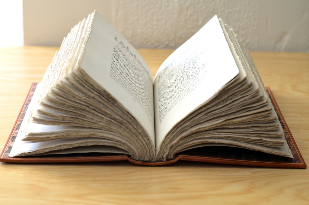


134Jan7Smith
>135 Django6924: I used an index card with very good results and as you said it added a bit of pleasure. I think I can accomplish this now with a degree of confidence.
135Django6924
>134 Jan7Smith: "Another question is why are books sold with uncut pages?"
Good question. I believe the reasons for this are a complex mixture of historical fact and snobbishness. In the 18th century, and for some time into the 19th, book printers only printed, on large sheets of paper which had several pages on each side. These large sheets were folded, perhaps several times so that inside the various folds were the pages of the book. These folded sheets were then sewn into signatures and the signatures assembled and bound with a temporary paper or cloth binding. This is because Bookbinding was usually a separate trade, and it was the bookbinder's job to "case bind" the book in hard covers with cloth, paper, or leather covering (or usually a combination of these materials) over the stiff cardboard. At this point, the uncut edges of the book block (sewn signatures) were trimmed. I think what happened was that over time, the uncut pages became a kind of selling point, by showing that the book had not been previously owned (or at least read). Of course many of the productions of the LEC were printed by one company and bound by another, but only a few of these went to subscribers with the pages untrimmed by the binder.
It always amuses me when I get a book with uncut pages--or only a few cut. After acquiring my George Harrap limited edition of Tristram Shandy many years ago, I was reading it avidly when I discovered that after Chapter 2.III., none of the rest of the signatures had the pages cut! (The Latin text of excommunication must have been too much for the previous owner.)
136Jan7Smith
>137 featherwate: I can always get the factual information I desire from Robert. Thank to all who provided the help and encouragement to get my pages cut. A great group of book lovers.
137featherwate
>137 featherwate:
>138 Django6924:
The Posner Center at Carnegie Mellon University houses rare and historic books and art collected by Mr. and Mrs. Henry Posner Sr. The books include some LEC publications, of which about 50 have been coverted for on-line searching. They are a random selection, the earliest being the 1929 Munchausen and the latest - other than the 1962 Around the World in 80 Days - a handful from 1951/2. To find them you need to enter Limited Editions Club in the author search box.
The images are of good quality and include illustrations, but where the books came with uncut pages, the center librarians have digitised only those that Mr and Mrs Posner did cut. What they didn't read remains out of sight!
Which is frustrating, but I am sure is procedurally correct behavior on the part of those in charge of archived material.
138Django6924
>139 BuzzBuzzard:
Thanks for this link, Jack. So the Posners did not read all their LECs either. I wonder if they, after the fashion of the previous owner of my Tristram Shandy, got to a point in the book and concluded ars longa, vita breves.
Thanks for this link, Jack. So the Posners did not read all their LECs either. I wonder if they, after the fashion of the previous owner of my Tristram Shandy, got to a point in the book and concluded ars longa, vita breves.
139BuzzBuzzard
I just realized that Macy published The Return of the Native (HP) in 1942 and the next and last Hardy produced under his watch was the 1956 Tess (LEC). Kind of strange don't you think? It is not like he used Agnes Miller Parker much in between, who was practically to become the go to artist for the LEC Hardy novels. But I would think that LEC subscribers would have demanded some Hardy much, much earlier than 1956.
140Django6924
>141 BuzzBuzzard: "I would think that LEC subscribers would have demanded some Hardy much, much earlier than 1956"
Well, not everyone is a Hardy fan....
As for Ms. Parker, she had already contributed to the LEC (Elegy Written in a Country Churchyard and Richard II for the 37-volume Shakespeare), as well as finishing up The Faerie Queen, so she was really not ignored. I wonder if there is any significance in the fact that her busiest period with the Macy companies happened after she moved from London in 1955.
141BuzzBuzzard
>142 Edmund_Fitzgerald: "Well, not everyone is a Hardy fan...." Even more so nowadays.
I discovered Hardy with The Mayor of Casterbridge when a post by Don sparked my interest. Then read Jude the Obscure, which I found wonderful and doubt that Hardy can top it. Recently have been looking into acquiring a couple of early HP books and The Return of The Native was on the list. The one with the brown cover and pictorial endpapers (number 12E). It is on its way and I am sure it is nice even without seeing it live. The plan is to eventually read all Hardy novels published by HP/LEC.
I discovered Hardy with The Mayor of Casterbridge when a post by Don sparked my interest. Then read Jude the Obscure, which I found wonderful and doubt that Hardy can top it. Recently have been looking into acquiring a couple of early HP books and The Return of The Native was on the list. The one with the brown cover and pictorial endpapers (number 12E). It is on its way and I am sure it is nice even without seeing it live. The plan is to eventually read all Hardy novels published by HP/LEC.
142Edmund_Fitzgerald
> 143 BuzzBuzzard: Have you read Tess of the D'urbervilles? That was my favorite!
143BuzzBuzzard
>144 featherwate: Just MoC and Jude. I am sure I will get to Tess at some point. Here is an interesting (I think) article about Agnes Miller Parker and the Hardy Novels . The reviewer is decidedly more favorable to her later work.
144featherwate
>145 Django6924:
Clare Leighton, too, illustrated The Return of the Native. This was for a limited run of 1500 copies issued by Harper & Brothers in 1929. The paper is whiter than that of the HP edition and of a similar quality; the binding, however, is inferior. The Harper type is the larger of the two, set with very wide margins, but lacks the HP's sharpness and consistency: the last line on several pages is over-inked. This is particularly noticeable at the end of a chapter, where the text is followed by a small tailpiece (similar vignettes appear as headpieces). It might. of course, be a fault only found in my copy!
The Harper volume is larger than the HP, which should mean that the Leighton's hors-texte illustrations have more impact than those of Parker. But in practice, it's Parker's that prevail. This is because her pictures flow across most of the space on their pages, whereas Leighton's are trimmed down to 6” by 4”, reproduced on a lightweight coated paper and tipped in to the book thus:

This may have been her decision rather than her publisher's: her illustrations for an edition of The Bridge of San Luis Rey, also issued in 1929, are reproduced in a similar way but for a different publisher, Longman's.
Parker's illustrations are, as they often are, more stylized than realistic. This gives her figures an epic quality, so that they are not overshadowed by the great, brooding heathland that is the story's setting (wonderfully described in the opening chapter).
Leighton's people are on a domestic scale: at home if not always at ease in the landscape that controls their lives. I think both approaches do justice to the story.
I hope you like the book!
145Django6924
>147 featherwate:
Jack, I actually prefer Clare Leighton's work for this novel to Ms. Parker's, although I would not say AMP's work is inferior. As you point out, she has gone for a stylized approach which is an equally valid one, but I find Ms. Leighton's empathetic approach keeps me more emotionally involved.
Incidentally, there is one of those peculiar little quirks about this book which make collecting HP both fascinating and frustrating: in Michael Bussacco's Sandglass Companion, the Sandglass 12:E identifies the printer as Quinn and Boden, in Rahway, New Jersey. However my copy has "Printed in the Netherlands" on the copyright page, but the reference to the printer in Sandglass 5LX has been deleted.
146BuzzBuzzard
>146 BuzzBuzzard: I am aware of this edition but although it is limited it does not impress me as a fine press. Cannot be sure if the woodcuts are printed from the block. If I had to guess I would say no. In fact I cannot find a single fine press book with her work, which is a shame. One interesting edition illustrated with 29 woodcuts by C.L is the 1952 The Book of Psalms The Book of Proverbs The book of Ecclesiastes issued by Doubleday. In fairness woodcuts in early HPs like Crime and Punishment and Gulliver's are also not printed from the block but the quality of the reproduction is amazing. The overall quality and materials used for these books are unrivaled especially considering their price point.
147featherwate
>147 featherwate:
Robert, 12:E was indeed the Sandglass for the first edition, which was issued in May 1942 and is one of the few HP books which has a colophon:

There is Return of the Native correspondence in the Ransom Center which is dated 1946-47 and is with J. Brandt & Zoon, a long established Netherlands printer/publishers of bibles and other religious works (making them a somewhat unlikely choice for a Thomas Hardy novel). I suggest this post-war printing is the one most likely to relate to Sandglass 5LX.
(I too prefer Clare Leighton's illustrations. The head and tailpiece vignettes are a delight. She had a knack for identifying with rural landscapes and their inhabitants, whether in England or America. She also illustrated Hardy's Under the Greenwood Tree, one of his least intimidating novels. You can safely pick it up in the knowledge that it's not going to be a case of there being bad times just around the corner (to misquote the title of Noel Coward's famous 1952 ode to gloom, which sometimes sounds like Hardy at his most Hardyesque:
Hurray, hurray, hurray!
Misery's here to stay.
There are bad times just around the corner,
There are dark clouds hurtling through the sky
And it's no good whining
About a silver lining
For we know from experience that they won't roll by.)
148Django6924
>149 featherwate:
Jack, thanks again, for the information, the colophon, and especially for the lines from Noël Coward--a longtime favorite composer whose work seems to be sadly forgotten here in the US, even among superannuated music fans such as myself.
(Don't you think Hardy--or at least Jude the Obscure--would appreciate "Why Must the Show Go On?")
149featherwate
>148 Django6924:
Vasily, the title page of the Native states that the illustrations are 'from woodcuts'. For her Bridge of San Luis Rey, the wording is 'Woodcuts by Clare Leighton'. For the Random House Wuthering Heights it's 'Illustrated with twelve wood engravings". I don't know if any of those terms give us a clue to the reproduction techniques involved - perhaps Robert does?
I agree that her Native is certainly no fine press edition, and as far as I know she never did work within the fine press movement (one of her obituaries observed that she was almost the only - perhaps the only - twentieth century engraver of her caliber of whom this could be said). This may explain why she apparently turned down Macy's invitation to contribute to the LEC Shakespeare - she was one of the first artists he approached.
She clearly was not too happy with what one might think of as elitist publishing, and wanted her work to reach as many people as possible. She had a strong social conscience. Her first act on leaving the Slade School of Art was to teach art to poor children at a London County Council School; her adoption of the USA as a home (and its reciprocal adoption of her) suggest she had no liking for a caste-ridden society like that of England, as you would expect of someone of Cornish, Irish and Scottish descent - she was a true Celt.
She was also a deeply religious Christian from childhood (as was LEC illustrator Boyd Hanna) and after spending most of her career in the intimate, black-and-white craft of wood engraving she turned with great success to working in glass - and colour! - firstly creating stained glass windows for several American churches, among them thirty-three windows for a new cathedral, two of them fifty feet high — and later became a competent mosaicist.
Definitely a regrettably empty stall in the LEC's stable of artists....
150featherwate
>148 Django6924:
A wickedly accomplished man, Coward, who has súrvived as a playwright. He still has a West End theatre named after him - though not dedicated to his work - but for the previous 30 years it was named after someone else and no doubt history will repeat itself. Perhaps the songs have fared less well because no-one could sing them the way he did (and the brilliant Mad Dogs and Englishmen is probably considered offensive in our post-colonial world). But he is a minor cinematic immortal, not for his own films, but as the master criminal in The Italian Job.
Ah, "Why Must the Show Go On?"! - the most devastating 'tribute' ever to the self-regard of actors! And what a rhymester
'Hats off to Show Folks
For smiling when they're blue
But more comme-il-faut folks
Are sick of smiling through..'
or
'Let's hope we have no worse to plague us
Than two shows a night at Las Vegas.'
Jude might have appreciated it but I'm not sure about Hardy. After the death of his first wife he did rather relish 'the throes/Of personal grief and private woes.'. On the other hand, he was always deeply upset by the death of any of his dogs and might well have 'locked himself in the john' and wondered whether, really,'the show must go on'. (One such dog was a bitch called - I kiddle you not - KiddleyWinkemPoops. Fortunately TH and his wife had renamed it Trot shortly before it died. Fortunately because the Hardys buried their pets in a cemetery and erected gravestones over them. A slight slip of the mason's chisel might have bestowed an eternal reputation for faecal incontinence on poor KiddleyWinkem Poops...)
151Edmund_Fitzgerald
>145 Django6924: Django6924: That's really interesting. I was surprised to see how much smaller the LEC Hardy novels are compared to their usual offerings. The article seems to suggest that it was intended to reflect British tastes in bookbinding. Is binding large books a more American style?
152Django6924
>153 Drfreddy94:
If you look at the first few years of the LEC, the book size varies rather dramatically, but the Club's members, as shown in the Reader's Polls at the end of each series, seemed to prefer large books, especially the 2-volume books such as Pickwick Papers, Vanity Fair and the other books printed by the Oxford University Press. The reasons for this may have to do with the age of the majority of the members (large fonts with generous leading being easier on the eyes, as I will attest), but probably more to do with the idea that they were getting their money's worth when they received a book such as The Canterbury Tales in two folio-sized volumes than when they received a slim Snow-Bound. To offset the OUPs weighty tomes, W.A. Dwiggins issued, during the same period, multi-volume works such as Gargantua and Pantagruel Plutarch's Lives and Droll Stories in small octavos.
Many of the larger books printed by the LEC had their size dictated, of course, by the size of the illustrations. I think this explains works such as Gay's The Beggar's Opera, which is rather larger in scale than one might think the work should require, but had to be scaled to match the size of Mariette Lydis' wonderful illustrations and was printed in France by the publisher G. Govone (who was Lydis' husband ). Actually, many examples of fine press production in France are even larger than the works of the LEC, and again, I think this is due to the fact that truly fine press books utilize illustrations pulled directly from the artist's medium, and eschew photomechanical reproduction.
I think after the war, the books of the Club tended to larger volumes and fewer multi-volume sets, and this is probably due to reasons of economy.
153Drfreddy94
Does anyone have the ML of the origin of species LEC?
154featherwate
An aside on size: The Junior Heritage edition of the Fritz Eichenberg Gulliver's Travels is larger than the corresponding Heritage Press edition: 17.5cm x 26cm as against 16cm x 24cm. I don't know if this is true for other JH books converted from HP originals.
(It's a handsomely produced book, with a decorated slipcase but it is edited for a younger audience, although not as much as one might expect - no frolicking on gigantic nipples, or urine-based fire-fighting, but equally no toning down the description of an unfortunate malefactor's decapitation, with his head bouncing up from the floor and his veins and arteries spurting so high and profusely as to dwarf the great Versailles fountain.
And its paper does not, of course, match the wonderful LEC-standard Worthy Paper Co stock used for the HP edition!)
155Jan7Smith
I think I would like to get the Les Miserables (LEC). I haven't seen any of the experts' opinions concerning the quality of the paper, Etc. I would appreciate any info anyone can provide.
157Jan7Smith
>157 Jan7Smith: Thanks, that is a big help. I thought someone had posted something but could not find it. I am now undecided as to the LEC or the Folio edition.
158Django6924
>157 Jan7Smith:
It's not the the most luxurious paper ever used in an LEC, but is a fine quality thin rag paper from the ubiquitous Worthy Paper Company, with a subtle "tooth." It is a "laid" paper, but the chains are virtually invisible. It feels good to the fingers and turns the page easily. Better than virtually any paper you find today in books which mostly used smooth-finish alpha cellulose.
It's not the the most luxurious paper ever used in an LEC, but is a fine quality thin rag paper from the ubiquitous Worthy Paper Company, with a subtle "tooth." It is a "laid" paper, but the chains are virtually invisible. It feels good to the fingers and turns the page easily. Better than virtually any paper you find today in books which mostly used smooth-finish alpha cellulose.
159Jan7Smith
>160 Jan7Smith: The quality of the paper is always a big factor to me and your information will probably make me go for the LEC rather than the Folio. I usually have a more satisfying feeling with Macy books in my hand. Thanks, Robert!
161katy1584
Hi all, I’m a relative LEC newbie who started collecting sporadically about five years ago. For the sake of my sanity and wallet, I force myself to resist looking on Ebay for months at a time; then I’ll binge on three or four books in one sitting. So far, I’m up to 35 books.
I’ve spent the last 24 hours obsessing over this forum and sorting out the politics of glassine and slipcases and many other topics I’ve also puzzled over in the past. This seems to be a wonderful and knowledgeable group and I only wish I’d stumbled on it sooner!
My big question du jour concerns The Flowering of New England. Yesterday I accidentally ordered a second copy of the book (time to start keeping an inventory list), but the silver lining is that this particular copy appears to include the author’s (Van Wycke Brooks) signature on one of the title pages. The copy I already own does not have his signature, only the illustrator’s. I would assume this is an anomaly, but there’s another copy on Etsy that also includes Brooks’ signature on the title page. Does anyone else own a copy like this?
162kdweber
>163 katy1584: Bill Majure's checklist states that the book is signed by Raymond Holden (the illustrator) but some copies are also signed by the author. Congrats on your purchase, obviously it's time to sell the illustrator only edition.
I use LT to catalog my books and a spreadsheet to note books on my wishlist and books on order so that I no longer buy the same book twice (at least not by accident).
I use LT to catalog my books and a spreadsheet to note books on my wishlist and books on order so that I no longer buy the same book twice (at least not by accident).
163katy1584
Great advice, kdweber...looking forward to cataloging my collection on this site. And thank you for solving the mystery of the signatures on The Flowering of New England. Happy New Year!!
164Django6924
>163 katy1584:
Katy, as Ken pointed out, sometimes living authors were available to sign copies, and this was offered to the subscribers--usually for a small fee--though it seems this option was not often exercised by subscribers. This, my copy of The Martian Chronicles contain ay Bradbury's signature on the colophon with the illustrator's signature, but also on the title page.
I need to get back to cataloguing my collection on LT, which I made a great start on several years ago, but haven't found he time to bring it up to date. In addition to the reason Ken brought up, I want my cataloged for insurance purposes.
165SteveJohnson
Of course, you have to keep updating it! LT has a great app for your phone that lets you quickly check while at your neighborhood bookstore to see if you already own something, but if you have not kept it up to date you may still buy something a second time, which of course I did recently. I SWEAR this week I will check to be sure everything is on LT...
166SteveJohnson
I keep fantasizing about making it into the top 5,000 libraries list, which would require me to list 2,718 books. I think I probably have that many but it takes so long to list them all. And then I would have to keep adding more to retain my position, or dream of buying even more books to move up, which might not be good for my checkbook and mental health.
167katy1584
SteveJohnson, good to know I’m not the only one who has accidentally purchased a redundant copy of something! It seems there is some confusion between books I’ve considered purchasing and those I actually have purchased. Cataloguing all of them is a daunting prospect, but just might be worth the effort!
168Drfreddy94
Does anybody here own the origin of species LEC?
Can someone throw some light on it?
Can someone throw some light on it?
170parchmenths
>170 parchmenths: It is a beautiful wellprinted book with nice wood engravings, with the spine in black leather and wood veneer to the sides. It was not signed by Landacre. Recommended.
>171 Django6924: I haven't seen any current prices, but I would say that if you can find a Fine copy for anywhere around 150 dollars, it is not overpriced.
>171 Django6924: I haven't seen any current prices, but I would say that if you can find a Fine copy for anywhere around 150 dollars, it is not overpriced.
171Django6924
>170 parchmenths:
I can only echo the comments of >172 Drfreddy94:--in my opinion, Paul Landacre and Lynd Ward were America's two finest exponents of wood engraving for illustrations, and Landacre's wood engravings sell for steep prices in the galleries here in Southern California. I think the novelty of the wood veneer boards and wallaby hide quarter binding is the major factor in the high price.
I can only echo the comments of >172 Drfreddy94:--in my opinion, Paul Landacre and Lynd Ward were America's two finest exponents of wood engraving for illustrations, and Landacre's wood engravings sell for steep prices in the galleries here in Southern California. I think the novelty of the wood veneer boards and wallaby hide quarter binding is the major factor in the high price.
172Drfreddy94
OK.
thank you.
might end up buying it.
thank you.
might end up buying it.
173SteveJohnson
This is a question I have meant to ask for some time... We know that the LECs were limited editions with a press run of between 1,000 and 2,000 books.
But does anyone have any idea how many copies of HP editions were printed, even a ballpark estimate? I assume it would vary depending on Macy's guesstimate as to potential sales. And then he could do second and third printings of the same edition, no? But it would be nice to have some idea how many of the books are out there...
But does anyone have any idea how many copies of HP editions were printed, even a ballpark estimate? I assume it would vary depending on Macy's guesstimate as to potential sales. And then he could do second and third printings of the same edition, no? But it would be nice to have some idea how many of the books are out there...
174BuzzBuzzard
The only Heritage Press book that I have seen indicating number of copies printed by year is Wind In The Williows. I have the 1962 Illustrated Bookshelf edition and between 1944 and 1962 almost 200,000 (!) have been printed. But I am sure this was anomaly. The book with Rackham illustations was such a sensation.
175Django6924
>175 Django6924:
In an article called "A Heritage Press Retrospective" Michael Bussacco--THE expert on the Press and the Heritage Club--wrote:
"By 1942, membership exceeded 9,200, and three of its selections, Lust for Life, Song of Songs, and Mother Goose, had each sold more than 20,000 copies in a single year. "
In an article called "A Heritage Press Retrospective" Michael Bussacco--THE expert on the Press and the Heritage Club--wrote:
"By 1942, membership exceeded 9,200, and three of its selections, Lust for Life, Song of Songs, and Mother Goose, had each sold more than 20,000 copies in a single year. "
176BuzzBuzzard
Interesting to see that the 1933 "Russian" LEC Anna Karenina was reprinted in Russian, reusing Piskarev illustrations and LEC design but in a single volume. The year was 1978 and it was limited to 250,000.
The following is from the ad description using Google translate:
The design of Leo Tolstoy's novel Anna Karenina was performed at the suggestion of the Club of Rare Editions in New York (1930-32). Each of the eight parts of the novel is equipped with a shmutztul (not sure what this is), a headband, and accent decorations. As the almanac "One hundred memorable dates" writes: "All the elements of the design are carefully thought out, carefully included in the fabric of the narrative. The number of illustrations (19) limited by the terms of the contract contributed to the fact that the artist stopped on the lyrical side of the work (the line of Levin and Kitty) and almost completely abandoned the dramatic episodes. The technique chosen for illustrations (color woodcut, up to three boards), extremely rare and complex, could not be more in line with the general intonation of the publication. N. Piskarev plunges the reader into the atmosphere of a melancholic Russian nature.
https://www.ebay.com/itm/1978-Russian-USSR-Soviet-book-Anna-Karenina-Leo-Tolstoy...
177featherwate
>176 BuzzBuzzard:
a shmutztul (not sure what this is)
The original in the ad is шмуцтитулом. If you hyphenate it шмуц-титулом it translates as "half-title", which is defined as "Normally in a hardback book, the first printed page, containing only the title of the book......... Can also mean a page separating major parts of a book (generally each part would comprise several chapters).
178parchmenths
>179 featherwate: "Schmutstitulom" in Russian and "smutstitel", which is the correct term in Swedish for half-title would translate "dirt-title". I guess that readers wiped the dirt off their fingers on the dirt title page before proceeding to read the book - just to annoy Richard de Bury et al.
179featherwate
>180 kdweber:
Ah, thanks for the elucidation. I did see dirt-title as an alternative on GoogleTranslate (another was 'short-wave') but couldn't make sense of it - I even wondered if it meant a dust jacket, but of course individual parts of a book, however substantial they may be, would not have their own jackets.
Ah, thanks for the elucidation. I did see dirt-title as an alternative on GoogleTranslate (another was 'short-wave') but couldn't make sense of it - I even wondered if it meant a dust jacket, but of course individual parts of a book, however substantial they may be, would not have their own jackets.
180kdweber
10 of the 11 editions that the Officina Bodoni printed for the LEC were signed by Hans (Giovanni) Mardersteig. Does anyone know why the 4th endeavor The Life of Benvenuto Cellini published in 1937 was not signed by the printer?
181Django6924
>182 kdweber:
Perhaps a slight disagreement between Mardersteig and Macy? In the Monthly Letter for Cellini, it appears that Mardersteig had originally planned the book as a 2-volume affair, and that was how it was announced by Macy in the Prospectus. When the book appeared as a large, single volume printed in double columns, one senses that Macy was not altogether pleased although there was the usual fulsome praise in the ML. Later, in Ten Years and William Shakespeare, Macy was a little more candid with his opinion that the book missed on some levels, without directly criticizing the printer. Macy's disagreement with Edwin Grabhorn in 1929 over Treasure Island meant that no other Macy publications would be printed by the Grabhorns. Now it may just be because of WWII, but between the Cellini in 1936 to 1952's I promessi sposi, there were no more LECs printed by Mardersteig.
Incidentally, Ken, is your copy of The Little Flowers of St. Francis signed by Mardersteig? Mine only has Molnar's.
182kdweber
>183 laotzu225: You're correct, only Molnar's signature on the St. Francis. I've updated my LT entry.
183laotzu225
This question may have been addressed somewhere in the past. But I have looked without success. I have also looked in Carol Grossman's book and did not find an explanation.
It is well known that Arthur Rackham, as his last work, illustrated the LEC The Wind in the Willows and died before he could sign the book. The LEC has sixteen color illustrations. The Heritage Press version has only 12, although I've read that it may contain some additional line drawings.
The Easton Press publication I have appears to be based on the Heritage version; it is probably from their 100 Greatest Books series. I will say the reproductions of the color illustrations are awful, looking quite faded. I've seen one of the pictures in the LEC Quarto-Millenary and the difference is striking. Even the photos of some eBay offerings are sharper. There apparently was a fine press 1950 British edition-by Methuen, probably through some arrangement with Macy and Scribners) which also only has 12.
It appears two of the missing pictures are a hilariously charming one facing the title page showing Toad trying to disguise himself as an old woman and one of Pan, which is quite lovely, based on eBay photos.
Unfortunately this particular LEC seems to be among the costlier available for one in reasonable condition.
-Does anyone know why these missing four were never reproduced?
-Has anyone else published a fine edition with all 16? Or even a suite of the paintings?
Thank you.
184BuzzBuzzard
>185 Drfreddy94: You are correct that this topic was touched upon recently. As far as I remember no one had answered your questions.
This being said I just came across this on the internet:
In response to his burgeoning fame, Rackham's publisher, William Heinemann, began producing deluxe and trade editions of his illustrated works, the first being Rip Van Winkle in 1905. Deluxe editions were produced in a limited edition of numbered copies (ranging in quantity from 250 - 2,020), bound in vellum bindings, printed on handmade paper, and signed by the illustrator. The trade editions were published concurrently in simple bindings, on thinner paper, and with fewer color plates. This publication strategy benefited both publisher and artist;
185Drfreddy94
Does anyone have a copy of the 1940 Decameron?
I wanted to know if it is worth the asking price of 200-300 dollars.
I wanted to know if it is worth the asking price of 200-300 dollars.
186Django6924
>187 Drfreddy94:
I paid $125 for my edition and think that's a reasonable price for one in Fine condition. The binding is quite nice in a deliberately traditional style, the paper and printing are excellent (although I don't care much for double columns in general), Fritz Kredel's little woodcut vignettes are charming, but not exemplary--I much prefer Rockwell Kent's uncharacteristically earthy illustrations for this work.
Still, the question for a prospective buyer is the translation: the 1940 edition used the anonymous translation by a contemporary of Shakespeare, complete with erratic punctuation (often meaning none) and orthography: such as "Magitians," (Magicians). When I read, I hear the sound of the words and have no problem with the sense, but passages such as the following may slow some readers down:
After many other, as wise and wholesome perswasions, which he constantly credited, because they spake them, they reconciled him to his wife, and she to him; but not without some difficulty in him; who falling into wonderfull greefe and melancholy, for losse of such an admirable precious stone, was in danger to have dyed, within lesse than a month after.
The high price is undoubtedly due to the fact it was outside of the Club's regular subscription series, only printed on order, and thus limited to just 530 copies.
187Drfreddy94
Thanks
188kermaier
>97 SteveJohnson:
Banknote paper? My copy of the HP Gulliver has very interesting paper, with multi-colored fibers scattered through it, but I'm curious what that has to do with printed currency.
Banknote paper? My copy of the HP Gulliver has very interesting paper, with multi-colored fibers scattered through it, but I'm curious what that has to do with printed currency.
189kermaier
>125 Django6924:
The Grabhorn press printed The Scarlet Letter for publication by Random House, in a limited edition of 980 copies. (Same arrangement for The Red Badge of Courage, also illustrated by Valenti Angelo.) I have both books, and I can confirm that Angelo's work is more in the line of chapter-head ornamentation, rather than detailed illustration of specific scenes and characters. Aside from that, the paper and printing are both superb, and well worth acquiring if your main interest lies there, rather than in the artwork.
The Grabhorn press printed The Scarlet Letter for publication by Random House, in a limited edition of 980 copies. (Same arrangement for The Red Badge of Courage, also illustrated by Valenti Angelo.) I have both books, and I can confirm that Angelo's work is more in the line of chapter-head ornamentation, rather than detailed illustration of specific scenes and characters. Aside from that, the paper and printing are both superb, and well worth acquiring if your main interest lies there, rather than in the artwork.
190wcarter
>190 wcarter:
Banknote paper often has different coloured fibres, in specific ratios, embedded in it to help prevent forgery.
Banknote paper often has different coloured fibres, in specific ratios, embedded in it to help prevent forgery.
191kermaier
>190 wcarter:
Ah, ok -- thanks! It's definitely nice paper, and I prefer Eichenberg's illustrations in the HP edition to King's more cartoonish ones in the LEC, which have a disturbingly Fritz-the-Cat air about them.
Ah, ok -- thanks! It's definitely nice paper, and I prefer Eichenberg's illustrations in the HP edition to King's more cartoonish ones in the LEC, which have a disturbingly Fritz-the-Cat air about them.
192rakkie
>175 Django6924:
The combined Tom Sawyer / Huckleberry Finn (Heritage Illustrated Bookshelf) has some printing numbers listed on the copyright page:
PRINTING HISTORY
October 1936: 10,000 copies of Tom Sawyer
September 1940: 10,000 copies of Huckleberry Finn, 7,500 copies of Tom Sawyer
October 1943: 15,000 copies of both volumes
July 1944: 10,000 copies of both volumes
May 1945: 10,000 copies of both volumes
November 1945: 10,000 copies of both volumes
March 1946: 35,000 copies of both volumes
August 1947: 13,000 copies of both volumes
October 1952: 10,000 copies, single-volume edition
I believe there were plenty of reprints after this as well.
193Airygold
I got a copy of LEC Battle of Waterloo and found that the pages are "uncut". Well not in the traditional way uncut, in that there is nothing printed on inside part of the uncut pages. so you can read the whole book. Is my copy a printing error? Or was this a play on Hugo's upside down perspective on the war!
Can somebody please check their copy of Waterloo LEC and let me know if all were made this way?
Can somebody please check their copy of Waterloo LEC and let me know if all were made this way?
194Jan7Smith
>195 featherwate: My copy is the same as yours. I did not see anything in the ML to explain why it was printed that way.
195featherwate
>193 Airygold:
>194 Jan7Smith:
Isn't that called a French fold, which is what in fact happened at Waterloo?
>194 Jan7Smith:
Isn't that called a French fold, which is what in fact happened at Waterloo?
196Airygold
>197 wcarter: featherwate, That is too funny!
197wcarter
>195 featherwate:
I have several books printed in the French fold method, which prevents print show-through, and saves the effort of printing the right page on the back of each page. More common in 19th.C books. Do NOT cut the pages.
I have several books printed in the French fold method, which prevents print show-through, and saves the effort of printing the right page on the back of each page. More common in 19th.C books. Do NOT cut the pages.
198Django6924
>197 wcarter:
Brilliant! It ranks with Wellington's famous remark when, after being introduced to French generals as the British ambassador to Paris, and they turned their backs to him: "I've seen their backs before."
Brilliant! It ranks with Wellington's famous remark when, after being introduced to French generals as the British ambassador to Paris, and they turned their backs to him: "I've seen their backs before."
199featherwate
>200 SteveJohnson:
I hadn't heard that one before! A man who could wield words as deftly as he wielded a sword.
I hadn't heard that one before! A man who could wield words as deftly as he wielded a sword.
200SteveJohnson
I have been going through all of my HP Sandglasses, and just noticed that the one for The Life fo Samuel Johnson has a code of "S28", which is unlike any other I've seen. The 28 apparently refers to the series -- Michael Bussacco says it was published in 1963-1964, which would be the 28th series. But didn't the HP generally just use Roman numerals, so this would be XV:28 (assuming it is the 15th book of the series)? Any others use the "S" designation?
201NYCFaddict
Does it mean Special?
203jveezer
Remind me again if there was a general cutoff where LEC went from letterpress to offset? Specifically, I'm wondering if the 1961 The Story of an African Farm is letterpress. I can't tell from the Monthly Letter or from the book itself...
204Django6924
The first LEC to announce that it was printed entirely in offset was the 1979 The Lyrical Poems of François Villon. Some previous LECs had the illustrations produced via offset lithography, and the Middle English text for Sir Gawain and the Green Knight and, I think, some of the LEC editions such as The Argonautica which printed the Greek text en face had to use offset because the desired font size wasn't available. From the Villon ML:
Most of the Club's books are printed letterpress from metal type....Occasionally the designer of one of our publications wishes to use a typeface that doesn't't exist in the appropriate size. We may then have the pages set in the size that is available, photographed in the desired proportions, and printed by offset lithography from flat plates.
The Villon ML goes on to tell how offset improved when it was possible to directly design the type layout photographically (Photocompostion) without the intermediate step of printing letterpress and then photographing it and reducing or enlarging it to make the lithographic plates--anyone familiar with photographic reproduction knows that intermediate step creates an inferior product due to generation loss and other factors involving lens aberrations, vignetting, etc.
To my knowledge, offset lithography for printing text was never used used by George Macy while he was in control of the Club. All of my Macy-era LECs used either handset, Monotype or linotype letterpress printing.
205BuzzBuzzard
Looks like Ten Years and William Shakespeare 1940 comes in three different binding formats - paper, cloth and leather. Is this so or am I reading the online information wrong?
206featherwate
>205 BuzzBuzzard:
No, I think you're right: Great and Good Books describes the binding as full calf; my copy is bound in a smooth black cloth. In addition, there are several copies for sale in 'paper-covered boards', the paper being the colour of expectorated tobacco juice. I'm assuming the paper is stuck to the boards and not a separate wrapper, although Oak Knoll refer to the book (or booklet in their terminology) as being first issued in leather and later as having a dust jacket - which could I suppose have covered the black cloth edition.
No, I think you're right: Great and Good Books describes the binding as full calf; my copy is bound in a smooth black cloth. In addition, there are several copies for sale in 'paper-covered boards', the paper being the colour of expectorated tobacco juice. I'm assuming the paper is stuck to the boards and not a separate wrapper, although Oak Knoll refer to the book (or booklet in their terminology) as being first issued in leather and later as having a dust jacket - which could I suppose have covered the black cloth edition.
207Django6924
>205 BuzzBuzzard:
I wasn't aware of different binding materials, however this may be the case as I have seen 2 different colors of the cloth binding (mine is black).
I wasn't aware of different binding materials, however this may be the case as I have seen 2 different colors of the cloth binding (mine is black).
208SteveJohnson
Mine is leather
209Jan7Smith
I remember someone mentioning making labels for HP slipcovers so the book spines could be turned to the back. I would love to do this and would appreciate details on accomplishing it with a quality look. I guess the labels would have to be a simple sameness to make huge numbers of labels not too complicated.
210Django6924
>209 Jan7Smith:
Jan, this is a project I have contemplated for some time. It will probably have to wait until I have a period of at least 2 weeks without having work or home chores interfere as it involves more concentration on my part to accomplish, given the number of titles I have to make.
I think the best method is to photograph the spine labels of the books themselves with a macro lens and use those as the basis for the slipcase labels, so there is a stylistic match to the books. This stylistic match seems to be most often the case with the slipcase labels of LECs. This would also make it easier to achieve the correct size and proportion. The photographs would then be combined in Affinity or Photoshop (or similar image editing program) into collages which, when printed on the normal 8.5" x 11" sized paper, would result in a sheet with multiple labels which would need to be cut out and fixed on the slipcases.
In addition to planning the layout of these collages, the most complicated part of this procedure would be finding the right paper to use and the paste-on procedure. I need to see if there is an archival-quality printing paper with adhesive and a peel-off backing, somewhat like the Avery labels. This would greatly simplify the task. Otherwise it would require the tedious work of using spray-mount adhesive
211Jan7Smith
>210 Django6924: Robert, I have 200 HP books and this would most likely be a huge task to complete. The Avery type labels would certainly simplify attaching the labels. Hopefully, archival labels can be found. Maybe others have done this and can share their solutions to this task.
I would be curious to know the number of HP editions others in our group have accumulated.
Thanks for your thoughtful response as usual.
I would be curious to know the number of HP editions others in our group have accumulated.
Thanks for your thoughtful response as usual.
212kdweber
>211 Jan7Smith: I only have 50 HP titles but I'd love to make labels for these volumes plus the two dozen LEC slipcases I've made or replaced, not to mention my 400 slipcased Folio Society editions.
213Jan7Smith
>212 kdweber: Ken, you have an enormous job ahead if you create labels for all slipcases you listed. Do you have ideas for creating the labels?
214SteveJohnson
I have about 250 HPs and I've had the same idea as Django - photograph the spine and then print out the photo and attach it to the slipcase, but I have no clue about the proper paper or adhesive. If several of us are interested, perhaps we could split up the tasks. I enjoy playing with Photoshop, and would be happy to deal with cropping the photos and pasting them on a page and posting it to Google Documents if someone else took photos and sent them my way. Seems like we'd want to keep the final result in alphabetical order, either by title or author (I recommend author because variants in the title can drive you crazy, c.f. our recent discussion of "Strange Case of Dr Jekyll and Mr Hyde".
One other thought - given that many of us have both HPs and LECs, we might consider adding the word "Heritage" to the label just to tell them apart from the LECs.
Wonder if the folks at Talas would have some ideas about archival-quality peel-off labels?
Sooooo... who is interested in contributing in some form or fashion?
215SteveJohnson
Do you have any advice on making slipcases? I'm willing to try, but it seems relatively daunting. Where do you buy the boards? Is there a template for how to cut them (adjusting for size, I know)? And what about covering them with paper? Any tips?
216kdweber
>215 SteveJohnson: There are a number of tutorials on Youtube on how to make a slipcase. Make sure all your supplies are acid free. I buy my supplies from Talas in NY. They sell acid free cardboard of varying thickness, bookcloth, and velour (to line your slipcase) as well as Jade PVS adhesive. I've made over two dozen slipcases and it's a lot easier than one may think. If you're making more than a dozen slipcases, the cost falls to about $15 each using premium materials.
217Django6924
>214 SteveJohnson:
I'd be happy to take the photos, but as I mentioned, I don't have as much time to work on it at the present. I also don't have as many HP books as I once did since I was replacing most of the non-exclusive HPs with the LEC versions, but I will try to make a list of what I have over the next week or so, and if members would tell me which labels would be desired, I have a few days off in June and could take the pictures then.
I'd be happy to take the photos, but as I mentioned, I don't have as much time to work on it at the present. I also don't have as many HP books as I once did since I was replacing most of the non-exclusive HPs with the LEC versions, but I will try to make a list of what I have over the next week or so, and if members would tell me which labels would be desired, I have a few days off in June and could take the pictures then.
218Jan7Smith
>210 Django6924: I guess I will be looking for a macro lens to take suitable photos for spine labels. I have always wanted one so maybe now is the time!
219jveezer
What are the thoughts on the LEC Two Years Before The Mast? Is there also a HP edition? I just picked up a copy of the 1936 Random House edition printed by the Grabhorns. The paper is superb as is the presswork. Couldn't resist picking up this nautical gem while visiting a sailing town in my heartland (Annapolis MD) whose author is the namesake of the next town over from my current home (Dana Point CA). That makes three editions including the Folio Society and the Ward Ritchie...
220SteveJohnson
Many thanks. I have the Jade PVS (from Talas) and book cloth, but I'm wondering if I can find the board somewhere local to avoid shipping costs. Maybe A.C. Moore? Is lining the slipcase important? I saw one YouTube video on how to do that but was wondering if it was necessary.
221kdweber
>220 SteveJohnson: It is not necessary to line the slipcase if you are using acid free boards (as you should in any case). For looks or if the boards of the book are easily scratched I line the slipcase with French velour from Talas.
222SteveJohnson
Django and I have been experimenting with printing images of some HP spines that can be affixed to slipcases. Now we need some feedback.
We have been scanning the entire spine at 200 DPI and then cleaning up the images as needed in Photoshop. We assume some folks would just want to use the nameplate, but others might want the entire spine, particularly where it has decorative elements. In some instances, where the spine image is too faint, we have taken the title image from the title page and used it for the spine, c.f., Beowulf, below.
We obviously don't have a complete set of HPs and LECs to scan, so we need the assistance of anyone who is interested in the project. We have a spreadsheet of all LEC and HP titles, which would help in dividing up the work.
For those who wonder why this would be worth doing, when you affix a nameplate or an image of a book's spine to the spine of a slipcase, you can then turn the book so the spine is toward the back of the bookcase, thereby protecting the spine from sunlight or dust that will otherwise eventually discolor it.
Here are some samples of what we have done thus far:
https://www.librarything.com/pic/6374329
https://www.librarything.com/pic/6374328
https://www.librarything.com/pic/6374326
https://www.librarything.com/pic/6374324
I hate LT's primitive image-handling capabilities so I uploaded the images to flikr.com as well where you can see a larger image: https://flic.kr/p/27eFJya
223Django6924
>219 jveezer:
J, it's interesting you mention this, as I just started reading the LEC Two Years Before The Mast last weekend. I have previously had it in the Ward Ritchie 2-volume set when I was in college--and still find that a wonderful edition with which I would not part, and the first Heritage Press edition, illustrated by Dale Nichols and featuring a binding design that to my mind is the finest--except that the navy blue tends to fade badly in the spine--to the point where it is difficult to find one that isn't either lavender (at best) or brown (most typical). The illustrations are outstanding--my favorite!--in four colors, and the letterpress work, by Quinn and Boden, is superb. The only quibble one might have would be the paper "Specially made for this edition" (but by whom the colophon and Sandglass don't specify) which is a bit on the thin side, which makes it a pleasant book with such a long text to handle, but on end-of-chapter pages, one can detect the slightest amount of show-through. I found my copy in a Salvation Army store in Kansas City over forty years ago, and bought it because the 2nd Heritage Press edition, a reprint of the later LEC illustrated by Hans A. Mueller, which I got as a member of the Heritage Club, had been confiscated by my brother, who had been in the U.S. Navy. I never got that edition back from him--which was OK because I much preferred the 1st HP edition in every respect.
About 10 years ago I picked up a copy of the LEC 2 Years, and as I said, have been enjoying my 2nd re-read of this classic, which is even more interesting this time, having relocated to California since then and having visited all the places Dana writes about so vividly. Mueller's illustrations really don't hold a candle to Nichols', though the multi-color wood cuts are technically interesting. The paper is much better than any of the HP editions and the sailcloth binding is a nice touch, though I think the design on the 1st HP is hands-down the best.
224Django6924
>222 SteveJohnson:
Actually, Steve has been doing the lion's share of the work, and am most happy he has taken this on, as my skills in Photoshop aren't up to the task!
I think for those who have quite a few HP books, this is a worthwhile task for the reason he mentioned--being able to shelve the books with the spines inward. How I wish this had been the case with the 1st HP printing of Two Years Before the Mast! The other "if-only" book that I wish had been shelved with the spine inward is the first HP edition of Poe's Tales of Mystery and Imagination, the edition with the batik-covered boards. It's that same navy blue which has faded on all my three copies. (I think Jack hit on the reason when he said that as these were printed in the early 1940s, the US government had bought up all the color fast navy blue dyes for the huge numbers of sailors.)
225BuzzBuzzard
>219 jveezer: >223 Django6924:
There is another beautiful edition of this title that not very many talk about - 1930 Lakeside Press edition, limited to 1000 copies and printed under the supervision of William A. Kittredge. Includes designs and illustrations by one of Macy's all time favorites Edward A. Wilson. It is from the same series as the famous Lakeside Press Moby Dick. I can post some pictures if anyone is interested.
There is another beautiful edition of this title that not very many talk about - 1930 Lakeside Press edition, limited to 1000 copies and printed under the supervision of William A. Kittredge. Includes designs and illustrations by one of Macy's all time favorites Edward A. Wilson. It is from the same series as the famous Lakeside Press Moby Dick. I can post some pictures if anyone is interested.
226jveezer
>225 BuzzBuzzard: That would be wonderful. That is very close in time to the Grabhorn. Is there an Introduction? If so, who wrote it? I'm always interested in the different takes on favorite books that can be garnered from reading them, as well as the different styles of illustrations, of course.
227BuzzBuzzard
Top of pages gold gilded, side and bottom untrimmed. 524 pages total. Comes with a slipcase, but mine is not original. There is a short two page introduction from the author. The illustrations are interesting and either full page, half page and some inline with the text. There is a bit of variety here, which is refreshing. Wilson also created decorations for the wind patterns and various weather conditions. Pretty clever idea in my opinion. The appendix has three pictorial guides (another nice touch by Wilson) of 1) nautical knots, splices, bends, and hitches 2) the spars and rigging of a ship, and 3) a ship's sails.
E.W.: It is my sincere hope that I have been able to catch the authentic ring of this story in the pictures, and that they will serve their purpose as a decorative background, for background they must be to be truly successful illustrations. The drawings of John the Swede, Captain Thompson, Mr. Amerzene, etc., are purely imaginery. no material being available. A most important thing in a sailor's life is the change of wind and weather; he watches it constantly with his "weather eyes,"so the decorations throughout the text indicate to some extent those changes and at the same time decorate the type pages.
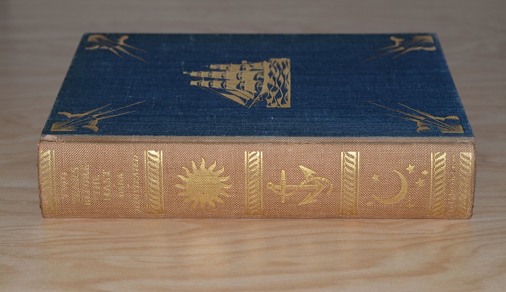
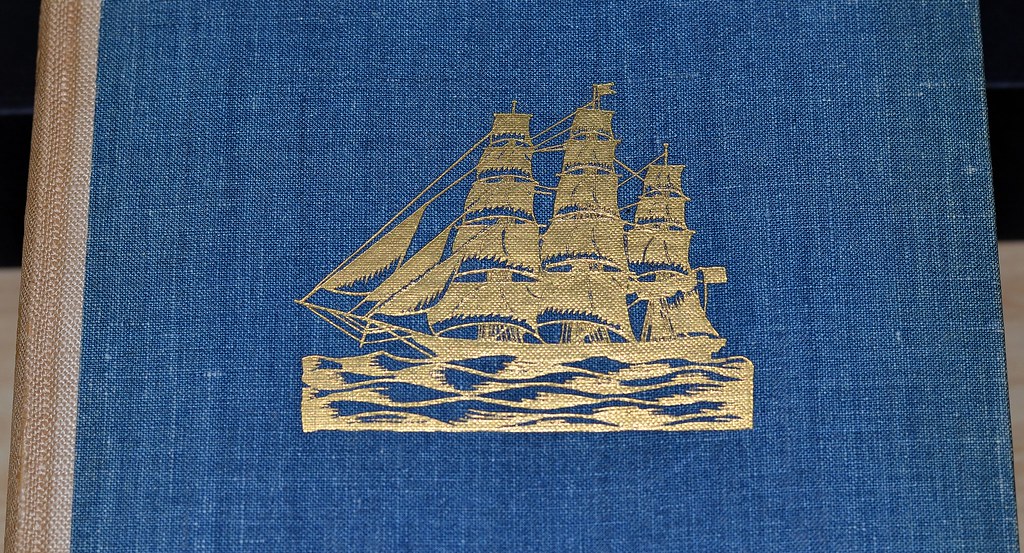


E.W.: It is my sincere hope that I have been able to catch the authentic ring of this story in the pictures, and that they will serve their purpose as a decorative background, for background they must be to be truly successful illustrations. The drawings of John the Swede, Captain Thompson, Mr. Amerzene, etc., are purely imaginery. no material being available. A most important thing in a sailor's life is the change of wind and weather; he watches it constantly with his "weather eyes,"so the decorations throughout the text indicate to some extent those changes and at the same time decorate the type pages.


228kdweber
>227 BuzzBuzzard: When my book club selected this book, I read the Lakeside Press edition but used the Ward Ritchie edition as a nice reference. My NF edition has the original slipcase but in very worn condition. I also ended up with a copy of the Westvaco edition in a bulk buy. Somewhere down the line I plan on replacing my HP 2nd edition with the LEC and a copy of the 1st HP edition.
229SteveJohnson
Two Years Before the Mast was one of the books that got me interested in collecting. When the University of Chattanooga merged with the University of Tennessee, they dumped a bunch of books from their library to, of all places, Woolworth's 5 and 10 cent store, and I purchased Two Years, Creasy's 15 Decisive Battles of the World, and Vol. 2 only of Dickens' Pickwick Papers, for 23 cents each (this was 1966, I believe). The Dickens is 1836, probably a first US edition since he published it in England in 1835, and the Dana is 1869, after the copyright had reverted to him and he added a chapter revisiting the scenes from the first edition three decades later. Only one illustration though and nowhere near as compelling as these from E. Wilson.
230Django6924
>227 BuzzBuzzard:
Wonderful! That goes right up with the Ward Ritchie and the 1st HP as my top choices for this title. I would think that Dale Nichols, or whoever it was who designed the 1st HP was influenced by the binding design of this Lakeside edition, as there ar many similarities.
Wonderful! That goes right up with the Ward Ritchie and the 1st HP as my top choices for this title. I would think that Dale Nichols, or whoever it was who designed the 1st HP was influenced by the binding design of this Lakeside edition, as there ar many similarities.
231Jan7Smith
I sometimes read a comment and then later would like to reread it. I can never find it and wondered if there is a way to search for a particular comment or a comment made by an individual member.
232wcarter
>231 Jan7Smith:
Go to the GMD home page, and just above the start of the Talk topics, on the right side, is a search box. Type in a phrase or word that you are searching for, and it will find it for you.
I typed in “search for a particular comment” from you post above, and it was found instantly.
Go to the GMD home page, and just above the start of the Talk topics, on the right side, is a search box. Type in a phrase or word that you are searching for, and it will find it for you.
I typed in “search for a particular comment” from you post above, and it was found instantly.
233Jan7Smith
>232 wcarter: That is just what I wanted, thanks. I was using the search site on the main page and it did not work. Maybe I can read old comments as I desire now.
234BuzzBuzzard
Why is the LEC Les Miserable much more common to find than the Count of Monte Cristo? I would think that the stories are equally famous.
235Jan7Smith
>234 BuzzBuzzard: Even the HP version is scarce. I found a fine copy recently, but it is a huge thick volume that is a load to hold, even with the thin paper used.
236BuzzBuzzard
>235 Jan7Smith: I fell in love with LEC Les Miserable and decided to seek the Monte Cristo set. Not only reasonably priced copies but any copies are super rare. Are you enjoying your Hugo?
237Django6924
>235 Jan7Smith: " Even the HP version is scarce"
And EXPENSIVE, Jan! I had looked for a copy in Fine condition for years and found one about 15 years ago and paid $50 for it.
And EXPENSIVE, Jan! I had looked for a copy in Fine condition for years and found one about 15 years ago and paid $50 for it.
238BuzzBuzzard
I suppose my $100 LEC is a real bargain then!
239jveezer
I've had an eye out for the Count as well, since I've always loved it. Would love it in the LEC, take it in the HP, but just in case I never find them I bought it in the Penguin edition. The 1996 translation by Robin Buss with the saucy bits put back in. Because I love the saucy bits and don't like that the Victorian censors had taken them out of the unknown translation I read way back when. I assume they also are not in the LEC or HP.
240Jan7Smith
>236 BuzzBuzzard: I am loving Les Miserables and I am about to start Vol. 4. I also love the LEC books, everything about them.
241Jan7Smith
>237 Django6924: Robert, I paid $58.50 plus $4.50 shipping for my copy of the HP edition. Unusually expensive but I was happy to acquire it.
242BuzzBuzzard
While the Nonesuch Dickens is out of my reach I decided to purchase a few of the HP Dickens titles. The paper and printing is nice but the series could have been so much nicer with some extra effort/expense. The page calls for a larger white margin (IMHO) and the binding could have been better. I like the patterned cloth but the spine and particularly hinges are fragile. Mine are what appears to be first HP editions but it is not always easy to tell. A few of the titles are printed for the members of the Heritage Club and have colophon at the end. They are also light on illustrations. Great Expectations for example supposedly has eight color plates but in my copy three are missing: facing page 64, 180 & 258. Can anyone check his copy. I am curios.
243Django6924
>242 BuzzBuzzard:
As I posted in a "Kid Brother" thread, Ardizzone did 2 complete sets of illustrations for Great Expectations. The first, which was the original edition and has the colophon, was done in watercolors, reproduced by Mourlot Frères, and includes the frontispiece, and facing pp. 64, 108, 180, 258, 304, 382, and 416.
The later edition, in which Mr. Ardizzone remade all the color illustrations as original lithographs, and includes frontispiece, and facing pp. 66, 114, 178, 258, 306, 382, and 418.
The letterpress and Worthy all-rag paper of the first edition (with the colophon) are quite superior to the later edition, and for this reason I prefer it. The illustrations of neither edition strike me as ideal (which I would apply to Wray Manning's illustrations for the HP Martin Chuzzlewit). The actual lithographs (pulled at the Curwen Press) are darker in execution and in that respect are better suited to the tone of the novel, but Ardizzone's draftsmanship is superior in the watercolors. If you read the descriptions of the scenes depicted, it makes you wonder, as featherwate remarked, if the artist actually read the book, so many details are wrong.
244BuzzBuzzard
>243 Django6924:
I knew this was discussed somewhere. I have the HP "original edition" but as I have stated no plates facing pp 64, 180 & 258 are present.
I knew this was discussed somewhere. I have the HP "original edition" but as I have stated no plates facing pp 64, 180 & 258 are present.
245featherwate
>243 Django6924:
Robert, the discussion you refer to was a spin-off from the Kid Brother series - you called it A Tale of Two Dickens and it was your New Year 2016 gift to the GMDs. It included a fine selection of photos comparing the two editions; as you pointed out neither of them is ideal.
I was ruder, probably from disappointment. I like much of Ardizzone's work (including the FS Travels with a Donkey and the wonderful Uncle Silas stories by H E Bates), but my expectations were clearly too great: with one exception I found his Dickens illustrations, especially the two frontispieces, wholly inadequate.
>244 BuzzBuzzard:
Buzz, a few years ago there was an Abe seller called something like Big Ed who had many of the original Heritage Dickens volumes on offer - his father had been a member at the time and had usually kept the Sandglasses, which were valuable, often essential, for confirming they were first editions. I bought four or five of them, but wasn't much impressed by any of the artwork. In fact, the only Heritage Dickens I own now is Oliver Twist; unfortunately Mr Ed no longer had his father's copy, so mine is the 1966 reprint. But I would like to find an authenticated 1939 first edition: Barnett Freedman himself oversaw the running off of his autolithographs at the Curwen Press, so making them original prints.
Which, of course, is why there are dealers who cut them out and offer them (and his exquisite Lavengro illustrations) for sale at £100 or so each...
In truth, though, I still prefer to read Dickens in the company of his original illustrators. Were I ten years younger and a hundred times wealthier I, too, would love to buy the Nonesuch edition.
246BuzzBuzzard
>245 featherwate: To me Gordon Ross illustrations for Great Expectations are fantastic. Part of my admiration is undoubtedly due to the fact that I love the overall design. The LEC is probably of the same quality as the Nonesuch set since both were printed at R. & R. Clark of Edinburgh around the same time (if not mistaken). Trying to remember if Macy pitched the Nonesuch set to LEC subscribers. I thought I read about this in the MLs but don't recall details. Like the inconspicuous ad for Bruce Roger's Oxford Bible, later to be recognized among the finest private press books of the 20th century.
The 1939 Oliver Twist is one of the Dickens books I bought. Printed for the members of The Heritage Club and having a colophon at the back. I am yet to read Oliver but do you think Freedman captured the spirit of it? I have my doubts.
The 1939 Oliver Twist is one of the Dickens books I bought. Printed for the members of The Heritage Club and having a colophon at the back. I am yet to read Oliver but do you think Freedman captured the spirit of it? I have my doubts.
247Django6924
>246 BuzzBuzzard:
Actually, the Nonesuch Dickens using the original illustrations was, I believe, George Macy's idea. It was also his idea, and one that earned him the enmity from someone associated with the Press, I can't remember who, to include one of the 877 surviving original engraving plates with each of the limited complete sets (thus limiting the run to 877 copies). When not all were sold in England, Macy did pitch the remaining sets to LEC members.
Here is my original post:
I recently purchased some LEC ephemera--the Prospectus for the Complete Shakespeare. Tucked inside was a letter to the subscriber--a resident of Salt Lake City, Utah--from George Macy, Director of The Nonesuch Fellowship--"a society of patrons of the Nonesuch Press." It is my understanding that Macy was in fact the owner of the Nonesuch Press since 1936, when the crippled economy in England made the continuation under Francis Meynall impossible. This letter is dated November 27, 1939, and announces that the fellowship members--who were members of the LEC--are now able to publish individual copies of their favorite Dickens works instead of having to purchase the entire set (for more than $250!). The following quote explains:
'It becomes possible because the British government has placed a crippling and compulsory war-risks-insurance charge upon all stocks of books held by British publishers. The Nonesuch Dickens was issued in an edition of 877 sets; to each subscriber was presented one of the 877 plates engraved for the original illustrations, that's why such an odd number was selected. On the official date of publication, about 600 sets had been subscribed. Each week since then, more collectors heard about it, additional sets have been shipped. Of the sets sent to America for distribution, none are left. But, in the Nonesuch warehouse in London, there are still some sets: fewer than fifty, yet enough to cause the Press to want to avoid payment of the new war-risks-insurance charge. To avoid that charge, the Press has decided to release the remaining sets in individual volumes.'
The letter goes on to point out what a great deal this is--such as being able to buy the less-popular works for as little as $5.75 per volume (those volumes being American Notes and Reprinted Pieces). The more popular volumes cost $13.50 and $11.50 per volume (strangely, Great Expectations bound with Hard Times in a single volume, is $9.75).
In addition to buying just the Dickens you want, you can also buy one of the remaining steel plates or wood blocks used to print one of the original illustrations. The Reprinted Pieces wood blocks engraved by Fred Walker are another bargain (I suppose) at a mere $20. One from a more popular work, say a steel plate etched by "Phiz" for Copperfield or Pickwick would have set you back $50. (From the nearest I can calculate, this would be about $1600 in today's currency.)
EDITED TO ADD:
Although your question about Freedman's work for Oliver Twist was directed to Jack, I hope he will forgive my putting in my own farthing's worth: I think this one of the best illustrated of the HP Dickens set, and his color lithographs seem to me to be nearly ideal. For one thing, they are portraits, and for someone who was conditioned to see these characters as depicted by the actors in David Lean's brilliant B&W adaptation, I have to give the illustrator a hand here as I find them equally persuasive. The little black and white vignettes at the heads of the chapters are also superb. Now I am not an unqualified fan of the original illustrations (sorry Jack). But I am not an unqualified fan of all the HP Dickens illustrations (and I do have all of them. I am close to be an unqualified fan of Barnett Freedman, though I will point out those occasions when, in my opinion, he comes a cropper--as he does in the HP Wuthering Heights. But I do believe that he very much caught the spirit of Oliver, and that his work here is among his best.
248featherwate
>246 BuzzBuzzard:
I get the impression from Carol Grossman's LEC History that between them Adolph Hitler and the still struggling economies of both the UK and the USA seriously damaged Macy's initial marketing strategy, a typically inventive combination of the serious and the flamboyant. The books sold slowly, especially in England, and Macy decided to market them in the US only, offering a range of Nonesuch volumes at a 25% discount to buyers who became 'patrons' of a new Nonesuch Fellowship. The offer was made in newspaper advertisements, and also directly to names on the LEC, Heritage and other mailing lists to which Macy had access. Unfortunately the Fellowship was most successful at boosting the sales of Nonesuch's non-Dickens books`!
I'll have a look for the Gordon Ross LEC, which I don't recall ever seeing. Curiously, Great Expectations was first issued in book form without any illustrations, the only time Dickens did not collaborate with an artist. I find Fred Pailthorpe's 1885 etchings attractive, certainly more effective than Ardizzone's (not difficult!).
I'm not sure what the spirit of Oliver Twist is! I can't pretend there's great psychological depth to Freedman's illustrations, despite his having been born and brought up in London's East End; I'm just a sucker for his mastery of lithography.
Thanks for reminding me that the 1939 edition had a colophon. On Abe there is a copy of what the seller calls the first edition and prices accordingly. But she makes no mention of a colophon, so I am doubtful.
Edited to say Robert has pipped me to the post in his reply!
249Django6924
>247 Django6924:
Don't forget Jack, that my father was born and raised in Oklahoma Territory in the 1880s, which means he was the offspring of "Sooners." :-)
Yes, I used to fall for that "first edition" or "first thus" line quite regularly, which is why I had at one time so many duplicate copies of HP editions. Now I ask for a picture of the colophon (and am regularly rewarded with the reply: "what do you mean?" I was going to post in June acquisitions a new purchase--not a Macy book, but one printed by a frequent Macy collaborator, and a native of my Pasadena: Ward Ritchie. The books were in good shape visually, and merited the ABE "Very Good" classification, but when I took the first volume from the slipcase my olfactories were assailed with what the dungeon of the Château d'If must have smelled like. Sadly, they were returned. Just another case of the descriptions in ABE being often less than reliable.
250featherwate
>249 Django6924:
Robert, I have always thought - well, since 1960 when I saw Cimarron I have always thought - that if you're going to establish a new society in untamed territory you are more likely to succeed if your pioneers are crafty persons of forethought and resource and not just folk who can ride a horse or drive a wagon faster than the next man or woman.
Thank you for also inadvertently leading me into the world of Sooners, Boomers, the Boomer Sooner fight song and the Sooner Schooner. Not that knowing such terms gives me any better understanding of American college football; its rites remain as arcane as those of the Vestal Virgins (possibly not the most appropriate of comparisons). But I'm sure they'll turn up in my New York Times crossword one day.
"But, in the Nonesuch warehouse in London, there are still some sets: fewer than fifty"
Macy's November 1939 statement doesn't seem to accord with John Dreyfus's history of the Nonesuch Press, in which he describes the September 1940 bombing of the Leighton-Striker bindery: "Not least of the losses were sixty-six sets of the Dickens." Ironically, they and other books, materials and office records had been moved to the bindery as being a safer haven than the Press's Russell Square warehouse/office, which had suffered a near miss during a previous bombing raid.
The lost Dickens sets were awaiting shipment to America, and presumably had to be replaced by a new print run. They were unbound, as sets destined for America had been since a 1938 shipment suffered extensive damage en route. This meant that as well as having to act as a temporary office and warehouse, the bindery derived no income from the books. This could explain a rather tetchy suggestion put forward in February 1942 by Robert Leighton that George Macy should consider remaindering all the Dickens sets still unsold, as simply storing them cost £200 a year in insurance. Macy almost agreed. In the event, all UK and USA stocks of the Dickens were sold out by the end of the war.
BTW, was your disappointing Ward Ritchie purchase his attractive edition of Two Years Before the Mast?
251Django6924
>250 featherwate:
Hmmm, as in so many cases involving the relationship between Macy and the Nonesuch Press, this disparity between the number of remaining Dickens sets and their eventual fate makes me want to do further research at the Ransom Centers George Macy papers.
There seems to be a certain mystery around what books were destroyed during WW II. Supposedly the first George Harrap edition of Cranford with Joan Hassal's illustrations was destroyed in the Blitz, but I have a copy and have seen several others offered by booksellers over the years.
As for the Ward Ritchie disappointment, it wasn't Two Years--I have owned that splendid 2 volume edition since it was first printed. It was a 3 volume set of Reminiscences of a Ranger by Horace Bell--an account of his time as a "peace" officer in early Los Angeles, which at that time exceeded Tombstone and Dodge City in lawlessness.
252featherwate
>251 Django6924:
"Supposedly the first George Harrap edition of Cranford with Joan Hassal's illustrations was destroyed in the Blitz"
I remember a note to that effect in my copy of the FS Cranford. But there is a 1948 Harrap second edition/impression for sale on Abe at present - the illustrations look crisper than those in the Folio.
There are some on-line transcripts of interviews with Ward Ritchie. He was a great raconteur and the transcripts are frequently punctuated by (laughter).
253Django6924
>252 featherwate: "But there is a 1948 Harrap second edition/impression for sale on Abe at present - the illustrations look crisper than those in the Folio"
Good eye--the illustrations in my Harrap edition are definitely crisper than the ones in my 1987 Folio edition. Interestingly, although the height and width of both editions are identical, the Harrap is easily twice as thick. The Harrap is only 55 pages longer, so I think the principal reason for its adiposity is the paper, which is very thick and nearly playing-card stiff.
Ritchie was quite a character and ran things pretty much the opposite of the big printing houses such as The Lakeside Press; his printing shop moved several times, usually whenever he found a building available at a less expensive rental cost, and he drafted friends , employees and family to move the presses and type.
He went to visit Macy in the hospital in California when the Director was first stricken with the symptoms of the cancer which was to take his life, and Ritchie had a hard time getting out of the hospital room despite everyone saying "Let George rest!" because George kept trying to determine the details for an upcoming LEC Ritchie was to print.
254edgeworn
May I add a query to this long discussion?
In my random walk approach to initial LEC purchasing, I have recently acquired the Evergreen Tales set with Aladdin, The Three Bears and Joseph & his Brothers. Quite nice examples as they still retained their glassine (although I don't think it is called that in the LEC world) covers and the books themselves are almost as new.
My query relates to the inscription in each volume, which is 'Jean Hersholt for Amy Joan Meskin'. I presume that these books were inscribed by Jean Hersholt to the intended recipient. Was this commonly done with LEC publications?
255UK_History_Fan
>254 edgeworn:
Not really. I believe if you read the colophon in full it will state that 2500 copies were made available on a subscription basis only. This is about 1000 copies more than a typical Macy era LEC release. My presumption is that one of the marketing points was Mr. Hersholt would personally inscribe the edition to the purchaser upon request. Personally I love the history of knowing who originally owned my copy despite the fact that none of the volumes in my complete series were inscribed to anyone famous or recognizable to me.
Not really. I believe if you read the colophon in full it will state that 2500 copies were made available on a subscription basis only. This is about 1000 copies more than a typical Macy era LEC release. My presumption is that one of the marketing points was Mr. Hersholt would personally inscribe the edition to the purchaser upon request. Personally I love the history of knowing who originally owned my copy despite the fact that none of the volumes in my complete series were inscribed to anyone famous or recognizable to me.
256Django6924
>254 edgeworn:
It was not usually the practice, but not unknown. I do kn ow another member here had a copy of one of the Evergreen Tales sets personally inscribed by Mr. Hersholt. Even the Heritage Press made such offers on (very) rare occasions. (From an earlier Post):
In the Sandglass for my first Heritage Press edition of Huck Finn illustrated by Norman Rockwell, there is a notice that with Christmas drawing on apace, the Press intends to print Tom Sawyer, also illustrated by Norman Rockwell in a companion binding, and to place both books in a single box (slipcase), and that the 2 volume boxed set will sell at bookshops for $5--the individual price per volume at the bookshops remaining $3.75. The final paragraph of the Sandglass contains the following:
We intend to persuade Mr. Rockwell to write personal inscriptions in each of these sets which is ordered by a member of the Heritage Club. If you want to place your order for one or more sets personally inscribed by Mr. Rockwell, you must send this order to our office before November first, since we could not ask Mr. Rockwell to make these inscriptions on more than one occasion. We will ask him to do so on November first only, and then ship the books to those who will have ordered them. In placing your order, we suggest that you give us the name of the person to whom you intend to make the gift, in order that Mr. Rockwell may inscribe that name with his own.
257kdweber
>256 Django6924: The HP Ink and Blood was also inscribed to each purchaser.
258edgeworn
>255 UK_History_Fan: >256 Django6924:
Thank you for explaining this - that all makes sense. The personalised inscription appears to have been done at the same time as the limitation number was added so, as in the case of the HP Huck Finn, I presume that Jean Hersholt was provided with a list of people who had requested personal copies, and this was referred to as the copies were numbered and signed.
Thank you for explaining this - that all makes sense. The personalised inscription appears to have been done at the same time as the limitation number was added so, as in the case of the HP Huck Finn, I presume that Jean Hersholt was provided with a list of people who had requested personal copies, and this was referred to as the copies were numbered and signed.
259Django6924
>257 kdweber:
Yes, Ken, thanks for reminding me about that--another reason why I hope to eventually add that edition to my library (if the Lotto ever cooperates).
By the way, do you know whether this offer was also made for The Book Of Edward A. Wilson?
Yes, Ken, thanks for reminding me about that--another reason why I hope to eventually add that edition to my library (if the Lotto ever cooperates).
By the way, do you know whether this offer was also made for The Book Of Edward A. Wilson?
260kdweber
>259 Django6924: "do you know whether this offer was also made for The Book Of Edward A. Wilson?"
Robert, that's a good question. I don't know the answer but my copy is personally inscribed.
Robert, that's a good question. I don't know the answer but my copy is personally inscribed.
261NYCFaddict
It has been quiet on GMD lately, so here's something I'm not sure about:
Were the LEC publisher's announcement cards ("We expect to ship ...") discontinued at some stage?
Were the LEC publisher's announcement cards ("We expect to ship ...") discontinued at some stage?
262Django6924
>261 NYCFaddict:
Hmmm, that's a good question. I'll check my later LECs to see which have Announcement Cards.
Hmmm, that's a good question. I'll check my later LECs to see which have Announcement Cards.
263SteveJohnson
I'm wondering about the differences in the LEC and HP editions of Gibbons Decline and Fall of the Roman Empire. I have the three-volume HP edition and just saw the LEC in a local bookstore. But it is $400 and the spines have some nicks, although the text appears to be clean. The LEC is six volumes and the HP only three, so the effect of the six crumbling pillars on the spines is a little diluted in the HP. But both have the Piranesi drawings and the maps in the front and they seem to be the same size and layout. Other than a difference in the quality of the paper, anything else?
264MobyRichard
>263 SteveJohnson:
It's letterpress, presumably. Although I can't really feel the 'bite' on this one so I can't even tell really.
I rarely pull it from the shelf because the spines are falling apart (Red rot). I'd probably stick with
the Heritage edition unless you can find the LEC in perfect condition. It's strictly middle-tier LEC to me.
265Django6924
>263 SteveJohnson:
Steve, I have mentioned in another thread that although I have both the LEC and the HP edition, I actually prefer the HP in a few respects. Purely a matter of taste, but I think the crumbling columns are more attractive as six columns than seven. I also prefer the silk-finish binders cloth on the HP to the leather used on the LEC, which on my set has crumbled even more than the depicted columns! (I understand that some of the members here own sets in which the leather is much better preserved, but I am dubious of how long such condition may last, as most of the sets I have seen show deterioration. (Incidentally, the HP edition with the columns is not the first HP edition--that one had a narrow frieze of Roman figures under the title.)
The laid Worthy paper in the LEC is has a very nice fell, but there is a surprising amount of show-through. The marginal notes show this especially. The HP, which uses a toned Chillicothe Paper company product, also has some show-through of the marginal notes, but it's harder to fault this considering they had to fit the over 2500 pages of the 7 volume edition into 3 volumes without reducing the font size (it is minutely smaller due to the fact the HP pages ar photographic reproductions of the LEC pages). It goes without saying that the HP is not letterpress, but the printing is very sharp and clear and I find no fault with it on that standpoint, and the added contrast from the photographic process actually makes the illustrations seem a bit crisper. Since the illustrations in the LEC are photographic reproductions from a set of the original engravings (reproduced via photogravure), they are not original prints as are the engravings in other LECs.
The paper sides of the LEC look like marbled paper--but they are actually photographs of marble! Very nice, and although I like the use of the Piranesi illustrations for the paper sides of my HP set, I'm partial to the marble.
EDITIED AFTER >264 MobyRichard:: The LEC is definitely letterpress, printed by Hildreth.
266SteveJohnson
I think you have convinced me to save my $$. The leather on the spines in this set were also starting to crumble.
267Django6924
>261 NYCFaddict: "Were the LEC publisher's announcement cards ("We expect to ship ...") discontinued at some stage?"
I don't have a definitive answer to this, but I suspect they may have been discontinued after the 45th Series. The latest LEC I own with an Announcement Card is Malcolm Cowley's Exiles Return, the last book in the 45th series.
I own 7 books in the 46th Series and 7 in the 47h Series , all have ML but none have Announcement Cards. This might be a coincidence, but it's all the evidence I have.
268NYCFaddict
That is ever so helpful. Thank you! Your data chimes with my limited data, so I think you must be right. (Does anyone have any contradictory data points?)
269kdweber
>268 NYCFaddict: I concur with Robert. I have every LEC from the 42nd through 48th series but none of the works from the 46th series (beginning with LEC 516 - Tender is the Night published in 1982) and on have an Announcement Card.
270Jan7Smith
I have a nice HP edition of The Decameron which I want to read but the text size is awfully small for my eyes. Does the 1930 LEC edition improve in that regard? I also don't like double columns but that seems to be the best of Macy's offerings.
271Django6924
>270 Jan7Smith:
Jan, the text size is indeed larger in the 1930 edition--as are the books themselves, quarto versus the 1940 editions octavo. I sent you a photo where I laid the page of one over the other so you have a direct comparison.
If you are opposed to double columns, as they are in both editions, may I suggest you look up the edition illustrated by Rockwell Kent? He is not, as some consider him, the be-all and end-all of illustrators, but I think he has done some of his best work in illustrating the Decameron (albeit they are much more erotic than Macy probably would have accepted).
272Jan7Smith
>271 Django6924: Robert, the photo shows the LEC edition with much better text size for me. Now I have to decide whether to purchase the LEC or the Rockwell Kent two-volume set. Thanks for your always helpful information. I look for your comments before most of my book buying choices.
273kdweber
>272 Jan7Smith: There is also the 1940 special edition (S-6) LEC illustrated by Fritz Kredel in a Renaissance manner (very different than his usual work) but also unfortunately printed with double columns. The Folio Society did a nice two volume set bound in cream colored leather with aquatints by Buckland Wright (1969) printed with only a single column. Both the Garden City (1949) signed (Rockwell Kent) limited edition and the Folio Society copy were translated by Richard Aldington.
274Jan7Smith
>273 kdweber: Ken, I am torn between the LEC edition 1930 and the Garden City 1949 Limited Edition. I do not want to leave the LEC but the double column pages just don't make me happy. I have never cared much for Folio Society books. Thanks for the good info.
275Django6924
>273 kdweber:
Folio did several Decamerons with the Buckland Wright illustrations. Mine was the 3rd printing (1998) with the David Eccles-designed binding of fluttering pennants on the front covers, the swallowtails of which form a pattern which stretches across the spines of the 2-volume set. They also did a limited, leather-bound single volume edition which utilized the basic pattern of their one-volume leather-bound Don Quixote.
The Buckland Wright illustrations are nice--of course the 1930 LEC is not really illustrated at all, and Fritz Kredel's little vignettes in the style of medieval woodcuts which decorate the 1940 edition are not really illustrations either--but Rockwell Kent really captured (for me, anyway) the variety of tone of Boccaccio's stories, from the comic, to the erotic, to the highly dramatic (melodramatic, even).
276Jan7Smith
I can not decide on which edition of The Decameron to purchase. How does the quality of the Garden City 2 volume 1949 Limited Edition compare with the LEC 1930 edition? Hopefully, someone has both of these selections or has seen both.
277Django6924
>276 Jan7Smith:
Jan, I own both LECs and have seen the Garden City 2 volume 1949 Limited Edition (with Kent's signature). If illustrations are not important to you, the 1930 LEC has superior printing and paper. It is not always easy to find in Fine condition, and even my otherwise pristine set has some odd, barely discernible mottling on the spine of Volume 1.
The quality of the Garden City books is certainly not bad--in fact for a post-WW II book it is on a par with many LECs of the same period. High-quality rag paper was not easy to come by and many of the master typesetters and printers from 1930 were no longer available for one reason or another (Macy laments both these issues in his Monthly Letters of the immediate post-war period). Again, the principal advantages the Garden City 2 volume 1949 Limited Edition are the illustrations and the single columns.
278Jan7Smith
>277 Django6924: Robert, I think your observations will enhance the likely choice being the Garden City 2 volume 1949 mostly for the single columns. Hopefully, the paper and construction will be near LEC quality. I really appreciate all the help with this endeavor.
279kdweber
>274 Jan7Smith: I have all the editions we've talked about. I have to agree with Robert that the printing and particularly, the paper are not as impressive as found in the LEC but not bad. There has been no foxing or yellowing of the paper in my copy of the Garden City edition. A nice cloth cover in a mediocre slipcase (no dust jackets), top edge gilded. The Rockwell Kent signature is the tiniest signature I have seen in a book. My copy is in pristine condition but it wasn't inexpensive.
280Jan7Smith
>279 kdweber: Ken, thanks for the description of the Garden City edition and I have noticed that a really nice copy will be expensive. I think it will be my choice when I find one I can be happy with.
One other thing I forgot to ask is text size as compared to the LEC 1930 edition or any size larger than the HP book.
One other thing I forgot to ask is text size as compared to the LEC 1930 edition or any size larger than the HP book.
281Django6924
>280 Jan7Smith:
Jan, although I seem to remember it was large and easy to read, I don't trust my memory enough as it's been several, several years since I saw that Garden City edition in the library at USC. Perhaps Ken can supply a more considered opinion.
Jan, although I seem to remember it was large and easy to read, I don't trust my memory enough as it's been several, several years since I saw that Garden City edition in the library at USC. Perhaps Ken can supply a more considered opinion.
282Jan7Smith
>281 Django6924: Robert, That is what I need as the old eyes aren't what they once were.
283Jan7Smith
I am surprised to find there is no HP or LEC edition of George Eliot's Middlemarch. Does anyone have a recommendation for an edition of comparable quality?
284NYCFaddict
I like the FS edition, which is in series with other Eliot novels. There is a scarcer printing with silk-covered boards.
285Jan7Smith
>284 NYCFaddict: I would like to get the Folio Society 7 volume set in fine condition. Abe has one but too much for me right now. I couldn't find the edition with silk covered boards. I will keep looking. Thanks for responding.
286wcarter
The FS Middlemarch with red silk boards was published in 1972. Beware of a sun faded spine which affects most copies after 46 years.
287Jan7Smith
>286 wcarter: Thanks for the description, that will help, finding a fine copy will likely be difficult.
288NYCFaddict
Warwick, I should have specified that I was referring to the edition/printing mentioned in message 6 here:
www.librarything.com/topic/161320
The spine is not covered in silk, and the printing is relatively recent: in the exact era of the 7-volume set (the internals are the same as the edition featured in that set).
www.librarything.com/topic/161320
The spine is not covered in silk, and the printing is relatively recent: in the exact era of the 7-volume set (the internals are the same as the edition featured in that set).
289Django6924
>283 Jan7Smith:
Jan, the omission of Middlemarch from the Macy canon is another mystery. Considering some of the works which were printed by the LEC, it is amazing that this novel, which I have always thought one of the best English novels, is most inexplicable.
Jan, the omission of Middlemarch from the Macy canon is another mystery. Considering some of the works which were printed by the LEC, it is amazing that this novel, which I have always thought one of the best English novels, is most inexplicable.
290Jan7Smith
> 283 Robert, I can only imagine how wonderful a three or four vol. LEC edition would have been!
291featherwate
>290 Jan7Smith:
....so long as it wasn't illustrated by John Austen!
If I remember aright the 1972 FS Middlemarch I had was illustrated by Robin Jacques (who did a couple of LECs, one of them the W B Yeats volume) - was there a different illustrator for the later FS Eliot set?
....so long as it wasn't illustrated by John Austen!
If I remember aright the 1972 FS Middlemarch I had was illustrated by Robin Jacques (who did a couple of LECs, one of them the W B Yeats volume) - was there a different illustrator for the later FS Eliot set?
292Jan7Smith
>290 Jan7Smith: Jack, do you have a favorite Middlemarch edition?
293featherwate
>292 Jan7Smith:
I do, Jan, but unfortunately it won't be a very useful recommendation! - it's a Kindle edition that has little aesthetic appeal but does enable me to choose a large Baskerville font size that I can read without strain. There are, of course, several Kindle editions and I must admit I chose this one out of admiration for the sheer chutzpah of its cover:
(I like to think the artist was a little chemically awry when he settled down before his easel, and confusing two commissions came up with an illustration for A Streetcar Named Dorothea).
To be serious, my Robin Jacques FS edition is the only Middlemarch I've owned. I remember his drawings as being skilful - he was a fine draughtsman - but not particularly inspiring. The typesetting and paper made for a readable text.
I do, Jan, but unfortunately it won't be a very useful recommendation! - it's a Kindle edition that has little aesthetic appeal but does enable me to choose a large Baskerville font size that I can read without strain. There are, of course, several Kindle editions and I must admit I chose this one out of admiration for the sheer chutzpah of its cover:

(I like to think the artist was a little chemically awry when he settled down before his easel, and confusing two commissions came up with an illustration for A Streetcar Named Dorothea).
To be serious, my Robin Jacques FS edition is the only Middlemarch I've owned. I remember his drawings as being skilful - he was a fine draughtsman - but not particularly inspiring. The typesetting and paper made for a readable text.
294Jan7Smith
>293 featherwate: Font size suitable for my eyes is what I desire in a hardback. Maybe I will find the right edition that meets my wishes soon. I may even try the Kindle edition. Thanks!
295Django6924
>293 featherwate:
Jack, I am in total agreement about Robin Jacques as an illustrator--technically excellent but uninspired, at least based on his work in Middlemarch and the LEC volumes Kim and Poems of William Butler Yeats. I think he was more renowned for illustrating books for young readers, most notably The Indian in the Cupboard, which despite criticism for its portrayal of Native Americans, has achieved classic status.
Jack, I am in total agreement about Robin Jacques as an illustrator--technically excellent but uninspired, at least based on his work in Middlemarch and the LEC volumes Kim and Poems of William Butler Yeats. I think he was more renowned for illustrating books for young readers, most notably The Indian in the Cupboard, which despite criticism for its portrayal of Native Americans, has achieved classic status.
296dukknt
One of the most puzzling, or subtle, collective appraisals of quality applies to the 1933 Brothers Karamazov. I am not generally interested in illustrations. Django's opinion carries much weight but objections have been noted. For me €150 is a serious investment. For all the illuminating insights and exposure the web offers it remains very weak in conveying those qualities of touch and feel.
I do own the LEC Plutarch and consider the touch and feel of binding and paper superb. Would it be possible for someone to compare the qualities of the 1933 BK to the Plutarch? that would be very helpful.
I do own the LEC Plutarch and consider the touch and feel of binding and paper superb. Would it be possible for someone to compare the qualities of the 1933 BK to the Plutarch? that would be very helpful.
297Jan7Smith
>296 dukknt: Our sensory perceptions of books I agree are neglected in descriptions of most editions with the exception of Robert (Django6924). His descriptions have made me lust after and purchase a number of editions that I could not really afford but enjoyed the luxurious feel of the various aspects that made up the books.
I don't have the LEC Plutarch but do have the LEC 1933 Brothers Karamazov and was not impressed with it initially although it has grown on me. It is great for reading in a comfortable size and also a great story.
I don't have the LEC Plutarch but do have the LEC 1933 Brothers Karamazov and was not impressed with it initially although it has grown on me. It is great for reading in a comfortable size and also a great story.
298Django6924
>297 Jan7Smith: "His descriptions have made me lust after and purchase a number of editions that I could not really afford ..."
Ouch! Sorry.....
>296 dukknt:
The 1933 BK is an LEC that seems to invite division of opinion. It is printed by D.B. Updike ("the dean of American printers") at the Merrymount Press. The letterpress is, in my opinion, every bit as beautiful as W.A. Dwiggins' Plutarch. I think most would agree with that! Now we get division when we discuss the paper: an all-rag paper made by Tileston and Hollingsworth of Boston. The Monthly Letter says "it does not look like an all rag paper; but it is" and goes on "if you like papers that look like a million dollars, you'll be disappointed" and concludes "we don't like it much." Well, it isn't in the same class with the paper in Cellini's Autobiography or the 1933 Don Quixote, but I would say it is the equal of the paper in the LEC Plutarch (albeit it isn't a laid paper, which is a feature I rather prefer). The binding is very nice, but some may feel that it is not monumental enough for such a monumental work. Plain linen spine with a leather label for the title, and the 3 volumes each featuring pfeistpapier paper sides, a variation on marbled paper, also made by hand, using ink and paste, each in a different color.
The major source of controversy are Alexander King's illustrations: you either like them (as I do), or they leave you cold; especially if you feel that the only proper illustrator for the great Russian classics is Fritz Eichenberg. I must say I find Eichenberg's lithographs exceptional, even for him, and I regret he did not use that format more often. The later LEC of BK is printed in double columns, and I have a prejudice against that format which is hard to overcome. The 1933 set is, as Jan points out, very comfortable to read--more so than the later 2-volume set.
Overall, my preference is for the earlier set. If you like illustrations to depict scenes in the story, then you will probably prefer Eichenberg; King only gives us portraits of the characters, but I often prefer this, especially in a work where the psychology of the characters is more important than the actions.
300SteveJohnson
OFF TOPIC:
I'm looking for resource material on 19th century magazines such as Harpers, The Eclectic, Grahams, North American Review, Godeys, etc. Are there any books out there on the general topic of magazines in that era? Any attempt at an overall list of all the main titles and the years in which they published? I have a fair collection of Harpers, St. Nicholas and Godeys plus occasional volumes of Grahams, The Eclectic and a few others. There is a very good book on Godey's, The Lady of Godey's. Is there anything on Harper Brothers? Anyone else on this list who collects bound volumes of magazines?
I'm looking for resource material on 19th century magazines such as Harpers, The Eclectic, Grahams, North American Review, Godeys, etc. Are there any books out there on the general topic of magazines in that era? Any attempt at an overall list of all the main titles and the years in which they published? I have a fair collection of Harpers, St. Nicholas and Godeys plus occasional volumes of Grahams, The Eclectic and a few others. There is a very good book on Godey's, The Lady of Godey's. Is there anything on Harper Brothers? Anyone else on this list who collects bound volumes of magazines?
301laotzu225
>193 Airygold:
I just got a copy of this book today-in near mint condition but lacking the Monthly Letter, which might have explained it. However, it seems clear this mode of printing was intentional. it probably has to do with the book not being very long and it allowed for more substance.
Now, reading the comments and replies, I understand this is called a French Fold.
Does anyone have the ML which they might be willing to copy and share-or even better upload to the Google Drive collection?
302laotzu225
What wonderful illustrations and vivid colors! Thank you for this effort. A book to look for!
303kdweber
>301 laotzu225: You don't need to post on three different threads.
304Django6924
French fold (or Japanese fold, as it is sometimes called), is primarily done to eliminate show-through when printed on somewhat thin paper.
305dukknt
>304 Django6924:
It suddenly came to me in a flash of inspiration that you might want to send me a parcel containing your one hundred favourite Limited Editions Club books. Take it for granted I will pay the postage. Think of the amount of time you would save not describing the material nature of the books and not having to motivate grappling with the contents of difficult works.
Just post 'em. Simple!
306elladan0891
Has anyone ever seen a fine copy of Penguin Island in captivity? Never seen a decent looking spine. Should I keep looking?
307BuzzBuzzard
Absolutely keep looking. From experience and after seeing a fine copy of Moby Dick I think every LEC could be found in fine condition.
308BuzzBuzzard
Also check out the 1938 Heritage Press edition, illustrated by Sylvain Sauvage. It is really nice and affordable.
309kdweber
>306 elladan0891: I have both the LEC and 1938 HP editions. I prefer the HP.
310Jan7Smith
After purchasing two editions of George Eliot's Middlemarch which seemed unsuitable for my reading pleasure due to small text size I found what I wanted in the latest purchase.
I found a 10 vol. set of The Works of George Eliot - University Edition published by Sully & Kleinteich - New York. The text size is estimated to be about 14 and is very easy on the eyes. Bound in blue cloth with gilt spine titling and decorations, top edge gilt, frontis illustrations, deckle page edges. No date found...maybe 1910 published. The books are all in excellent condition and I will be reading George Eliot for a long time if I read all of these titles. Thanks to all who offered advice when I was attempting to find a suitable solution for this endeavor.
Any information about these books would be a plus as I have found very little. I am happy with them regardless!
313Django6924
>310 Jan7Smith:
Jan, Sully & Kleinteich seems to have been a publishing company that published everything from high literature in the public domain--including your complete works by George Eliot and a complete Shakespeare--to pulp boys' books in an attempt to rival the Stratemeyer Syndicate's Tom Swift and Rover Boys series: a series of books about Bert Wilson, a multi-talented chap who was a star pitcher in BERT WILSON'S FADEAWAY BALL (a pitch he must have learned from Christy Mathewson) as well as a daredevil racer, BERT WILSON'S TWIN CYLINDER RACER. Starting their business in 1860, they published sporadically through the War Between the States and Reconstruction, gained momentum in the Industrial revolution and hit their peak years in the Jazz Age following WWI. The Complete Eliot shows dates of both 1900 and 1920 in the online sellers' inventories, so it's hard to say when your edition was printed.
As with many publishers, the Depression almost put a quietus to their business: they apparently only published 7 editions between 1926 and 1992, but then rose, like Dracula from the grave and published 17 editions between 1992 and 2009. I can find no further information about them after that date.
314Jan7Smith
>313 Django6924: Robert, I really appreciate the information you always provide for my obscure editions. I will likely never get any better knowledge of these books, but I love them anyway. They are everything I dreamed of for reading George Eliot, they are attractive and well constructed. I don't know if I will ever finish the entire set, it is quite a load.
Thanks again for all the education you provide for me and others.
Thanks again for all the education you provide for me and others.
315elladan0891
>307 BuzzBuzzard: Absolutely keep looking. From experience and after seeing a fine copy of Moby Dick I think every LEC could be found in fine condition.
Thanks, I will! Your wonderful finds are a solid proof that it's the case.
>308 BuzzBuzzard: >309 kdweber:
How does HP's paper compare with the LEC?
Thanks, I will! Your wonderful finds are a solid proof that it's the case.
>308 BuzzBuzzard: >309 kdweber:
How does HP's paper compare with the LEC?
316Django6924
>315 elladan0891:
As with Pooh-Bah, I can't refrain from putting in my oar here about one of my all-time favorite HPs--the 1938 Penguin Island: the paper in this edition is an a rag paper from the Worthy Paper Company which has a most pleasant tooth which I love to touch and which takes the letterpress beautifully. The LEC also uses a Worthy Paper which seems slightly whiter than that used in the 1938 HP--the creamier tone of the HP is my preference.
I do think the Sauvage illustrations in the HP are much preferable to the B&W sketches in the LEC, but I like those as well and would be very happy with them if I had never seen Sauvage's.
Incidentally, if you do opt for the HP, look for the edition that has "For the Members of the Heritage Club" on the title page. A virtually identical edition just says "Heritage Press," but that edition lacks the colophon with production details.
317BuzzBuzzard
>316 Django6924: I love Sauvage. Oddly I did not find his Penguin Island illustrations very inspired. On one hand I felt that some scenes should have been illustrated but were not and on the other illustrations could have been reproduced better. This being said I stand behind my endorsement of the HP edition. Printing is top notch and I like the binding a lot.
318Jan7Smith
>316 Django6924: Robert, your delicious description of the paper naturally caused me to order a copy of the "For the Members of the Heritage Club" edition of the 1938 Penguin Island. You sell lots of books for Abe & E-Bay!
319Django6924
>318 Jan7Smith:
Turnabout is fair play! You have also aided me in reducing my savings account!
I'm glad you were able to find one of the Heritage Club editions; it's getting harder to find these HP exclusives with the colophon.
Turnabout is fair play! You have also aided me in reducing my savings account!
I'm glad you were able to find one of the Heritage Club editions; it's getting harder to find these HP exclusives with the colophon.
320varielle
Fellow biblio fiends, What is this boycott of ABE all about? https://eurekabooksellers.com/banned-booksellers-week/?fbclid=IwAR3_2UF6o0DHtiFD...
321Django6924
>320 varielle:
Perhaps people are beginning to fear that Amazon is likely to take over all commercial transactions in the future and that if some sort of protest isn't lodged now, the individual sellers will have no bargaining power and will have to play by Amazon's rules if they want to play at all.
I can't see that the boycott is likely to accomplish much, and I would think it would hurt the boycotting companies most of all.
322Jan7Smith
I just received the 1938 Heritage Press "For the Members of the Heritage Club" Penguin Island and as near as I can determine it is in perfect condition...the slipcase is well worn on the edges. As Django6924 & BuzzBuzzard indicated the book is really desirable in every aspect. I think it is the finest HP book I own.
323kdweber
>322 Jan7Smith: "I think it is the finest HP book I own."
Have you taken a look at:
1935 The Tragedy of Romeo and Juliet
1936 Leaves of Grass
1937 The Song of Songs which is Solomon's
1940 Gulliver's Travels
Have you taken a look at:
1935 The Tragedy of Romeo and Juliet
1936 Leaves of Grass
1937 The Song of Songs which is Solomon's
1940 Gulliver's Travels
324Jan7Smith
>323 kdweber: Ken, I do have the 1940 Gulliver's Travels with the rugged linen boards which I am very proud to own. I have The Leaves of Grass - Doubleday, Doran & Co., NY, 1940. There are so many books that I am fond of and when I add another that excites me I tend to move it to the top. Too many to pick only one as being the favorite!
325BuzzBuzzard
>324 Jan7Smith: I hear you. The next book is always the most exciting one! For me though there is one HP book that I can nominate as the finest and it is the 1938 Crime and Punishment. It is not necessarily the best printed HP book, neither having the best paper. But illustrations and content can hardly be rivalled. The story impressed me deeply and in certain way I liked it better than Brothers Karamazov.
326Django6924
Jan, design-wise I agree with your opinion of the 1938 Penguin Island--a complete triumph. I'm glad your copy is in such fine condition.
327Jan7Smith
>325 BuzzBuzzard: Crime & Punishment is also so very easy on the eyes with large text and is a beautiful book.
I am still in a state of mourning over not getting the LEC The Count of Monte Cristo you discovered for me. The set was so appealing in the pictures and the price was low for an edition that good. That is the reason it was snapped up so quickly! Hopefully another will come available soon.
>326 Django6924: Robert, we think alike on many books... much to my satisfaction.
328Jan7Smith

This is the set of George Eliot's books I mentioned in message >310 Jan7Smith: earlier. I am enjoying reading them with the nice text and bright paper.
329Jan7Smith

Penguin Island 1938 "For the Members of the Heritage Club" mentioned in message >316 Django6924:. A really nice edition.
330Django6924
>328 Jan7Smith:
That's a lovely set of Eliot--much nicer than my Folio Society set. And congratulations on finding such a nice copy of Penguin Island! Most of the copies I've seen, including my own, have pristine binding but the gilt has faded. Yours is very sharp and legible.
That's a lovely set of Eliot--much nicer than my Folio Society set. And congratulations on finding such a nice copy of Penguin Island! Most of the copies I've seen, including my own, have pristine binding but the gilt has faded. Yours is very sharp and legible.
331Jan7Smith
>330 Django6924: Robert, thanks for your favorable comments on the books. Wishing you and all the other book lovers a Happy Thanksgiving.
332Jan7Smith

I just received a 26 volume set of 1928 -Doubleday/Doran - Joseph Conrad books and they seem to have never been read, but the labels are age darkened and dim. Does anyone know of a way to clean and brighten the labels without harm? Thanks for any suggestions. Love the books other than that.
333Jan7Smith

Title page of Conrad books. I seem to keep getting books that I can't find much information. Too old I suppose but I love old books.

335Django6924
>332 Jan7Smith:
Jan, I wish I knew a way to brighten them. Of course it would destroy the collector value, but I have, on the slipcase labels of some of my LECs which were in poor condition, scanned them, photoshopped the scan to clean and brighten it, and then printed it out on my inkjet printer on Crane's all rag paper, and then replaced the original label. A somewhat time-consuming job, and I don't think I would do it again.
Jan, I wish I knew a way to brighten them. Of course it would destroy the collector value, but I have, on the slipcase labels of some of my LECs which were in poor condition, scanned them, photoshopped the scan to clean and brighten it, and then printed it out on my inkjet printer on Crane's all rag paper, and then replaced the original label. A somewhat time-consuming job, and I don't think I would do it again.
336Jan7Smith
>335 Django6924: Robert, Thanks for telling me of your solution for your labels.
I took pictures of my 200 or so Heritage Press spines hoping to make slipcase labels, then I realized I didn't have the skill to accomplish the goal. I may someday try to attain some degree of understanding photoshop and try that approach to creating labels.
I took pictures of my 200 or so Heritage Press spines hoping to make slipcase labels, then I realized I didn't have the skill to accomplish the goal. I may someday try to attain some degree of understanding photoshop and try that approach to creating labels.
337WildcatJF
I was asked a very good question on my blog re: Physiology of Taste, in regards to M.F.K. Fisher's translation. The comment notes that Fisher's translation has seen reprints outside of the Macy sphere (Penguin in particular), and the writer was curious if anyone here might know the particulars of a hypothetical deal between Fisher and Macy outside of the Letter that allowed her work to be republished outside of his publishing houses. Thanks in advance!
338elladan0891
>307 BuzzBuzzard:
So I ended up acquiring a LEC copy of the Penguin Island. NF or VG, but still in much better shape than any copy I'd ever seen before. Listing description proclaimed it "Fine", and few available pictures were encouraging. I was leaving for a 1.5 month-long vacation, didn't have time to ask for additional pictures, but considered the low price and took a gamble. Unlike examples usually listed online, the leather of the spine did not deteriorate a bit and there was no sunning. However, sure enough, there is an annoying scratch at the top of the spine (the area I would have asked the seller to take an additional photo of). The rest of the book is in perfect condition. As I was able to open the package and inspect the book only over a month and a half after the sale, and since I didn't pay much for it, I'm keeping it. But as I'm not 100% happy with it, I'll keep looking for a truly Fine copy or the HP alternative.
Incidentally, the substantial slipcase of this 1947 LEC is lined with velour, which is the first for me. Are there any other LECs which came with velour-lined slipcases? I own only 46 LECs so far, but was under the impression that the LEC never invested much into slipcases.
339kdweber
>338 elladan0891: "Are there any other LECs which came with velour-lined slipcases?"
Sure, The Book of Job and The Book of Ruth come to mind from the Macy years. There were plenty of velour lined slipcases or clamshell boxes in the Shiff era.
Sure, The Book of Job and The Book of Ruth come to mind from the Macy years. There were plenty of velour lined slipcases or clamshell boxes in the Shiff era.
340BuzzBuzzard
>338 elladan0891: As well as the 1929 Baron Munchausen. There has to be others.
341EclecticIndulgence
>338 elladan0891: Brave New World is lined with an indigo velour, I believe. This is particularly important to protect against scratches on the... seemingly plastic, binding.
342kdweber
>341 EclecticIndulgence: Your post made me think of Fahrenheit 451 and its soft aluminum binding. If ever a book called for a velour lined slipcase, this is it. So I checked, and indeed, it's lined with black velour.
I think the LEC's Brave New World will be the last LEC I ever buy (and only for completeness, in that case). I hate that binding, what were they thinking?
I think the LEC's Brave New World will be the last LEC I ever buy (and only for completeness, in that case). I hate that binding, what were they thinking?
343elladan0891
>342 kdweber: "Fahrenheit 451.... indeed, it's lined with black velour"
Ha, in that case I have at least 2 LECs with velour-lined slipcases
Ha, in that case I have at least 2 LECs with velour-lined slipcases
344BuzzBuzzard
Is it possible that an LEC copy of Ulysses with apparent fire damage sold for $1,500 on eBay today? Ts, ts...
345kermaier
>338 elladan0891:
The Poems of Emily Dickinson and The Works of Epicurus have velour-lined slipcases.
The Poems of Emily Dickinson and The Works of Epicurus have velour-lined slipcases.
346elladan0891
>344 BuzzBuzzard:
My first thought was maybe it had the coveted Joyce's signature, but no, and worse - the limitation page with signature(s) is missing altogether along with the title page! Probably cut out for framing after the book was salvaged from the fire. Nuts.
My first thought was maybe it had the coveted Joyce's signature, but no, and worse - the limitation page with signature(s) is missing altogether along with the title page! Probably cut out for framing after the book was salvaged from the fire. Nuts.
347elladan0891
>345 kermaier:
Thanks. So it looks like from time to time the LEC did invest in better slipcases.
Thanks. So it looks like from time to time the LEC did invest in better slipcases.
348kermaier
>347 elladan0891:
Seems so. Though neither of those slipcases are what I’d call “good” — they’re still relatively crappy cardboard. Both of those books, however are bound in full leather, which may have motivated them to put a soft lining in the slip case — although my copies of The Prince and Of the Nature of Things are leather in plain slip cases. Go figure, as they say in my neck of the sprawl.
Seems so. Though neither of those slipcases are what I’d call “good” — they’re still relatively crappy cardboard. Both of those books, however are bound in full leather, which may have motivated them to put a soft lining in the slip case — although my copies of The Prince and Of the Nature of Things are leather in plain slip cases. Go figure, as they say in my neck of the sprawl.
349Jan7Smith
Would someone who has The Flounder LEC please tell me what is on the spine of the books. The pictures I can see are not clear enough for me to see what the markings show.
350BuzzBuzzard
>349 Jan7Smith: Natural eel skin spines.
351Jan7Smith
>350 BuzzBuzzard: Do the spines have any writing on them?
352elladan0891
>351 Jan7Smith:
No, just plain skins. I'll try snapping a couple of pics for you tomorrow.
No, just plain skins. I'll try snapping a couple of pics for you tomorrow.
353Jan7Smith
>352 elladan0891: Thanks...the pictures I have seen are not very sharp and they seem to show something that looked like odd markings. I am likely buying the set and didn't have a lot of information to satisfy my curiosity.
354Jan7Smith
I read somewhere that Macy had another book or books ( not Gulliver) chosen to be the first LEC selection. Could someone refresh my memory?
355BuzzBuzzard
It was supposed to be Undine but Allen Lewis was not the fastest of artists :-) This was related in one of the first MLs.
356Jan7Smith
>355 BuzzBuzzard: Thanks for your response and another thing I am curious about is that the ML for Gulliver has number five printed at the top. Why five if it was the first published? What Monthly Letters were numbers 1-2-3-4? Pardon my ignorance!
357BuzzBuzzard
The first four monthly letters give information about this then new club as well as discuss some of the books. ML #2 discusses Leaves of Grass. ML #3 discusses Baron Munchausen. ML #4 discusses Gulliver's Travels. I am missing the very first one. The early letters are very interesting. I will have to reread them at some point.
358Jan7Smith
>357 BuzzBuzzard: Thanks and I just found the four letters and I am printing them to read later. You are a wealth of LEC info.
359BuzzBuzzard
Not really. I enjoy reading MLs though.
361elladan0891
>353 Jan7Smith:
My apologies - I first snapped some pics in bad light, decided to re-shoot next day, but then a few things came up and I've been crazily busy since. Just got a chance to catch up on messages with the thought of taking pictures for you tomorrow, but I see that you obtained a copy already. Congratulations!
My apologies - I first snapped some pics in bad light, decided to re-shoot next day, but then a few things came up and I've been crazily busy since. Just got a chance to catch up on messages with the thought of taking pictures for you tomorrow, but I see that you obtained a copy already. Congratulations!
362Jan7Smith
>361 elladan0891: Thank you and after obtaining the book I can see why it is difficult to get good pictures of the spines. I am proud to see this edition on my shelf...plan to read it soon.
363Jan7Smith
Could anyone who has both LEC editions of Casanova give me some information related to the vast differences in the 1940 and 1972 editions? The 1972 shows 502 pages and the 8 vol. 1940 shows 3068 pages. Seems inconceivable they could be the same book in different format.
365Jan7Smith
I usually don't care much for abridgments and this seems extreme as to page number differences. Is there that much unnecessary print in the 1940 edition?
366Django6924
>365 Jan7Smith:
Jan, about 15%--20% of the 1940 edition is taken up with notes by the Casanova Society (very informative and helpful in explaining the historical background of the episodes). I do not have the later edition, but the only advantage I can see would be Ben Sussan's illustrations, and as much as I admire the artist, I would be loathe to give up those notes. I don't know how much of Casanova's actual memoirs were abridged, but, like Pepys' Diary, once you start reading the work, it is compelling, despite the often rambling nature of the work, as it gives an amazingly vivid picture of the times.
Incidentally, the 1940 version used Machen's translation of an earlier edition of Casanova's manuscript which was apparently heavily censured (!), and in 2013 an edition of the complete, uncensored manuscript was published in France. I don't know if there has been an e\Englsh translation of this as yet.
367Jan7Smith
>366 Django6924: Robert, great information from your vault of book knowledge...as usual. Thanks and I may try to obtain the 1940 edition.
368UK_History_Fan
Was the 1940 edition unillustrated? Not home currently to look at my own copies but this discussion has made me curious.
369Django6924
>368 UK_History_Fan:
No illustrations, and except for a spare border around the title and production information on the title page (spare compared to some of the borders Bruce Rogers concocted for LECs such as Bacon's Essay), no ornamentation. Lots of very interesting notes.
No illustrations, and except for a spare border around the title and production information on the title page (spare compared to some of the borders Bruce Rogers concocted for LECs such as Bacon's Essay), no ornamentation. Lots of very interesting notes.
370GusLogan
Hello resident experts! I was wondering if anyone could please enable me with respect to the Gilbert and Sullivan LEC - or put forward a compelling argument against the HP version? I assume the key question is whether one likes G&S, which I do!
371johnbean9
>370 GusLogan: I do not have first-hand experience with this title but you can get more information on both productions here - https://georgemacyimagery.wordpress.com/2011/02/08/heritage-press-the-first-nigh.... I would assume the LEC is a higher-quality production, and it is available for a rather reasonable price at different sellers. But the Heritage looks nice also. I've been tempted by the LEC myself and likely will take the plunge, some day :)
372Django6924
>370 GusLogan:
I do not have the Heritage Press edition which was offered before I joined the Heritage Club in the early 1960s and then never re-offered to my knowledge, but do own a pristine copy of the Limited Editions Club G&S.
The main reason to get the Limited Editions Club version is the binding, which is, as the ML claims, a "knockout" with sumptuous red velvet on the spines and green linen on the sides.
The paper is from the Curtis Paper company, and while it might be part- or even all-rag paper, it feels more like a good archival grade of alpha cellulose. The type, though nicely designed in double columns, is, I am fairly certain, printed offset. There is no perceptible indentation on the page and setting the complicated layout with lead type, even on the Linotype, may have been too expensive for the Club at this point. Again, I can't say that it isn't letterpress, and the ML gives no indication one way or another.
Thus, the factors that often sway me toward the Limited Editions Club over the HP--paper quality and letterpress printing--are not present here. I will have to see if I can find an HP copy for comparison, and at the relatively inexpensive prices I see for the HP online, it seems like one could hardly go wrong in opting for it.
373GusLogan
>371 johnbean9:
>372 Django6924:
Many thanks for these valuable responses! They have in total left me unable to choose between the LEC and HP versions, even adjusted for price, but I think in this case that might actually be the right response - so I’ll just keep an eye out for an LEC bargain until I decide I can either pay for speed or settle for the HP...
374dukknt
I have just finished reading Laurence Sterne's Sentimental Journey in the Heritage Press edition. I am very impressed with both Sterne's writing and the edition itself, but am disappointed there is no LEC or HP Tristram Shandy to look forward to.
Can anyone recommend a good-value-for-money edition of Tristram?
Can anyone recommend a good-value-for-money edition of Tristram?
376kdweber
>374 dukknt: I think the LEC edition is the best bang for the buck but the Folio Society is currently selling a very nice edition and for those with the big bucks to spend, there's always the Arion Press edition.
378Django6924
My own favorite Tristram, and the only one I have owned for over 40 years, is the limited edition published by George Harrap in 1926 and illustrated by Rowland Wheelwright (signed by him) in a very 19th century painterly style which I find more appropriate than the more modern illustrations I've seen in other editions (such as those by Tom Phillips). It's a single volume, which I prefer in this case, and the letterpress printing is excellent.
379MobyRichard
>378 Django6924:
>377 dukknt:
There's also a nice folio-sized 1885 limited edition of 'Sentimental Journey' published by J. B. Lippincott, 1885. Decent copies cost about the same as an LEC book and it has 220 in text illustrations and about a dozen full page. It's the kind of lavish treatment I would have thought they would reserve for Tristram Shandy itself but I read somewhere that 'Sentimental Journey' was more popular than Tristram back in the day.
381dukknt
>378 Django6924: Yes I spotted that while browsing. It looks splendid.
>379 MobyRichard: ' I read somewhere that 'Sentimental Journey' was more popular than Tristram back in the day.'
That is interesting. I have to admit Sentimental Journey was better than I expected having only dipped into Tristram Shandy before.
>379 MobyRichard: ' I read somewhere that 'Sentimental Journey' was more popular than Tristram back in the day.'
That is interesting. I have to admit Sentimental Journey was better than I expected having only dipped into Tristram Shandy before.
382Django6924
>379 MobyRichard:
Folio-sized Sentimental Journey doesn't sound right--it's an intimate story, and a folio seems too monumental, but I'll have to look it up--perhaps, like the Limited Editions Club Sonnets from the Portuguese it was intended to show off the printing and illustrations/ornamentation.
I have the LEC Sentimental Journey printed by Gill, and while I admire it, I still prefer the wartime HP exclusive with Sauvage's illustrations. I also have an edition illustrated by Valenti Angelo which is very attractive though not luxurious. Many years ago in college I read an edition that I still vividly recall for the illustrations, which were very witty and slyly suggestive, especially the final illustration--Yorick's and another hand clasped together and looming between them the startled face of the fille de chambre. I have tried to find that copy as well, as I remember thinking the illustrations were the most appropriate for this delightful book.
EDITED: twice due to autocorrect's lack of French.
383Glacierman
>382 Django6924: You are right to doubt a folio-sized book. That 1885 Lippincot Sentimental Journey is 9-1/2 x 13". A quarto. Several booksellers describe it as a folio, but it is not.
384MobyRichard
>383 Glacierman:
Lol. I mean if we're getting that specific...the words "folio" and quarto are both vague, almost misleading these days. When they did have a concrete meaning, they had little to do with height. They specified how many leaves the original sheet of paper was folded into. I've seen "quarto" sized books that were actually octavo in the original sense. I also see 'large paper' copies of antiquarian books that sure look like a modern "octavo" to me and maybe are "octavo" or "royal octavo" or any of the twenty different octavos in the original sense but who knows at this point.
I use folio in the modern meaningless sense. I.E. "oversized" Sentimental Journey is oversized if that works better for you. If only 19" tall books are folio, then it's a useless word in terms of modern usage and we should probably just stop using the word except for true antiquarian books.
385Glacierman
>384 MobyRichard: You will get no real argument from me. The original definitions of the terms have indeed been long antiquated. An attempt was made to modernize them into specific dimensions rather than being related to how many times a sheet had been folded, but as you noted, that hasn't worked out too well either. I favor simply giving the page dimensions (not the binding) for modern books and calling it good. But we must keep those old terms for old books as you say. I mean, "double-elephant folio" just has a certain ring to it, you know? Duodecimo, octavo, quarto and the rest --- my favorite being sexigesimo-quarto (64mo) --- are a bit irrelevant in regards to modern book production, but I think they might still apply to pre-1900 books, and thus the Sentimental Journey referred to above, to my mind, should be considered a 4to. But let's not dig too deeply into bibliographic details, as it isn't really important here.
386dukknt
I have the Heritage Press 'The Brothers Karamazov', but I was thwarted in some way by the double column, perhaps from unfamiliarity or a sense I was reading a newspaper.
I bought a cheap flawed LEC 3 volume edition, with the flaw lying very heavily on the 3rd volume in the form of a complete split or tear - the 3rd volume is in 2 pieces.
If the flaw was in the 1st volume I would not have been tempted, but knowing myself I know that my reading impetus fades, so it seemed a problem deferred, like a lazy man's load. I will post a picture of the 3rd volume if required, it is in two pieces.
I have full confidence I can repair this split volume referring to youtube videos or my own common sense. I know from years reading this forum that some people here have extraordinary knowledge about the structure of books and might have some helpful advice before I jump in on a repair.
My aim is to make the holding of the 3rd volume feel as if it had not been split in in two.
388Django6924
My common sense (as well as my awareness of my abilities as craftsman) would tell me to take it to a professional book binder.
It was always a dream in the back of my mind to learn the book-binding trade in my retirement. Unfortunately , a neck injury has left 3 fingers and the thumb of my left hand numb, so my ability to even make a slipcase of the quality posted by Jan and Ken and others is beyond my capabilities.
It was always a dream in the back of my mind to learn the book-binding trade in my retirement. Unfortunately , a neck injury has left 3 fingers and the thumb of my left hand numb, so my ability to even make a slipcase of the quality posted by Jan and Ken and others is beyond my capabilities.
389Glacierman
>386 dukknt: The book will need to be completely disbound, re-sewn, re-backed and re-covered (using the original covering material if is in decent condition) and it may or may not require new endpapers (there are many styles & techniques to choose from). You really should get a good bookbinding manual and learn the craft from the beginning if you wish to do the work yourself. A few videos will not, in my experience, be enough to teach you the skills you will need to master to accomplish those things. The alternative, as has been mentioned above, is to engage the services of a binder. PM me if you would like a few bookbinding manual titles to check out. Disclosure: I am self-taught and began learning the craft of bookbinding through various manuals forty years ago. I am still learning.
Binding, repairing and restoring books is a very satisfying hobby for a bibliophile and it allows you to save money by doing the work yourself, including making slipcases and other protective covers for your books.
Binding, repairing and restoring books is a very satisfying hobby for a bibliophile and it allows you to save money by doing the work yourself, including making slipcases and other protective covers for your books.
390dukknt
>389 Glacierman: Thanks very much for that. My books should be arriving within a week. The structure of a book remains largely hidden but I think I can guess at what is going on. I don't think I own a well made book which, for lack of interest, I might take apart to see the design.
You suggest the book should be stripped to its parts and resewn, rather than naively attempt to heal the two halves(!). I imagine the signatures are each sewn onto a piece of tough cloth of some kind which keeps them together. The signature thread holes should all be reusable I imagine. Then I suppose I use PVA(?) to glue the cloth to the boards and cover with endpapers.
I cannot even guess how to "recover using the original covering."
PM to be sent.
391dukknt
>388 Django6924:
"It was always a dream in the back of my mind to learn the book-binding trade in my retirement. Unfortunately , a neck injury has left 3 fingers and the thumb of my left hand numb, so my ability to even make a slipcase of the quality posted by Jan and Ken and others is beyond my capabilities."
I am very sorry to hear that. I was sure, given your thorough knowledge of book making, that practical construction was something also to have interested you.
For me, money is an issue, not for books but for luxury books. I already have three paperback versions of BK and the Heritage Press version. I have long wanted the three volume LEC BK, from reading the comments here, and when I saw this damaged copy for $40 (plus about the same in postage) I decided to make the repairs. The professional route is not an option for me. The first 2 volumes being in good condition was a big selling point because I can take my time learning some technique.
392kdweber
>386 dukknt: I'd buy a cheap damaged book with a sewn binding from the library or a charity shop for ~$1 and practice on it.
393dukknt
>392 kdweber: Yes, I am going to use a contemporary Everyman edition hardback I have lying around.
394varielle
Maybe one of you erudite book hounds can answer this question. Is there a technical name for a book that is made in an odd shape? For instance I’m looking for a book published in the late 70s early 80s that was cut into the shape of a ladies fan. In those days I as an impoverished grad student but I never forgot about it. I just want to use the right terminology in my search. Thanks.
395Glacierman
Only term I can think of would be "shaped book."
That one perhaps should be called a "weirdly-shaped book." *grin*
That one perhaps should be called a "weirdly-shaped book." *grin*
396wcarter
>394 varielle:
If you like fan shaped books, check out the fine press edition of The Snails by Foolscap Press here.
If you like fan shaped books, check out the fine press edition of The Snails by Foolscap Press here.
397Glacierman
>394 varielle: Guess I'm something of a Luddite in matters bookish. That, to me, isn't a book. It is a book-like object (BLO) and more like paper art; nothing I would be interested in. BUT many others find such things desirable. One man's junk is another man's treasure.
398varielle
>396 wcarter: I’ve seen this but out of my price range.
399varielle
Aha! I believe this is it. https://www.librarything.com/work/2728299He
400Django6924
Yes, as >395 Glacierman: mentioned, books cut in non-rectangular shapes are correctly termed "shape books." I remember seeing an gorgeous collection of children's books cut into an amazing variety of shapes at a book fair once. I remember I even had a book when I was very young about a train which was die-cut in the shape of a toy locomotive.
I can't think of any shape books for adults; probably the closest thing to that I have seen was an LEC copy of Sir Gawain and the Green Knight which had been specially redesigned by a "book artist" in the shape of Satorsky's knight; I don't know if the entire book was treated this way or only the cover.
I can't think of any shape books for adults; probably the closest thing to that I have seen was an LEC copy of Sir Gawain and the Green Knight which had been specially redesigned by a "book artist" in the shape of Satorsky's knight; I don't know if the entire book was treated this way or only the cover.
401kdweber
My Blue Piano - Eight poems by Else Lasker-Schüler, translated by Eavan Boland, and a major essay by the translator on the life and times of the author. The poems are excerpted from Lasker-Schüler's 1943 collection, My Blue Piano (Mein Blaues Klavier), which she wrote while living in exile in Jerusalem after fleeing Nazi Germany. The book is incased in a blue cloth box fashioned as a Grand–Piano by Evan Hoshen, 30 numbered and signed copies:


402GardenOfForkingPaths
Hello again fellow GMDs
Could anyone offer any words of wisdom or advice for what to look for (in terms of condition and sensible price) when hunting for a copy of 'Daphnis and Chloe'? Research here suggests it often fares much better than some of the other titles with leather bindings.
From checking through previous sales on Worthpoint, It seems like most examples will have some measure of wear to the top/bottom of the spine and corners. Are there red flags I should look out for that indicate something more serious?
I'm not in any particular hurry, so can play the waiting game, but it's definitely near the top of my wish list and it would be good to be ready when the right thing comes along.
Thank you!
403WildcatJF
>402 GardenOfForkingPaths: I recently did a post on mine here: https://georgemacyimagery.wordpress.com/2020/09/06/limited-editions-club-the-pas...
I paid $40.50 for my copy which did come complete with slipcase and ML and in the condition shown, but I feel I may have gotten a bit lucky in my situation.
I paid $40.50 for my copy which did come complete with slipcase and ML and in the condition shown, but I feel I may have gotten a bit lucky in my situation.
404kdweber
>402 GardenOfForkingPaths: You've got it exactly right, this binding has held up really well. As you mentioned, watch out for wear to the top/bottom of the spine and corners. My copy is NF but the slipcase was a bit worn. I paid substantially more than >403 WildcatJF: at $68.
405GardenOfForkingPaths
>403 WildcatJF: >404 kdweber:
Thanks to you both. Based on what you have said, I think the current offerings on the market are perhaps priced quite high for the condition they are in. I will keep on the hunt.
>403 WildcatJF: Thanks! Your excellent website post was actually what first got me interested in acquiring this title (and many others!).
406SteveJohnson
Bought a copy of The Martian Chronicles by Ray Bradbury today and was getting really frustrated trying to enter it into LibraryThing. I had typed "Martian Chronicles Heritage Press" but it was not showing up on Amazon or Overcat or any of the other sites. Then I noticed that the book was published by The Heritage Club and the Sandglass says it is for the members of the Heritage Club. I've never seen that before. The book was published in Avon, CT. Was this something the folks there did for their first book or so and then went back to Heritage Press??
407Django6924
>406 SteveJohnson:
Steve, when the Heritage Club was first started, there were copies printed to be sold through commercial bookstores such as Brentano's, and these were labeled 'The Heritage Press." There were copies printed for subscribers to the Heritage Club and these had "For Members of the Heritage Club." I happen to have both types for the Sauvage-illustrated Penguin Island and aside from this difference on the title page, the only other difference I see is the one for Members of the Heritage Club has a colophon at the back stating that is was made especially for members of the Club. My first printed edition of Faust just has "Heritage Club" on the title page and the first Great Expectations has "Members of the Heritage Club." These are all from Series C which was June 1939 through to 1940. My first History of New York, Wuthering Heights and Grapes of Wrath, all from Series D, just have "Heritage Press." I believe the war made printing and distributing 2 separate printings unfeasible.
But in 1974, your Martian Chronicles was the only HP with the "Heritage Press Avon, Conn. printed for members of the Heritage Club" in Series 39 (and is apparently very rare in this format), and then in Series 41, just The Oregon Trail used "Heritage Press Norwalk, Conn. printed for members of the Heritage Club." I have not found any other later HPs that mention the Heritage Club on the title page. Things got very bizarre in the last years of the Club.
408GardenOfForkingPaths
Happy New Year fellow GMDs!
Just before Christmas I received a copy of Quo Vadis, which sadly did not survive the transatlantic voyage unscathed. Hopefully I can describe this correctly: the front and back hinges are severed so the text block has separated from the covers in its entirety. I have attached a couple of pictures below.
Apart from a bookplate (and being in 2 separate pieces, of course!) it's all in Fine condition. It would be great to get it repaired, as long as it wouldn't be too disproportionately expensive, and while bearing in mind the book was only $50. I am not sure I am comfortable to attempt the repair myself. So a few questions:
1) Could anyone offer any guidance on who to ask and what sort of cost to expect? A bit of research into UK book repairers brought up the names Sussex Book Restoration and Paul C Delrue as possibles.
2) I assume an invisible repair would also require new pastedowns and endpapers (not a bad thing if the bookplate could be removed too)?
3) Once repaired would the book be basically 'good as new' in terms of its strength and integrity?
The dust jacket is in great shape but sustained a tear, which I imagine could be neatly repaired too.


409Glacierman
Two things.
1) That is a common problem with that book. I have TWO copies with that issue.
2) That is a simple repair for any competent bookbinder and it will be as good as new. As far as cost is concerned, that will vary by binder. A Google search for "hand bookbinders UK" will yield a number of binders capable of doing the work. An enquiry to a few of them will give you some idea of pricing. Include your photos and they will be able to give you a very accurate price quote and summary of work necessary.
410GardenOfForkingPaths
>409 Glacierman: - Thank you for your thoughts! I will definitely make some enquires and report back when the repair has been made.
Very interesting to hear it's a common problem. It's a pretty hefty block of pages and the binding does seem a little lightweight, perhaps.
Very interesting to hear it's a common problem. It's a pretty hefty block of pages and the binding does seem a little lightweight, perhaps.
411Django6924
>409 Glacierman:
Ditto--the front hinge on my copy, which I received in the original shipping carton, never opened! is showing signs of separation after a single reading. Mardersteig's later LECs probably should have been printed in 2 volumes, a practice he seemingly didn't want to do for Macy, if you read the ML for Cellini's Life.
Ditto--the front hinge on my copy, which I received in the original shipping carton, never opened! is showing signs of separation after a single reading. Mardersteig's later LECs probably should have been printed in 2 volumes, a practice he seemingly didn't want to do for Macy, if you read the ML for Cellini's Life.
412MobyRichard
>409 Glacierman:
>411 Django6924:
The Toilers of the Sea appears to have the same issue? At least I've seen cracked hinges on two otherwise fine looking copies.
>408 GardenOfForkingPaths:
With that level of damage, it's probably not worth the cost. I've been quoted something like $200 for just endpaper replacement in the past and I wouldn't trust any binder that quoted me less. It would be different if the hinges were just a little tender or cracked or could be tissued over as discussed here:
https://cool.culturalheritage.org/byorg/abbey/an/an19/an19-3/an19-305.html
Notice the cost estimate of $40 - $55 for just the supplies alone and this is back in 1995.
I got my copy of Quo Vadis for $20.
413GardenOfForkingPaths
>412 MobyRichard: Wow, that kind of cost would probably be prohibitive. I'll see what quotes I am given but perhaps a DIY effort is more suitable on this occasion after all!
>411 Django6924: Very interesting! I suspected that my copy had received some rough treatment when the package was opened by the customs officials. However, if your completely unopened copy was already showing signs of separation, I imagine the motion of the package alone, or the slight movement within the slipcase, could have dislodged the text-block on my copy. I was therefore doing those good people at the border office a disservice.
So, from a technical point of view, what would be the criticism of the original binder? That the woven material they used for the hinges (the mull?) was too thin, or of low quality? Or is this a problem that afflicts many of the large single volume LEC books no matter the binder?
414Django6924
>413 GardenOfForkingPaths:
Probably a combination of factors are responsible: the mull may not have been strong enough, the endpapers might have been stretched too tightly when they were glued or pasted, the type of glue or paste may not have had sufficient elasticity. Any one or a combination of several of these, combined with an unusually heavy text block may have been enough with time and environmental issues (excessive heat or dryness) to cause the problem. I tend to suspect the quality of the materials in post-war Italy (neither of my pre-war Mardersteig books have any issues of this nature), and possibly the lack of experienced, skilled labor to be the cause. My first Limited Editions Club Don Quixote has textblocks every bit as heavy and has no hinge issues, nor do any of the 2 volume Oxford Press LECs: Pickwick, Vanity Fair, Peregrine Pickle, Old Wives' Tale, etc. Plus my Webster's New International 2nd Unabridged Dictionary whose 3200+ pages must weigh over 10 lbs. has no hint of cracking at the hinges, and with close to 40 years of use doing NY Times crossword puzzles, must have been opened more often than Starbuck's coffee shops.
As a side note, I have never had a Heritage Press book with a cracked hinge, so let's give a well-deserved (albeit it tardy) pat on the back to the Russell-Rutter company.
415MobyRichard
Forgot to say 'Toilers of the Sea' is also later Mardersteig which is why I bring it up. Two copies with cracked hinges is hardly definitive, but I've personally never seen any other LECs with cracked hinges so....
416GardenOfForkingPaths
>414 Django6924: Fascinating, thank you for your thoughts. It makes sense that lower quality materials and a labour shortage in post-war Italy could have been factors. I don't know too much about Mardersteig but did read the 1970 New Yorker article about him. My impression was of a man absolutely committed to the very highest standards, so no doubt he was doing the best with what was available. It sounds like Verona took an absolute beating during the war (about 40% of the buildings destroyed or seriously damaged).
>415 MobyRichard: 'Toilers of the Sea' is (or was) on my wish list!
>415 MobyRichard: 'Toilers of the Sea' is (or was) on my wish list!
417Glacierman
>418 kdweber: Definitely quality of materials. The mull in my copies is stiff and breaks easily.
To be honest, it would no doubt be cheaper to replace the book. However, that is what I attempted to do, but the replacement copy (Fine in d/w with Fine slipcase) fared no better. The hinge cracked upon opening and the cover began to separate immediately. If this problem is as ubiquitous as it appears, you may have the same problem.
I will fix it myself when I have the time.
418kdweber
>414 Django6924: Quo Vadis was published in 1959 and Toilers of the Sea was published in 1960. This date seems quite a bit past WWII and any paper shortages Italy might have had during the war. The Officina Bodoni produced a bunch of titles from I Promessi Sposi in 1951 to Metamorphoses in 1958. Of all my Officina Bodoni LEC titles (11 in all) only my copy of their last LEC title The Toilers of the Sea had the broken hinge problem. There were also two later titles in 1966 and 1976 produced by the Stamperia Valdonega (also without hinge problems). Perhaps the Officina Bodoni was just trying to keep costs down near the end and succumbed to using inferior materials.
419MobyRichard
>418 kdweber:
My copy of Quo Vadis is also fine. But that does make 3 copies of Toilers with broken hinges...hmm.
My copy of Quo Vadis is also fine. But that does make 3 copies of Toilers with broken hinges...hmm.
420Django6924
>418 kdweber:
What you say is very logical, and yes, I have post-war editions from Mardersteig that don't have hinge issues. I do think that the hinge issue seems to be prevalent in the post-war period, especially on single volume works with heavy text blocks, but I confess my deductions were based on the fact that Hollywood was a very large presence in post-war Italy, due to the cheapness of labor and materials. In the 1950s films such as "Quo Vadis?", "King of Kings," and "Ben-Hur" wold have been prohibitively expensive to shoot elsewhere, and not just big-budget "A" pictures were shot in Rome's Cinecittà, but lower-budget "spears and sandals" movies such as the Hercules movies were co-financed by American independents because it was so cheap to shoot in Italy. This situation continued up until the disaster of the 1963 "Cleopatra" and the co-incidental development of Spain as a place where you could make $10 look like $100 on the screen thanks to cheap labor and construction costs.
Again, I don't know if there is any legitimate parallel to the book business, but I do believe post-war Mardersteig books, at least for the LEC, were not up to the quality of the pre-war editions. (Still better than almost anyone else's.)
421GusLogan
>420 Django6924:
A bit of thread necro here, but I had the same issue of broken hinges with the OB-LEC Suetonius from 1963 - paid quite a bit more than what the book cost me to fix it - and have seen multiple copies with this problem for sale. So I would generally advise against purchasing replacement copies of at least Toilers, Qui Vadis and 12 Caesars unless they’re very inexpensive and you enjoy the benefits of US media mail. Receiving a second - or third - copy with the same flaw apparent or just waiting to manifest is so dispiriting…
This said, they’re lovely books, of course! I wish Macy had asked Mardersteig to do some Machiavelli.
422abysswalker
>421 GusLogan: I've heard this problem noted many times as well, but not only do my copies not have these issues (I have a full run of everything Mardersteig did for Macy, bar two releases), but the bindings look quite solid: obviously sewn onto tapes, not just hinged with end papers. Here is my copy of Toilers, for example:
Maybe I've just gotten lucky? Perhaps the end papers used are particularly prone to dehydration? In any case, the text blocks are heavy, so I certainly don't push my luck when handling them.

Maybe I've just gotten lucky? Perhaps the end papers used are particularly prone to dehydration? In any case, the text blocks are heavy, so I certainly don't push my luck when handling them.
423Django6924
>422 abysswalker:
There's no rhyme nor reason that I can see; there is also a frustrating lack of continuity in the Mardersteig bindings which prevents determining any definitive cause of the separation. My post-war copies of The Betrothed, and Last Days of Pompeii exhibit those tape bindings and show no separation of the heavy blocks; Quo Vadis, also post-war with a heavy text block does not have the tapes and is fine. The Little Flowers and Benvenuto Cellini, both pre-war and very large books don't have the tape and both are fine albeit over 80 years old and well-read. The Gallic Wars, post-war and no tapes--and not even that heavy a text block!--shows cracks. I sold both Toilers of the Sea and the Suetonius Twelve Caesars and both had cracked hinges, (completely detached text block for the Suetonius) and don't remember if they had the tapes.
There's no rhyme nor reason that I can see; there is also a frustrating lack of continuity in the Mardersteig bindings which prevents determining any definitive cause of the separation. My post-war copies of The Betrothed, and Last Days of Pompeii exhibit those tape bindings and show no separation of the heavy blocks; Quo Vadis, also post-war with a heavy text block does not have the tapes and is fine. The Little Flowers and Benvenuto Cellini, both pre-war and very large books don't have the tape and both are fine albeit over 80 years old and well-read. The Gallic Wars, post-war and no tapes--and not even that heavy a text block!--shows cracks. I sold both Toilers of the Sea and the Suetonius Twelve Caesars and both had cracked hinges, (completely detached text block for the Suetonius) and don't remember if they had the tapes.
424Glacierman
I have two copies of Quo Vadis, both with broken hinges. Have no intention of buying another. I'll just have to fix these two. Very annoying.
426GusLogan
>425 Lukas1990:
It’s early (more time for copies to be lost/destroyed), it’s Bruce Rogers, it’s a famous text - and only 1 500 were printed in the first place. I know you know all this, but I would suggest it’s explanation enough… It hasn’t struck me as disproportionately rare, though - I bought two copies last year!
It’s early (more time for copies to be lost/destroyed), it’s Bruce Rogers, it’s a famous text - and only 1 500 were printed in the first place. I know you know all this, but I would suggest it’s explanation enough… It hasn’t struck me as disproportionately rare, though - I bought two copies last year!
427BionicJim
>426 GusLogan: ...and GusLogan bought two copies...
428GusLogan
>427 BionicJim:
Well, I have previously offered him one of them! (But it was lacking a slipcase.)
Well, I have previously offered him one of them! (But it was lacking a slipcase.)
429GardenOfForkingPaths
Has Little Women always been an expensive LEC to acquire, or are we just in the midst of a strange price bubble with that book?
I'm seeing current listings for $4-500, and sold listings on eBay show that similar prices have actually been achieved recently. Unless I'm missing something, it looks a fairly typical book from this era of the LEC. What makes this production so expensive/desirable, or is it just the popularity of the work itself?
I'm seeing current listings for $4-500, and sold listings on eBay show that similar prices have actually been achieved recently. Unless I'm missing something, it looks a fairly typical book from this era of the LEC. What makes this production so expensive/desirable, or is it just the popularity of the work itself?
430GusLogan
>429 GardenOfForkingPaths:
Perhaps some celebrity recommended it - my copy was a reasonable 40 USD back in 2020. I think it’s the work rather than the production values.
Perhaps some celebrity recommended it - my copy was a reasonable 40 USD back in 2020. I think it’s the work rather than the production values.
431kdweber
>429 GardenOfForkingPaths: I paid $9 ($5 plus $4 shipping) for a mint copy including the monthly letter and announcement back in 2019. It’s actually the least expensive LEC that I own.
432PBB
>429 GardenOfForkingPaths: I've been curious about historical prices for this one too. The 2019 movie was quite popular and may have spiked the prices, but based on the two posts following yours, low prices were available after the movie came out. I'd love to have this one, but in the $400 range there are quite a few books I'd be much more excited to own.
>431 kdweber: $9 is what I paid for my cheapest LEC, but it was only American Notes by Dickens. That's a crazy find.
>431 kdweber: $9 is what I paid for my cheapest LEC, but it was only American Notes by Dickens. That's a crazy find.
433GardenOfForkingPaths
>430 GusLogan:
>431 kdweber:
That sounds more like it! ($9 is amazing).
Hopefully, a seller or two will come along with lower prices to help flush the inflation out of the system!
>432 PBB: Yes, me too. Personally, I would not pay anywhere near $400. I was thinking more like $50...so the market and I are a long way apart!
434PBB
>433 GardenOfForkingPaths: An update on the market for Little Women, this not so great copy just sold: https://www.ebay.com/itm/394538519448
Around $100, give or take whatever offer was actually accepted.
Around $100, give or take whatever offer was actually accepted.
435GardenOfForkingPaths
>434 PBB: That seems encouraging!
That seller's books are interesting: as you say, the condition is not great with foxing to books and slipcases, but the glassines look excellent with hardly any browning, even on the early LECS. I wonder if the glassines were replaced in recent times.
That seller's books are interesting: as you say, the condition is not great with foxing to books and slipcases, but the glassines look excellent with hardly any browning, even on the early LECS. I wonder if the glassines were replaced in recent times.
436PBB
Just received The Book of Job. There are three different watermarks throughout the book, but only one paper is used, a French rag paper per the ML. One of the watermarks is FRANCE, another is BFK in script, and last is GU. All positioned on the bottom right, and used multiple times. I know the BFK is Rives.
Maybe this is something elementary, but it has me wondering how often multiple watermarks are used by paper mills for the same book, and what GU could mean, if anything. Does anyone know how common of a practice this is?
Maybe this is something elementary, but it has me wondering how often multiple watermarks are used by paper mills for the same book, and what GU could mean, if anything. Does anyone know how common of a practice this is?
437Glacierman
Probably not Rives, but a bespoke paper made for LEC, which would account for the three separate WMs, as the Rives watermark usually looks something like this:

Other than that, I have nothing to add.

Other than that, I have nothing to add.
439GardenOfForkingPaths
>438 GusLogan: Thanks! This should be a good test of what the market really thinks this title is worth!
I like the seller's concise and emphatic description: "Pristine".
I like the seller's concise and emphatic description: "Pristine".
440GusLogan
>439 GardenOfForkingPaths:
Almost 250 USD! Colour me astonished.
Almost 250 USD! Colour me astonished.
441GardenOfForkingPaths
>440 GusLogan: Me too! I didn't bid when I saw it was starting to get out of control.
I think I'll go with the HP or one of the Folio Society editions!
I think I'll go with the HP or one of the Folio Society editions!
442BuzzBuzzard
Anyone knows of a nice edition of Borrow’s The Romany Rye? I am finishing Lavengro in the LEC edition and very much enjoying it.
443Glacierman
>442 BuzzBuzzard: Well, don't think there's a fine press version out there. Among trade editions, you might look at the Cresset Press or Oxford UP editions.
Then there's this one: https://www.biblio.com/book/romany-rye-borrow-george-introduction-brian/d/111922...
Not necessarily that copy, but that edition.
But I really don't think you're going to find one that fits the bill.
Then there's this one: https://www.biblio.com/book/romany-rye-borrow-george-introduction-brian/d/111922...
Not necessarily that copy, but that edition.
But I really don't think you're going to find one that fits the bill.
Join to post

