Stretch: Back on track for 2016
KeskusteluClub Read 2016
Liity LibraryThingin jäseneksi, niin voit kirjoittaa viestin.
Tämä viestiketju on "uinuva" —viimeisin viesti on vanhempi kuin 90 päivää. Ryhmä "virkoaa", kun lähetät vastauksen.
1stretch
Still a maybe...
Current:
 |
| 
Poe: 19 New Tales Inspired by Edgar Allan Poe | Portions: Complete Tales & Poems of Edgar Allen Poe
Fiction:
The Buddha in the Attic by Julie Otsuka
Equal Rites by Terry Pratchett
Every Dead Thing
Secondhand Souls
Non-Fiction:
Among the Thugs by Bill Buford
Soccer in a Football World: The Story of America's Forgotten Game by David Wangerin
Inverting the Pyramid: The History of football Tactics by Jonathan Wilson
The Numbers Game: Why Everything you know About Soccer is Wrong by Chris Anderson
Outcasts United
Eruption: The Untold Story of Mount St. Helens by Steve Olson
Nothing to Envy
_____________________________________________________
Pencils and Sharpeners Reviewed:
》 Forest Choice HB graphite
》 Mongol 482
》 Dixon Ticonderoga and Black
》 Papermate Mirado
》 Carl CP-80
》 General's Cedar Pointe
》 Staedtler Norcia 132 46 HB
》 Palomino Prospector
》 Mitsu-Bishi 9850 HB
》 Palomino Golden Bear
》 Musgrave Test Scoring 100
》 Staedtler Noris school pencil
》 General's Test Scoring 580
》 Staedtler FullHB
》 Helix Oxford Premium Grade
》 Write Dude's USA Gold #2
》 Blackfeet Indian Pencil
》 Palomino HB
》 Write Notepads Co. Lenore
》 Tombow Mono HB
》 Just/Basics HB
____________________________________________________
✖ Books off the TBR as of 1/1/16
✔ Books Bought in 2016
Percentage of Books read off the TBR pile = -1.1%
2dchaikin
I'm hoping it's on the yes side of maybe...I'm always interested in what you have going on.
3stretch
✖ Among the Thugs by Bill Buford

Soccer hooliganism was and still is the bane for much of the footballing world. Violent, drunken fans, hell bent on destruction leave nothing but shame and millions of dollars of damage behind. There are many books and articles explaining the socio-economic and general psychology of crowd behavior, but there haven't been many that seek out an insiders view of the violent crowd. In Among the Thugs, Bill Buford embeds himself in the lad culture that prevailed in European soccer in the late '80s and early '90s to provide a unique perspective of what fuels the crowd.
The violence exhibited by supporters of the top flight soccer before, during, and after the matches was in many ways a feature of game for many in the 1980s. It was just what was done. By the late '80s the violence had become organized. At the time the police looked to confine the violence, rather then curb it. As long supporters only harmed other supporters then so be it. Buford, an ex-pat, inserts himself into these violent crowds like no other member of the press ever had. He becomes a hooligan.
Bill Buford describes all the horrible drunkeness, and awful violence you'd expect for a book about hooliganism. And what people do in the anonymity of the crowd is truly horrible. But what sets Buford's account out for the others is that he tries to seek out the not just the how but why the violence was so prevalent during those times. Sure alcohol fueled the rage. The changing economy from blue collar work to service industries played a major role and soccer became an outlet for the aggression. For Buford though it was the experience in the terraces that really drove the crowd. Being jammed into such a tiny place, that you had to become apart of the crowd just to survive. Moving and a swaying and pushing and pulling on people to keep from getting crushed created something of living organism. You have to give up your individuality to become apart of the crowd. Once people stop being individuals and their actions are dictated by the crowd then anything and everything is possible. Especially with a select group of troublemakers looking to lead that crowd.
Today, the firms that once controlled the crowds are largely dead in England. The nationalist party fell away, nationalism isn't that big anymore, economy improved, policing of supporters got better, banning the leaders/jail time, the rise of the EPL, all-seater grounds, and destruction of the terraces has lead to a calmer supporter culture. Violence still happens but now its smaller and less organized then in the past. Buford by immersing himself so deeply in the lad culture has done a wonderful job of giving us some insight into violent crowds. And along the way gave me some wonderful passages about the game to remind me why I love it so much.
Origin: UK
Date Published: 1993
Pages: 320
Rating: ★★★★
5stretch
>4 baswood: yes hopefully they never return to force. Now the worst of the hooligans are just some young punks reliving glory days that never were. Something is lost though from the terraces which is sad. I wish they could bring more Terraces like Dortmund back. those would be truly spectacular to see.
6detailmuse
>1 stretch: I'll happily read whenever you post!
>3 stretch: I finally read Buford's Heat last year, wish he'd write more books.
>3 stretch: I finally read Buford's Heat last year, wish he'd write more books.
7stretch
>6 detailmuse: The way Buford puts himself into the story its probably dangerous for his health. I get the feeling that he did a little more than just act as a witness to the events in Among the Thugs.
8janemarieprice
>3 stretch: Interesting. I'm a huge American football fan which also has its share of very fair criticism. I'm always interested in works that can tackle the problems without losing the love the games inspire.
9Helenliz
I'm always intrigued by the difference between football and rugby. Football fans are segregated and kept apart, rugby fans don't have "ends", they're all mixed up together. I don;t know if it's at all related to the violence ON the pitch, as opposed to off it. There's not been anything like the same fan violence in rugby, if it were really a societal cause that strikes me as not to be expected.
10stretch
>9 Helenliz: I've never really thought about it like that. But tit does seem like the segregation and seperation would feed into the siege us vs them mentality of the crowd. It is interesting how different cultural norms play into the violence as well. Soccer does have a unique supporter culture all to its own. And in a lot of ways encourages more segregation; both as fans and politically/nationally. The spread of the casual subculture and the right-wing politics that have attached themselves to the game throughout the years would be an interesting book in itself.
11stretch
Yes, unfortunately for you poor souls the overly wordy pencil reviews are still a thing:
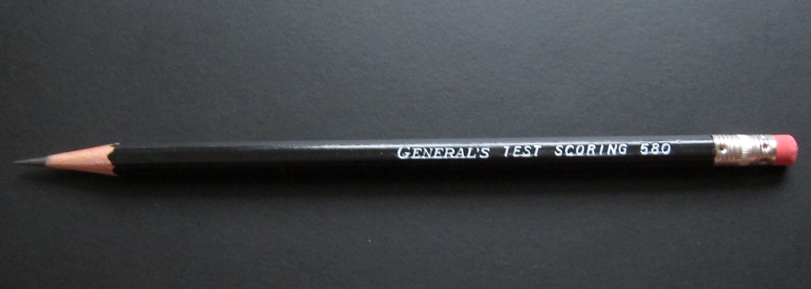
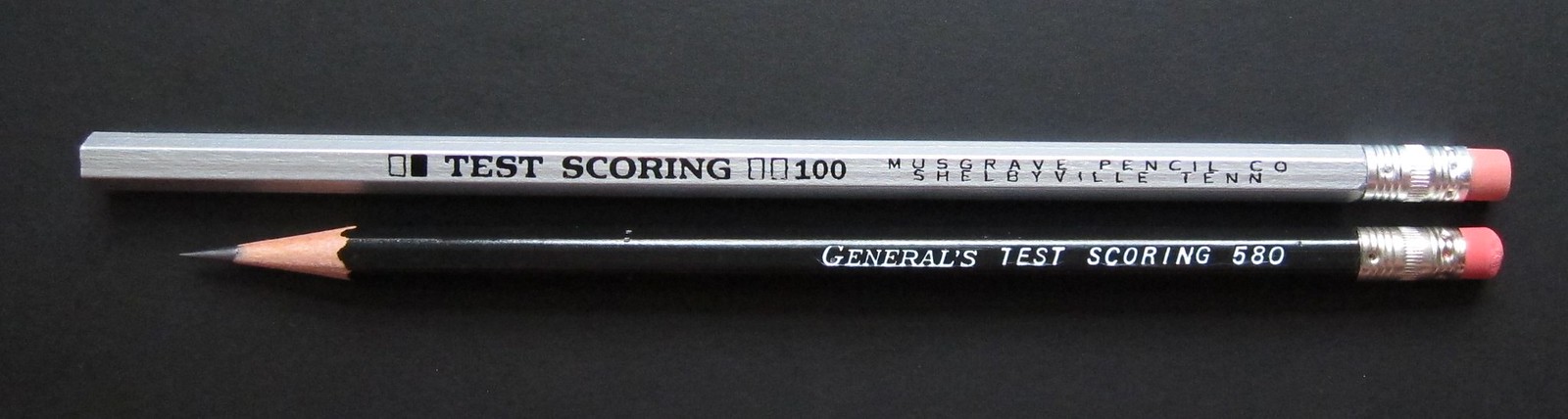
General’s Test Scoring 580
General’s Test scoring 580 is much like the Musgrave TS 100 in that it was designed specifically for the scantron testing age; a lead core specially formulated to be super dark yet able to hold a point for long periods of time. The 580 is an excellent pencil, but for me comes up a bit short of being a great pencil.
For once the fit and finish of a General’s pencil is quite good. There are often visible imperfections across General’s various pencil lines. The 580 is almost perfect. A simple black lacquer coating on the the semi-hex barrel with a bright white imprint makes the 580 a very eye pleasing design. The very classic look of this pencil is completed with a basic aluminium ferrule and simple pink eraser. And yet for me this pencil is mostly blah. I keep looking for something that sets the 580 apart from all the dark writing, black pencils I have in the collection. I’m afraid the 580 is just another black barreled pencil that is far too difficult and costly to purchase. For the per unit cost, i expect something more; some unidentifiable quality that will take this pencil to the next level.
The 580 is primarily produced to be a work horse for the standardized testing age we now live in. The specially formulated core does leave a very dark line, more like a 2B. It is also, surprisingly smooth. But it can suffer from inconsistencies from time to time. Sometimes it is buttery smooth, but then it can become as scratchy as a 9H, yet the darkness of the line never faulters. The point retention for such a dark writing pencil is beyond fantastic. The core of this pencil certainly puts the 580 in the upper echelons of the market.
Another aspect that makes the 580 something special is the seemingly humble pink eraser. This has to be one of the softest rubber erasers I’ve ever come across attached to a basic pencil. Almost every line disappears beneath this eraser. I’d love to own a block of this excellent rubber someday. Set in a simple ferrule only adds to the humble nature of a truly excellent eraser.
When all the elements are put together the 580 could be considered an upper middle of the road offering. Sadly, the General pencil company makes this pencil not only next to impossible to purchase, but have attached a premium price tag. When you can only purchase this pencil from select online retailers in packs of 24 instead of the standard 12, you make it hard for people just looking to try your products. Then there’s the added shipping costs attached to an already high price tag because of small batch sizes. Only the most loyal of General fans go out of their way to buy this thing.
My overall impression of the 580 is that it is a mostly great dark writing pencil with an amazing eraser, but is overpriced and pretty bland. Nothing other than the eraser sets it apart from pack and could justify the hale it takes to get a hold of this pencil. There are just too many options of really good, cheap pencils to compete against to make the 580 an everyday kind of pencil.

General’s Test Scoring 580
Wood: Incense-cedar
Core: HB core, very dark
Shape: Semi-hex
Finish: Smooth Black lacquer
Ferrule: Aluminium ferrule with a slight tinge of gold
Eraser: Very soft pink rubber
Markings: “General’s Test Scoring 580” All caps; bright white paint
Origin: USA
General’s Test scoring 580 is much like the Musgrave TS 100 in that it was designed specifically for the scantron testing age; a lead core specially formulated to be super dark yet able to hold a point for long periods of time. The 580 is an excellent pencil, but for me comes up a bit short of being a great pencil.
For once the fit and finish of a General’s pencil is quite good. There are often visible imperfections across General’s various pencil lines. The 580 is almost perfect. A simple black lacquer coating on the the semi-hex barrel with a bright white imprint makes the 580 a very eye pleasing design. The very classic look of this pencil is completed with a basic aluminium ferrule and simple pink eraser. And yet for me this pencil is mostly blah. I keep looking for something that sets the 580 apart from all the dark writing, black pencils I have in the collection. I’m afraid the 580 is just another black barreled pencil that is far too difficult and costly to purchase. For the per unit cost, i expect something more; some unidentifiable quality that will take this pencil to the next level.
The 580 is primarily produced to be a work horse for the standardized testing age we now live in. The specially formulated core does leave a very dark line, more like a 2B. It is also, surprisingly smooth. But it can suffer from inconsistencies from time to time. Sometimes it is buttery smooth, but then it can become as scratchy as a 9H, yet the darkness of the line never faulters. The point retention for such a dark writing pencil is beyond fantastic. The core of this pencil certainly puts the 580 in the upper echelons of the market.
Another aspect that makes the 580 something special is the seemingly humble pink eraser. This has to be one of the softest rubber erasers I’ve ever come across attached to a basic pencil. Almost every line disappears beneath this eraser. I’d love to own a block of this excellent rubber someday. Set in a simple ferrule only adds to the humble nature of a truly excellent eraser.
When all the elements are put together the 580 could be considered an upper middle of the road offering. Sadly, the General pencil company makes this pencil not only next to impossible to purchase, but have attached a premium price tag. When you can only purchase this pencil from select online retailers in packs of 24 instead of the standard 12, you make it hard for people just looking to try your products. Then there’s the added shipping costs attached to an already high price tag because of small batch sizes. Only the most loyal of General fans go out of their way to buy this thing.
My overall impression of the 580 is that it is a mostly great dark writing pencil with an amazing eraser, but is overpriced and pretty bland. Nothing other than the eraser sets it apart from pack and could justify the hale it takes to get a hold of this pencil. There are just too many options of really good, cheap pencils to compete against to make the 580 an everyday kind of pencil.

12stretch

Write Dude's USA Gold #2
Wood: Incense-Cedar
Core: HB, a dark HB
Shape: Rounded hexagonal
Finish: A yellow-orange paint, also, comes in a natural finish
Ferrule: A brass colored aluminum with a blue horizontal stripe
Eraser: Pink rubber
Markings: USA Gold, 2 emblem HB and a star stamped in blue foil, features a quote “America's Pencil”
Origin: Shelbyville, TN
The Write Dude's USA Gold is easily the best school pencil sold today in some of the largest chain stores. And best of all it is still made in the United States. A box of USA Golds should be on everyone's back to school list, replacing those ugly, badly manufactured Dixons. Ticonderogas have been ruined, USA Golds and Silver for that matter are poised to become the go-to replacements.
To be fair USA Golds aren't great pencils, but they are great school pencils. It's clear that the USA Golds are clearly marketed for the school crowd. The yellow-orange paint harkens back to the standard yellow school pencils of the past, and its very low price tag puts it in the same category as the Dixon Ticonderogas and those other no-brand pencils. USA Golds are easily far superior to any those of alternatives. And the USA Silvers are the best second choice. Part of this is Write Dudes high quality standards and the use of one of the best factories in America. However, the utter crap that Ticonderogas have becoming since moving manufacturing overseas has helped cement the Golds at the top of the pyramid. Write Dudes is very proud of the pencil being manufactured in the states, so proud they have stamped the quote “America's Pencil” on the barrel. Back in the day slogans were a common feature on pencils. Mostly they advertised the special qualities of the pencils. This slogan, however, seems like an outright challenge. I can't help, but smile every time I read those words.
Everything about this pencil screams for use by school children, including its core. An average HB, not too dark nor too light. So the point retention should be on par with an average HB. The point retention on this pencil, however, feels way above average, requiring far fewer sharpenings than any of the other pencils in the collection.
There are a couple oddities with the pencil. Both the eraser and the barrel are a bit undersized. This may a cost savings measure to in order to compete with the cheaper options. This is all speculation, but the most expensive parts to a pencil are the eraser and the wood that make up the barrels. It makes sense to trim those areas as much as possible. None of this is substandard craftsmanship just everything is a bit on the smaller side. The eraser does more than an adequate job just won't last as long as the typical eraser tipped pencil. Took a minute to get use to the smaller diameter as well, but is very comfortable to write with for long periods of time.
USA Golds are really solid school pencils. There unique design, solid performance, and their manufacture in the United States make these a great choice for school aged children. Plus, who doesn't love the nerve of that slogan, “America's Pencil”?
13stretch
Staedtler Full HB
The FullHB is the “greenest” pencil in production. No wood casing, just a solid core of graphite. This is possibly the closest we can get to writing with a raw graphite, like the legends of yore. Really though the FullHB is little more than a novelty. For stick of graphite the lines are less than consistent. Sometimes the lines are so faint it can be difficult to make at the words on the page and at there are times when it's just another HB core. Being all graphite it sharpens really well, and it's kind of neat to stare the very symmetrical groves the sharpener's blade pattern cut into the pencil. The eraser is so-so, works fine with this pencil, but is not of the best quality that Staedtler is capable of producing. The FullHB is a neat in concept, but not a very practical as a pencil.
Wood: None; All Graphite
Core: HB
Shape: Hexagonal
Finish: Thin graphite colored paint
Ferrule: Aluminium
Eraser: White plastic, non-smudge
Markings: Swirl, FullHB Staedtler logo HB 2 in silver foil
Origin: China
The FullHB is the “greenest” pencil in production. No wood casing, just a solid core of graphite. This is possibly the closest we can get to writing with a raw graphite, like the legends of yore. Really though the FullHB is little more than a novelty. For stick of graphite the lines are less than consistent. Sometimes the lines are so faint it can be difficult to make at the words on the page and at there are times when it's just another HB core. Being all graphite it sharpens really well, and it's kind of neat to stare the very symmetrical groves the sharpener's blade pattern cut into the pencil. The eraser is so-so, works fine with this pencil, but is not of the best quality that Staedtler is capable of producing. The FullHB is a neat in concept, but not a very practical as a pencil.
14stretch

Blackfeet Indian Pencil (Vintage)
Wood: Cedar
Core: HB core
Shape: Hexagonal
Finish: Clear coat of lacquer
Ferrule: Black painted metal, iridescent with age
Eraser: Reddish-brown rubber
Markings: The Blackfeet Indian Pencil 2, black imprint in all caps
Origin: Montana, USA
The Blackfeet Indian Pencil is special not because of the materials that makeup the pencil, the perceived quality, or the famous users it cultivated. The Blackfeet Indian Pencil's claim to fame is who and how it was manufactured.
The Blackfeet Indian Writing Co. was a pen and pencil manufacturing company started as tribal owned initiative in the early 1970s. The best known products being the Blackfeet Indian Pencil in various grades and the “Earth Pencil,” an eraser-less pencil made completely of natural materials. Even the ink in the imprint was soy based. The Blackfeet Indian Writing Co. was never very large company, but they made some really solid products with a natural bent.
Since the closing of the company in the late 1990s, their products have been becoming increasingly rare. I was lucky enough to get a box of one of the later versions of these pencils from a co-worker. (Feed the addiction) There were many variations of the Blackfeet Indian Pencil throughout its lifetime. I have the most simple version with a very basic imprint and black ferrule. And I love everything about the pencil.
As much as I love this pencil, there isn't much of a reason to do a full blown review. I could talk about how beautiful the clear lacquer coating makes the cedar look, or how perfect the minimalistic touches fit with the companies mythos, or how surprising smooth and dark of a line is within in this core. But there were too many variations throughout the years and since they are no longer manufactured, I am not going to sully this pencil with a review. They will be used and loved.

15lilisin
Poor souls? But... but I like the pencil reviews.
I also read a book about hooliganism (well, half of the book - I got distracted) but particular to Argentina called Hinchadas. It's actually a collection of essays but it was quite interesting and I've been wanting to get back to it although now it's another country and I can't really do that. But it was interesting to see how violent it was and yet how organized it was within the violence. You had to go through physical trials and tests and it's all this weird big thing. In any case, just trying to say that I enjoyed your review and if by any chance you read in Spanish, I highly recommend it.
I also read a book about hooliganism (well, half of the book - I got distracted) but particular to Argentina called Hinchadas. It's actually a collection of essays but it was quite interesting and I've been wanting to get back to it although now it's another country and I can't really do that. But it was interesting to see how violent it was and yet how organized it was within the violence. You had to go through physical trials and tests and it's all this weird big thing. In any case, just trying to say that I enjoyed your review and if by any chance you read in Spanish, I highly recommend it.
16RidgewayGirl
I enjoy your pencil reviews tremendously, stretch.
17stretch
>15 lilisin: 1,000+ words on pencils is tough for even me to get through.
Oddly enough I can read Spanish. Can't speak a lick of it, but being from rural California you end up with functional Spanglish and the ability to read a language you can't speak. Not so good with fiction for some reason but nonfiction stuff is easy enough. I'll have to see if I can't find a copy. Thanks.
>16 RidgewayGirl: Thanks, just few dozen more to go.
18detailmuse
I enjoy the pencil reviews too. I think I'll replenish next time with some Write Dudes. The fewer sharpenings is a pro, the smaller diameter has me a little hesitant.
19stretch
>18 detailmuse: The diameter difference really isn't that large. About a 1/3 smaller would be my guess. No where near the territory of the smallness of bridge pencils. I suspect most people wouldn't notice a difference unless they hold a lot of pencils. It threw me off for a little while because I couldn't put my finger on why exactly the USA Golds felt so different.
20janemarieprice
I enjoy the pencil reviews as well. Most of my limited knowledge is drawing pencils so I like seeing the differences with ones geared toward writing. Do you know how they make the lead 'hard' and 'dark' for scantrons?
21stretch
>20 janemarieprice: The basic ingredients of any lead pencil core are water, graphite, clay, and a wax. The combination or exclusion of these ingredients determines the hardness and the darkness of the line.
The ratio of clay to graphite determines the hardness. The wax acts as a binder, as well as a gardener. More clay and wax the harder the pencil, but the line is fainter. A 9H is a lot of clay to graphite were as a 5B has as little clay and wax as feasible. The harder the pencil the better it's point retention.
The kicker in all this is that each company has their own formula for the various grades. There is no standard mix for an HB for instance. That's why there is so much variation across pencils.
Also, the quality of the raw materials matter a great deal. Graphite being a pure carbon mineral has a very unique crystalline structure. But like other carbon minerals this structure can trap impurities. So no graphite is 100% pure. The clay used can be incredibly important. Some pencils have stopped being made because the source of certain kinds of clay ran dry.
So to makeup for the uncertainty of raw materials wax can be added to the mix. Trade off the wax can make a harder pencil. Waxed cores can add to point retention where as an unwaxed cores make the darkest lines but won't last as long.
It's next to impossible to get an accurate idea of the recipe, other than through trial and error. Hence why old vintage pencils aren't recreated but are copied as close as possible.
In the case of 'scantron'' pencils like the Test 100 and the 580, they are most likely using the very best graphite, as little wax ad they can get away with or are unwaxed, and optimized the clay ratio within their budget. The exact mix and determining whether they are waxed/unwaxed is not something I can confidently confirm. My best guess is that the Test 100 uses less wax or clay than the 580 and thus has slightly less point retention.
Believe it or not this is the short answer.
Fun fact the original scantron pencil from IBM added a magnetic mineral to the mix so that marks reflected light better for machine to pickup better. The original scantron concept was to replace the punch cards in computing. Computers went in a different direction, so there wasn't a need for a super accurate machine that could read markings on a page. But IBM found a different market for the idea and later scantrons didn't need pencils with metallic minerals. IBM even changed the formula of their pencils soon after the second iteration of the scantron. The pencils that are magnetic are worth a stupid amount of money.
Another off shoot to this discussion is that the darkness of the line has nothing to do with how a scantrons read documents. Ink absorbs light, while graphite reflects light. So a scantron produces a reverse negative. The ink becomes black and the graphite markings become bright white. More graphite equals a brighter mark. Nice trade off is that when used for writing scantron pencils leave behind rich dark lines.
22dchaikin
>21 stretch: i found this whole post fascinating. Had no idea there was such an art to pencil lead.
23dchaikin
And now I'm wondering what kind of clay ran dry and what the stories are behind that. I always imagined clay as where all the non-quartz stuff ends up, as in there is too much of it, not too little.
24theaelizabet
The pencil reviews are fascinating. For those of us who are newish and perhaps missed an explanation, I ask: Why pencil reviews?
Also, any knowledge of Thoreau family pencils?
Also, any knowledge of Thoreau family pencils?
25detailmuse
Kevin how have you come to know all this? It's fascinating.
26stretch
>23 dchaikin: I've been somewhat frustrated by what the industry means by "clay." I suspect clay is much like granite countertops, a generic term used to describe a range of clay minerals. My guess is that aluminum phyllosilicates are what they are referring to as clay.
From what little I can track down it appears that Kaolinite is/was considered the best clay, coming from China and Africa. But there are some S. American clays which I still haven't quite figured out. Perhaps some of the chlorite and illite groups? China was once and in some ways the best "clay" suppliers in the world. When China closed off its economy marked a change in the lead world. A lot of formulas underwent some drastic changes.
>24 theaelizabet: I don't know really. I've always loved wood case pencils, one of the few writing instruments that doesn't break under my pressure. Then I found a community of fellow pencil nerds that put as much effort into hunting down high quality pencils as I was. Collecting the histories and stories of individual pencils is weirdly interesting to me and I have become fascinated with amount of engineering and globalization has gone into such a simple object. I started the reviews for my own sake and figured no one would actually read them. I must have been sick when I posted the first one because I never had any intention of making them public. Now it's just a thing I do.
I don't really know that much about the pencils. The Thoreau family got into the graphite business after John Thoreau's brother-in-law found a North American source of graphite. Not great graphite but good enough for that day and age. They made some really nice pencils probably the first American pencil that didn't use a lot of filler, so their claim that they made the best pencils available to writers and artisans was most likely true. Early pencil history is a bit murky to be honest. There's a lot of hedging. But there wasn't a company mass producing quality pencils. Pencil making was still a cottage industry and quality could vary widely from utter crap to something like pure buttery graphite sticks. The best pencils of the time still had to be imported from Europe, for a brief time the Thoreau family had a monopoly on pencils in N America.
Henry only ever worked part time for the family company but during the periods he put in time at the company he managed to make several innovations to pencil manufacturing: figured out inject lead into hollowed out pencil blanks, invented a machine that ground graphite to very fine particles, and may have independently invented the mixing of clay and graphite like the Conte method to produce higher quality and more consistent pencils.
The Thoreau family eventually lost their monopoly and decided to focus on making crucibles for the metal industry. I could be off on this part and maybe mixing some Dixon history in with this one can't remember where everyone fits on the timeline.
27stretch
>25 detailmuse: MJ it's cold in the winter and I had to stop listening to Air Traffic control. So lots of Google rabbit holes and talking/reading with people in the online pencil community. A small but nerdy group of folks that share whatever we find. There are still a lot of holes to be filled.
On a side note I'm pretty confident I can now land a plane and guide it to a gate at the Indianapolis airport. I would not recommend finding the live stream from the ATC.
On a side note I'm pretty confident I can now land a plane and guide it to a gate at the Indianapolis airport. I would not recommend finding the live stream from the ATC.
28dchaikin
I'm impressed Kevin. You know so much about this stuff.
"... had to stop listening to Air Traffic control. "
??
"... had to stop listening to Air Traffic control. "
??
29theaelizabet
Kevin, thanks for answering my questions. I really find the answers fascinating. I was going to recommend Petroski's book, but noticed that you already have it. Of course!
30stretch
>28 dchaikin: Dan spent 6 weeks, 8 hours a day working inside an ATC center. At first with nothing to do most of the day the chatter is annoying. The next thing you know you're looking up the live stream feeds and mapping out airports. It's sick I know lucky it was a phase.
32detailmuse
ATC, also interesting! I'm not one who wants to listen to the feed when I'm onboard a departing/arriving plane.
34stretch
✔ Soccer in a Football World by David Wangerin

Soccer has famously or infamously been the sport of the future in America since the 1970's. But has never quite reached the aspirations of its many promoters. Professional quality soccer has had many starts and stops throughout our history. Soccer in a Football World is a detailed history of those attempts to grow the game in our country and put the national on the world stage.
This book is only recommend to the soccer nerd, who lives and breathes the game. It was kind of painful to read just how close we got to turning the corner and creating something special. But the obstacles to get a foothold in the American sporting landscape has just been too difficult and could never feed the need to turn a profit:
It's a shame that such limits have been able to kill the game so many times in our past. The outlook of the game has looked bright many times in the past and in 2005 when the book was finished Soccer was on the up swing. Finally, all those kids that grew up playing the game were coming of age. The kind of age that has money to spend on things as frivolous as tickets to a stadium. But it was also a perilous time for the latest professional league. Understandably Wagnerin was a bit pessimistic on the outlook of the game of the future. A time of contraction and a reputation as a league stars go to collect their final paychecks. In the ten years since we have developed a unique fan culture, built more soccer specific stadiums, started to build academies and the infrastructure the other world powers of the game have had for generations, and through a ton of salary rules and exceptions have started to put the kind quality on the field that changes minds.
Soccer finally has the kind of foothold so many have wished in the past. This time it feels like soccer is here to stay.
Origin: UK
Date Published: 2008
Pages: 352
Rating: ★★★½

Soccer has famously or infamously been the sport of the future in America since the 1970's. But has never quite reached the aspirations of its many promoters. Professional quality soccer has had many starts and stops throughout our history. Soccer in a Football World is a detailed history of those attempts to grow the game in our country and put the national on the world stage.
This book is only recommend to the soccer nerd, who lives and breathes the game. It was kind of painful to read just how close we got to turning the corner and creating something special. But the obstacles to get a foothold in the American sporting landscape has just been too difficult and could never feed the need to turn a profit:
1. Too Un-American, a game played the hyphenated Americans
2. Too slow, not enough progression to scoring
3. Resistance to the Americanization of the game
4. Not enough natural breaks for Americans for all things commercials (lack of revenue)
It's a shame that such limits have been able to kill the game so many times in our past. The outlook of the game has looked bright many times in the past and in 2005 when the book was finished Soccer was on the up swing. Finally, all those kids that grew up playing the game were coming of age. The kind of age that has money to spend on things as frivolous as tickets to a stadium. But it was also a perilous time for the latest professional league. Understandably Wagnerin was a bit pessimistic on the outlook of the game of the future. A time of contraction and a reputation as a league stars go to collect their final paychecks. In the ten years since we have developed a unique fan culture, built more soccer specific stadiums, started to build academies and the infrastructure the other world powers of the game have had for generations, and through a ton of salary rules and exceptions have started to put the kind quality on the field that changes minds.
Soccer finally has the kind of foothold so many have wished in the past. This time it feels like soccer is here to stay.
Origin: UK
Date Published: 2008
Pages: 352
Rating: ★★★½
35janemarieprice
>34 stretch: Interesting though likely not a book for me. It's been strange to me that kids playing soccer has gotten so popular in the US over the years but hasn't quite translated to watching pro soccer.
Not enough natural breaks for Americans for all things commercials (lack of revenue). - I've always been under the impression that this was one of the biggest obstacles. Gotta capitulate to ESPN.
Not enough natural breaks for Americans for all things commercials (lack of revenue). - I've always been under the impression that this was one of the biggest obstacles. Gotta capitulate to ESPN.
36stretch
>35 janemarieprice: Things have changed so much from when I played as a youth and what my nephews play today. There are two problems with turning youth players into fans. The 1st generation of young players from the late 70s and early 80s came up in a time devoid of soccer on TV and virtually no local soccer being played at the highest level. The second generation like me are now just reaching the stage of expendable income and we just so happen to have both domestic leagues and access to oversee soccer. The 80s and 90s were the dark ages for professional soccer.
The TV picture is complicated. NBC the broadcasters of the EPL get millions of viewers in on Saturdays and Sundays at ungodly hours. ESPN and Fox have finally gotten the world cup right. And are now broadcasting MLS at regular hours. The lack of commercials was seen has hurtled in the past but today there is plenty of money and creative ways to reach viewers.
The TV picture is complicated. NBC the broadcasters of the EPL get millions of viewers in on Saturdays and Sundays at ungodly hours. ESPN and Fox have finally gotten the world cup right. And are now broadcasting MLS at regular hours. The lack of commercials was seen has hurtled in the past but today there is plenty of money and creative ways to reach viewers.
37stretch
✔ The Buddha in the Attic by Julie Otsuka
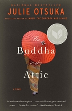
The Buddha in the Attic is sparse account of Japanese ‘picture brides’ experiences in America: the hopes and dreams of a new life in America; the disappointment of the meeting the men they are promised to; the abuses they faced from their husbands and from the others around them; the fear of and sadness of life in a new country; the harshness of manual labor working for as maids, laundress, groceries, and farm labors; the rejection they faced from society, from their husbands, and even from their children; the fear of the interment process; and even a few moments when life wasn’t disappointing.
It was a pretty dark and depressing little novel. And told in the third person singular (we) forces the reader to recognize the collective nature of the experiences of these women. Lot of folks will find the writing style annoying and are unable to connect with these women. For this story had been told as a single person narrative it wouldn’t had been as impactful for a story with a wide ranging experience of picture brides and the interment of the Japanese people deserve. My only issue with the story is how diverse Otsuka made California sound. Her depictions of rural northern California and the lives of farmers was spot on. It was actually pretty cool for someone like me to get the places I grew up in name dropped and for those places to feel authentic (Yuba City, Gridley, Elk Grove, Chico, Lincoln, etc.). The problem is that the very small populations of these places just haven’t been all that diverse through our collective past. I think making the lives of the Japanese characters throughout California was to make their absence something more widely felt. But the sad reality is that internment went unnoticed by very large portions of the state.
Origin: US
Date Published: 2012
Pages: 144
Rating: ★★★½
38dchaikin
On audio, the first hour it so of The Buddha in the Attic is terrific. The last hour just dragged. The book didn't get worse, it just wore me down a bit with the endless new we's. It's very moving. And it's surprising how hard their lives were.
39stretch
>38 dchaikin: Yeah I read it in chunks with large breaks in between. Maybe that's why i didn't find the writing style to be annoying. Audio though would be overwhelming.
40detailmuse
Belated happy national pencil day!
41stretch
>40 detailmuse: It does sneak up on you doesn't it.

43stretch

Helix Oxford Premium Grade
Wood: Basswood dyed pink
Core: Light HB
Shape: Rounded hexagonal
Finish: Dark blue lacquer
Ferrule: Simple aluminum
Eraser: White hard plastic; non-smudge
Markings: Helix Oxford Premium Grade HB P35 in yellow-gold foil
Origin: Great Britain
The greatest source of raw graphite came from the Plumbago Mine in Borrowdale, England. It would make sense that England should be capable of producing some great pencils. Historically this was true, but today there just aren’t that many writing pencils manufactured in Great Britain. Sadly the much of the pencil manufacturing in the UK can’t quite live up to the legendary reputation of the Mine.
The aesthetics of the Helix is are pretty plain, with one exception: the wood. Cheaper basswood doesn’t really fit the Helix’s historic past. As a reminder of the glory days Helix has dyed the wood pink to mimic the bygone era of red cedar. In my estimation this is a miserable failure and so laughably gimmicky. It’s such a bright, distracting pink that in no way resembles the look of red cedar. Helix is putting too much effort on an aspect to remind a select few pencil nerds of an era long gone. The Helix would better served if Helix just went with an incense cedar. Besides the hideous pink wood the rest of the pencil isn’t all that bad. The dark navy blue paint is actually quite nice. Matched with the yellow-gold foil imprint, simple aluminum ferrule, and white makes this a handsome pencil. Then Helix ruined the looks by putting a large white barcode on the reverse side of the pencil high up near the ferrule. Most pencils with barcodes position them near the tip of the pencil so that they are eventually sharpened away. That’s not going to be the case with the Helix, this barcode is hanging on until the bitter end.
Another disappointing aspect of the Oxford is a lackluster fit and finish. The ferrule is crimped to the pencil unevenly. In some places the ferrule is tight to edges and in other places there’s a gap that sticks out from the hexagonal panels. The ferrule isn’t even tight with the eraser. The eraser can easily be pulled out a bit. I guess you could argue that this is a feature that extend the life of the eraser, but in reality this is a poor excuse for a ferrule that just barely gets the job done.
The graphite core is lackluster. It’s pretty smooth, but not all that dark. Sort of a middle of the road darkness within the HB range. Point retention however, is fantastic. The point seems to last forever so the Oxford has that going for it.
Aside from the eraser coming loose from the ferrule, it really isn’t that bad. It’s a lot harder than the typical plastic vinyl eraser. Normally a hard eraser is not a good thing, but in Oxford’s case a hard plastic eraser works. Another strange aspect of the eraser is that it leaves behind dusting more equivalent to a rubber erase than the typical plastic. Most plastics leave behind long stringers in nice neat clumps.
The Helix Oxford is not necessarily a disappointment. Helix has made a reasonably okay standard school pencil. Still in search of that great UK pencil. Helix really should drop the pink wood and fix the issues of the ferrule if they want to become a contender for that Premium moniker.
44stretch

Write Notepads Co. Lenore (Special Edition)
Wood: Dyed black basswood?
Core: HB core, No. 2
Shape: Hexagonal
Finish: All black lacquer
Ferrule: Thinly painted black metal
Eraser: Soft black rubber, dyed
Markings: Write Notepads Co. - Balto. MD. with LENORE flanked by ravens and No. 2 with USA logo all in a copper colored foil. All of this in a left handed orientation.
Origin: Shelbyville, TN

The Write Notepads Co. is a Baltimore manufacture of notebooks and small batches of pencils. This is a company that is proud of its products and prouder of their roots. So when they decided to launch a subscription service of limited edition notebooks/pencils they went with a theme very close to home: Edgar Allen Poe. The dark and moody atmosphere of Poe’s famous poem “The Raven” serves as the inspiration of the completely blacked out notebooks and pencils. In the stationary world these limited edition subscription services have become all the rage and serves as a time for these companies to exercise their creativity. Write Notepads really went out on the ledge with their first edition. With this first edition Write Notepads have pushed the standards of limited editions and are going to be hard to follow up with future editions.
Everything Write Notepads Co. puts out is top notch and well thought out, no detail is overlooked. For their 1st special edition Write Notepads working with a partner in Shelbyville, TN went with an all-black pencil. This includes the wood, which has been dyed black to the core. A thick black lacquer, black ferrule, and a dyed black rubber eraser completes a pencil Johnny Cash would have been proud to hold. The black wood is just such as a cool touch. Naked wood would just clash with the theme. There’s no way a pencil called Lenore should be anything but black to its very core. Another very cool touch is the copper colored foil used in the imprint. Copper orange only adds to the ominous feel of the pencil and really pops. Add a couple little ravens and its hard not to obsess over Lenore.
A small note to add to the uniqueness of Lenore, is that the imprint is printed in a left-handed orientation. So when held in the right hand the writing is upside down. Just another cool aspect of the Write Notepads Co. They have a line of products purposely built for folks of the left-handed variety. Departing from the norm and going after such a niche market is just something Write Notepads does, so going for broke and thinking outside the box is a comfort zone for this company.
The coolness of the pencil wouldn’t matter much if the core was trash. But Write Notepads doesn’t take those kinds of short cuts. The HB is dark and smooth fitting to the overall theme. Not the greatest point retention, but it does the job just fine. The core transitions perfectly with the core, combine that with the adequately dyed black rubber eraser, and painted ferrule it’s almost like writing with one continuous black stick.

There are, however, a couple of issues with Lenore. The first is that Lenore is a full Hex, so the edges can feel sharp in the hand. Also, the paint on the ferrule is super thin and flakey. Exposed aluminum on the ferrule cheapens the overall look. For the price that limited edition pencils start at, these flaws really should be worked out. Some additional sanding and an additional coat of paint would go a long way to making Lenore a perfect pencil.
The Lenore is Write Notepads Co. first foray into the limited edition market. As a concept Lenore wins in all the cool factors: looks are top notch, details fitting to the theme, locally made, and edgy outside the box thinking. Lenore is just something special. There are some flaws for sure, but I think Write Notepads Co. has really knocked it out of the park and pushed the stationary special editions envelope in a new direction. It’s an exciting time for the stationary world. Then again my judgement could be colored by the fact that I’m a sucker for anything Poe.

45stretch
✖ Inverting The Pyramid: The History of Soccer Tactics by Jonathan Wilson

So apparently I do still know how to finish on of these things!
I won't bore ya'll with too many details. Because in all honesty there are maybe like four people who read this book all the way through. So Inverting the Pyramid is the history and evolution of soccer tactics from the earliest days of the rugby style line to the high press and quick passing team game of the modern era. It's a complete history. Details are not left out and the reader will be swimming in hard to pronounce names and formation numbers for hours. It's not for the faint of heart and soccer nerds are probably the core demographic here. It'll make an excellent resource but I'd stay away if soccer is merely an interest and not something that sustains pretty much every waking moment of your life.
Origin: UK
Date Published: 2008
Pages: 464
Rating: ★★★★
46lilisin
>45 stretch:
I love soccer (playing and watching for over 20 years) but even I don't think I could read through that one.
As always, love the pencil reviews.
Did I ever tell you about my number 3 pencil? I had this random number 3 pencil in elementary school and I used to torture my friends by marking on their papers as the pencil was nearly impossible to erase. Oh, such fun. lol I've never seen such a pencil since but I assume they still make them.
47stretch
>46 lilisin: Ah yes the great American inbetweener known has the F pencil. Not quite an H but not a HB either. You don't see many of those in the wild these days. I only know for one that is still made and it's by papermate so they're probably ruined.
48stretch

Palomino HB
Wood: Incense-cedar
Core: Dark HB core
Shape: Rounded hexagonal
Finish: Blue or orange lacquer with a gold stripe near the ferrule
Ferrule: Gold metal
Eraser: White plastic; non-smudge
Markings: Palomino HB with Palomino horse logo in gold foil
Origin: USA and Japan
I consider the Palomino HB to be the flagship of the Palomino brand. Sure Blackwings probably make up the bulk of the sales, but the HB is where the company started making premium woodcase pencils. And the HB remains one of the very best pencils available for something just shy of the upper echelon prices for pencils.
The Palomino HB is quite pretty in its simplicity. The lacquer is thick and smooth. The imprint is clean and crisp. The gold foil and single band of gold near the ferrule adds a bit of class without being garish. And both the blue and orange colors are super vibrant and rich. However, Palomino no longer makes the orange eraser tipped version of the HB. The orange is now only available as a drawing pencils in multiple grades. The new orange Palomino has a black and white end cap. It’s still a wonderful looking pencil, just a little sad to see the eraser tipped orange finish go extinct.
Behind the perfect finish is an exceptionally dark and smooth graphite core. As one of Palomino’s more premium options the core is more than capable to living up to that kind of billing. A very dark, smooth line with fantastic point retention makes this a joy to write with for long hours. Easily one of the best cores in a mass produced pencil.
The eraser is a pretty standard white plastic, non-smudge found on so many pencils. Nothing particularly special, just an honest workhorse. It does well enough, but can leave some minor ghosting. The eraser is also grumblier than the typical plastic. Most of the time the eraser leaves a long stringer rather than the dust left behind the pink rubber. So this eraser is considered a bit “dirtier” than one would expect from a plastic. A better quality eraser would be fitting for such a great pencil.
The Palomino HB may no longer be the top dog over at Palomino, but to me the HB is still one of the truly great pencils stile currently being manufactured. It’s a shame that the orange lacquered version is being phased out of production. And the quality of the eraser is somewhat disappointing. But the core is just beyond fantastic and more than makes up for these very minor flaws. If I wasn’t already flushed with so many pencil options, I would certainly consider picking up a gross to use as an everyday pencil.
49detailmuse
>44 stretch: I'm fascinated with the Lenore and its left-handed orientation and curiously bothered by its black wood/eraser. Great review.
>46 lilisin:, >47 stretch: enjoyed learning about the #3/F.
>46 lilisin:, >47 stretch: enjoyed learning about the #3/F.
50stretch
✖ The Numbers Game: Why Everything You Know About Soccer is Wrong by Chris Anderson

So, I can't seem to get away from increasingly nerdy readings of the beautiful game. This time The Numbers Game is all about those statistics and numbers that govern the game. Like baseball stats it is easy to get lost in the weeds and the over valuation of numbers that without proper analysis are meaningless.
While the statistics and the growth of managers using statistics to govern their decisions is enlightening, the subtitle is a little misleading. Fans of the game at anything more than passing knowledge will have already accepted the 'truths' that Anderson exposes. Still it's nice to see that hard data backups what has been assumed as knowledge for years. It'll be interesting to see how the game changes in the coming decades as analytics becomes more mainstream and as the old guard retires. Goals are rare, very rare. Maximizing the potential to score a goal and minimizing the chances of the opposing side is where the real power of analytics resides. Managers will be foolish ignoring the numbers as a tool to govern new transfers and team tactics.
My one issue with this book on numbers is the claim that luck or fortune turns nearly all games into a 50/50 coin flip. It's true, soccer is a game of margins and the skill of manager and players really only effect a small portion of the game. There are always random elements that can effect the outcome of the game, like all sports. I take issue though with the coin flip proposition for a book on statistics. The 50/50 outcomes only come into play over league play when the sample size is large enough for the rules of large numbers apply. For single elimination games or to say that preparation and training doesn't help mitigate some of the random is using the numbers to justify the hard to explain and not an application of analytics that should be taken seriously. Otherwise it is fascinating look at the game that is bound to find its way into all my future pub arguments.
Origin: UK
Date Published: 2013
Pages: 400
Rating: ★★★★
51stretch

Tomow Mono HB
Wood: Incense Cedar
Core: Dark HB core
Shape: Rounded hexagonal
Finish: Black lacquer with a thin gold horizontal band and thicker cream colored band near the top of the pencil
Ferrule: No ferrule, a black end cap
Markings: In gold foil “highest quality Tombow Mono” with Tombow’s dragonfly logo;
on the reverse side: Made in Japan · for hi-precision drafting. HB’s within cream colored band.
Origin: Japan

The Tombow Mono is a high quality Japanese writing instrument. I know this because its degree of quality is stamped right into the barrel. And like most Japanese pencils it has been manufactured for a very specific purpose; in this case the Mono’s expressed purpose for being is for all hose “hi-precision” drafting needs. I’d imagine just about any pencil with a sharp enough point could be used for drafting, but whatever, marketing is a thing.
Regardless of its marketed purpose the Tombow Mono is a quality pencil that is more than capable of meeting any number of pencil related needs, including the writing of this review!
The Mono exudes a certain amount of elegance, much like a tuxedo. A smooth black lacquer over the warm cedar wood, with a gold and cream band near the butt end of the pencil cap off a formality that isn’t all that common. And the precision of the colors of the finish alone is remarkable. Then add the nearly flawless gold foiling of the imprint to the barrels and you have the very definition of elegant. The amount of craftsmanship exhibited in just how precise everything looks is testament to just how much Tombow cares about making quality products. Considering the techniques for painting and imprinting pencils is still fairly primitive, it is next to impossible for there not to be issues. Flaws in the metal typing used to create the imprint aren’t non-existent, both the lettering and paint edges are crisp, the lacquer is perfectly even, and the plastic end cap is perfectly blended with the body of the pencil. For something that is massed produced the individual quality for each Mono is beyond amazing. Frankly, not many pencil manufactures can claim they have the same standards for fit and finish like the Tombow company.
There is another version of the Mono dedicated to the 100th anniversary of the Tombow company, called the Mono 100. From all accounts the Mono 100 is basically the same pencil with a refreshed paint job. Same black lacquer and gold foiling, but just lacks the horizontal band. It has now been replaced by a thin gold band and a vertical line descending from the end cap. Personally I prefer the looks of Mono over the 100. With no functional differences it really comes down to ones preferences for the looks of the thing, at least until the manufacturing run of one of these pencils comes to an end.
Besides being a really well-crafted pencil, the graphite core is also exceptionally dark and smooth with a point retention that rivals some of the harder grades available from the Japanese. Maybe the claim that the Mono has been made for hi-precision drafting isn’t all bluster. With the rounded edges and dark lines it feels like this pencil can write for forever and still put the lines exactly on point. Since there isn’t an attached eraser, the Mono just begs to be matched with the finest of German plastics. I particularly like the Staedtler Rasoplast. Does a fine job of erasing and matches the black lacquer, which only seems fitting.
The Mono is really a Japanese pencil of the highest quality. Everything about this pencil has been crafted to the highest of care, nothing has been compromised. Very few pencils can actually live up to their own hype, but the Mono is pretty close to perfect.
52stretch
Just/Basics HB
Just/Basics is analogous to the generic office brand school pencil. Made in China the Just/Basics pencils is the absolute epitome of a basic pencil, made from Basswood with a so-so HB core. Nothing special. The bright orange paint job would have been distinctive if it wasn’t the same paint color used for all the other office brand No. 2s. With the bright cherry red rubber eraser, these pencils are actually pretty ugly. Much too bright and colorful for something trying to so damn generic.
Aside from being hard to look at Just/Basics is a classic case of getting exactly what you pay for in terms of quality. If the core isn’t broken right of the box then you can expect an inconsistent although surprisingly smooth line. Most of the time it runs somewhere between a middle of the road HB to something close to an F grade. Then there are those random moments when it’s super dark and chalky. When the dark line comes out, it behaves more like a charcoal pencil with lots of ghosting and smudges all over the page. The other smudgy aspect to this pencil is its eraser. Out of the box all the erasers are super hard. Some work pretty well, others are the destroyers of paper. Most leave behind those impossible to remove pink and grey smudges that permanently haunt your mistakes. It’s gamble whether you get a good eraser or if its crap, assume crap. Also, out of the box most of these pencils will be warped. Basswood if not shipped correctly has a tendency to shrink in hot dry places. Just/Basics pencils are guaranteed to be shipped as haphazardly as possible, so they all are a bit curved. On top of all that the point retention is something awful as well. The Just/Basics pencil is a perfectly serviceable pencil for the short term, infuriating for use of anything more elaborate then the name and number type tasks.
There’s nothing wrong with wanting a generic, cheap pencil. For a few cents extra there are a so many better options. Just/Basics is a throw away tool and it shows. They’re just barely serviceable and will get you through in a pinch, but not much else. Still there are worse pencils out there using inferior materials and managing to be manufactured with even less care.
Wood: Basswood
Core: HB core
Shape: Hexagonal
Finish: Bright orange paint over a white paint layer, faint imprint of the date of manufacture near the top
Ferrule: Basic Aluminum
Eraser: Cherry red rubber eraser
Markings: Just/Basics No. 2 in a black foil
Origin: China
Just/Basics is analogous to the generic office brand school pencil. Made in China the Just/Basics pencils is the absolute epitome of a basic pencil, made from Basswood with a so-so HB core. Nothing special. The bright orange paint job would have been distinctive if it wasn’t the same paint color used for all the other office brand No. 2s. With the bright cherry red rubber eraser, these pencils are actually pretty ugly. Much too bright and colorful for something trying to so damn generic.
Aside from being hard to look at Just/Basics is a classic case of getting exactly what you pay for in terms of quality. If the core isn’t broken right of the box then you can expect an inconsistent although surprisingly smooth line. Most of the time it runs somewhere between a middle of the road HB to something close to an F grade. Then there are those random moments when it’s super dark and chalky. When the dark line comes out, it behaves more like a charcoal pencil with lots of ghosting and smudges all over the page. The other smudgy aspect to this pencil is its eraser. Out of the box all the erasers are super hard. Some work pretty well, others are the destroyers of paper. Most leave behind those impossible to remove pink and grey smudges that permanently haunt your mistakes. It’s gamble whether you get a good eraser or if its crap, assume crap. Also, out of the box most of these pencils will be warped. Basswood if not shipped correctly has a tendency to shrink in hot dry places. Just/Basics pencils are guaranteed to be shipped as haphazardly as possible, so they all are a bit curved. On top of all that the point retention is something awful as well. The Just/Basics pencil is a perfectly serviceable pencil for the short term, infuriating for use of anything more elaborate then the name and number type tasks.
There’s nothing wrong with wanting a generic, cheap pencil. For a few cents extra there are a so many better options. Just/Basics is a throw away tool and it shows. They’re just barely serviceable and will get you through in a pinch, but not much else. Still there are worse pencils out there using inferior materials and managing to be manufactured with even less care.
53stretch
✖ Equal Rites by Terry Pratchett

I've always loved the witches. They're tough, independent women that are the pillars of common sense in a sea of insanity. They're easily some of the best characters in the Discworld series, but they seem to be stuck in the worst stories outside of the Tiffany Aching plot lines. The plot of Equal Rites sounds interesting on the surface. Mixing the Witches with the world of the Wizards should be all kinds of fun, but really it just feels flat. So far the witches series just haven't quite lived up to the badassary the witches exhibit in the small moments outside the main plot.
Really, all the Witches Series just feel like prototypes for Aching Series.
Origin: UK
Date Published: 1987
Pages: 272
Rating: ★★★
54detailmuse
>51 stretch: beautiful pencil and great review. I'm trying a dozen!
55stretch
>54 detailmuse: The rabbit hole for all your pencil related needs: CW Pencil Enterprise
You don't even have to buy them by the dozen.
You don't even have to buy them by the dozen.
56dchaikin
Hey Kevin - I think I agree with you about Equal Rites. The last Pratchet I tried was Wyrd Sisters, a witch-centered take on MacBeth (which I haven't read) It got the point I struggled to pick it up. Maybe was witch problem, or maybe I need to read MacBeth...
57detailmuse
>55 stretch: Fabulous! And quite the pedigree of links when I googled the site name. I'd love to visit in person.
58stretch
>57 detailmuse: Whoops my href link was missing a space. Yeah the pencils ladies and guy are great folks by the sound of it (from interviews and podcasts). Plus there is nowhere else that you can get that kind of selection.
59stretch
✔ Eruption: The Untold Story of Mount St. Helens by Steve Olson
Eruption is a recounting of the events and decisions made by geologist, politicians, companies, and the public in the days before the eruption. The deaths on St. Helens were tragic and preventing them was a complicated mess of stake holders and differing values. The scientist wanted more cautious approach. Logging companies wanted to keep working and turning profits. Politicians wanted to avoid making unpopular decisions. The public wanted to exercise their freedom and enjoy the good weather and the mountains. The sheriff wanted to keep people safe. And the environmental movement was looking for an opportunity into halting the logging companies’ destruction of old growth forest. All pulling in different directions, compromises had to be made in light of an unpredictable mountain.
The stories of those that perished are tragic. The passing of the buck after the event of the politicians was disgraceful. Nobody wanted to cry fire if the mountain wasn’t going to blow. Geologist were guilty of not communicating with decision makers with the right urgency. In the author’s opinion they should have also known that Helens was going to blow up sideways and not follow the more familiar pattern for these type of volcanoes. His take on the geology matters is pretty elementary and is more conspiracy than was necessary.
Main lesson here is that people are bad at risk assessment. Especially if the incentive to take risks is weighed against a potential disaster with no definitive timeline.
Origin: USA
Date Published: 2016
Pages: 320
Rating: ★★
60stretch
So I made it through Infinite Jest and wow... was this the right book at the right time. Never has book become so personal so quickly. I don't even know how to process some if it into coherent sentences. There is so much going on and you can take what you want from it, but it has really helped me understand some loss and pain. i don't know if i ever want to revisit it but I'll never forget some of the passages.
61stretch

Casemate/Nataraj Neon HB
Wood: Exotic wood
Core: HB
Shape: Hexagonal
Finish: Thin highlighter bright paints in Orange, Yellow, Green, Blue, and Pink
Ferrule: Black Aluminum
Eraser: Matching colored hard plastic
Markings: No. 2/HB in gold imprint
Origin: India
Recently Walmart has started selling their own branded stationary under the Casemate name, which includes its own suite of pencils. The pencils they are selling aren’t just the generic cheap yellow sticks with a new name slapped on the sides. No the pencils Walmart sells come in bright vibrant neon colors, in both round and hexagonal forms, are made from exotic woods, and don’t totally suck.
The Casemate brand is really nothing more than a set of partnerships with existing products from oversees. In the case of the hexagonal form of their pencils are re-branded Nataraj Neon HB pencils from India. For all practical purposes the Casemates are noting more than the original pencils without the Nataraj’s markings. With the trend this year in back-to-school is for bright, vibrant, fun woodcase pencils with interesting stripes and patterns there is no better time to begin importing Nataraj’s line of pencils. Nataraj pencils have a lot of different design elements not seen in a typical woodcase pencil, the Neon HB is actually one of the more tame offerings. The Neon HB comes in five highlighter bright colors: blue, green, pink, orange, and yellow. However, the paint is very thin and there is a lot of bleed through from the white base coat. I think the bleeding of the white base is actually kind of neat and separates it from so many of the other ultra cheaps that have flooded the pencil markets. Most people will see this a major flaw in the fit and finish. I have formed a fondness for cheap, tacky paint that only makes the pencil stand out in the crowd. So I see being slightly washed out as a mark of character rather than a flaw.
Besides being unique in its paint scheme the other big wow factor with this pencil is its exotic wood. I really have no idea what wood species it comes from, but according to Nataraj’s website it is sustainably harvested from plantations. The wood grain is very tight and narrow, so it has excellent sharpening characteristics. What really makes this wood grain distinct is the mix of patterned dark and light grains creating something resembling tiger stripes. Once freshly sharpened though the pencil does give off a faint vinegar smell. It’s not a very strong smell but it’s present and can be distracting if the smell of the pencil is an important part of the writing experience.

Performance of the Neon HB is not lacking either, the core and eraser are not that bad for such an inexpensive generic pencil. The core is dark and smooth, with decent point retention. The eraser is a hard plastic dyed the same color as the body of the pencil, and is quite functional. Neither of these components are that great, but they do more than an adequate job which is refreshing for the alt. branded segment of the market.
The Casemate/Nataraj Neon HB is a decent, cheap back-to-school offering that is widely available from Walmart. The colors are bright with my kind of character building imperfections. Overall its not a top echelon pencil, but its fun and perfectly adequate pencil that can get the basic job of writing done and cracks the door of future Nataraj offerings that will only help diversify the market.
62This-n-That
Wow, I never realized there are so many variations in pencils. Personally, I especially love a good eraser. Thanks for posting all this information.
63stretch
Vitals:
Total Number of Books = 13 | Pace = 1.08
Fiction = 5
Non-Fiction = 7
Other = 1
Total Number of Pages = 5557 | Average = 427
TBR Status = 3.4 % increase (89 books last year)
Author Demographics:
Male = 10
Female = 2
Mixed = 1
New to Me = 7
Country of Origin:
U.S. = 8
U.K. = 5
Publication Year:
2010+ = 8
2000-2009 = 3
1990-1999 = 2
1980-1989 = 0
Pre-1980 = 0
Ratings:
5 = 1
4.5 = 0
4 = 5
3.5 = 4
3 = 2
2.5 = 0
2 = 1
1.5 = 0
1 = 0
Average = 3.62
46.2 % Rated 4 stars or higher
46.2 % Rated between 3 & 4 stars
7.7 % Rated below 3 stars
Favorites of 2016:
1st Quarter:
Among the Thugs by Bill Buford
Soccer in a Football World by David Wangerin
2nd Quarter:
Inverting the Pyramid: The History of Soccer Tactics by Jonathan Wilson
The Numbers Game: Why Everything You Know About Soccer Is Wrong by Chris Anderson
3rd Quarter:
Every Dead Thing by John Connolly
Infinite Jest by David Foster Wallace
4th Quarter:
Secondhand Souls by Christopher Moore
65Polaris-
>14 stretch: This pencil gets a lovingly told tribute in William Least Heat-Moon’s delightful Writing Blue Highways: The Story of How a Book Happened. He wrote his first draft with them. There’s an extract of it in my review of the book if you’re curious.
66stretch
>65 Polaris-: I will defenitely be looking that one up. He's not among the long list of famous pencil using folks and it's always interesting to see how creative people use their tools and how the feel about those tools. There's a recent art book that covers nothing but that concept with modern users.

